Principal
Product
Designer
Hello, I’m Andrew — a user‑experience expert with 15 + years of hands‑on work designing digital products, mentoring designers, and leading cross‑functional research and design teams. My engineering education, experience co‑founding a startup that reached 1 M MAU, and building UX/UI agency User House, (200+ completed projects), help me bridge design, development, and product management to create products users love.
I’m currently open to new opportunities — let’s connect and discuss how I can contribute to your team.
Versatile
I tailor my approach to each product context, from consumer mobile apps to enterprise software.
Impact-Driven
I build products that balance user needs with measurable business impact across platforms.
Data-Driven
I integrate data and analytics into the design process to inform decisions and measure success.
Entrepreneurial
I approach design with a business owner’s mindset, ensuring each decision contributes to meaningful innovation and growth.
End-to-End
I combine strategic product thinking with hands-on design execution, from ideation to launch and beyond.
Collaborative
I work closely with cross-functional teams, bridging design, engineering, and product to deliver cohesive experiences.
Systematic
I build reusable design systems that scale across products and teams, ensuring consistency and efficiency.










Now — Principal Product Designer — Freelance
- Conducted usability testing for the Ilex.by legal information system, developed a comprehensive design system, and led a full redesign of the desktop version, improving navigation and usability. The updates led to a 17% increase in user engagement and a 12% boost in task efficiency.
- Designed the mobile version from scratch, optimizing the experience for on-the-go users. Combined with the desktop improvements, the redesign resulted in a 42% rise in user satisfaction based on post-launch surveys.
- Mentored over 15 UX/UI designers and researchers, focusing on user-centered design principles, qualitative and quantitative research methodologies, and Agile practices.
2022 — Senior Product Designer — June Homes, Remote, New York, NY
- Designed a mobile application interface for apartment maintenance professionals, which led to a 75% reduction in operational costs over six months, while maintaining stable service quality, and increased the successful specialists’ visit rate by 26%.
- Improved the design system for multiple platforms, allowing customers to experience seamless transition between platforms and 15% faster implementation of new functionality by developers.
- Collaborated with cross-functional teams (PMs, R&D) to ensure consistency and high-quality user experience throughout all product touchpoints, working on 3 projects simultaneously.
2010—2022 — Head of Product Design, CEO, Founder — User House, Moscow, Russia
- Assembled, trained, and led a cross-disciplinary team of UX/UI designers and researchers (20+ employees in total), successfully completing over 200 projects for the world’s and Russia’s largest companies (with a total of 100M users).
- Developed and implemented methodologies for creating cross-platform interface designs and design systems based on the results of usability research and business requirements.
- Established a mentorship program within the company, fostering knowledge sharing and skills development, leading to a 35% increase in employee growth and nurturing 5 emerging leaders.
- Facilitated transparent and effective communication between designers, researchers, and other key stakeholders, working with a team of 15 people.
- Demonstrated leadership in ambiguous and rapidly changing project conditions, confidently making decisions, leading to the successful launch of 10+ new products.
2010—2014 — Principal Product Designer, Co-Founder — Automotive Startup
“AutoPOI” is a platform with 1M MAU, connecting automotive companies with car owners for purchases and services.
- Formulated and implemented UX Strategy & Vision based on big data, which allowed doubling MAU for 6 consecutive quarters.
- Initiated and conducted regular stakeholder meetings to promote understanding and support for strategic UX initiatives, advocating for a user-centric culture.
- Introduced a continuous user research process, ensuring the team stayed informed about current user needs, resulting in 25% faster product adaptation to meet user demands.
2006—2008 — Product Designer — Usethics, Moscow, Russia
- Designed and implemented a new design system for Consultant Plus (200,000+ customers), leveraging usability testing insights to reduce average problem-solving time by 15%.
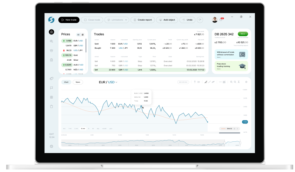
- Created the trading terminal interface for Moscow Exchange (400,000+ clients), ensuring seamless access to financial tools and improving user efficiency.
- Conducted 50+ interviews и usability tests, uncovering critical user issues and proposing design solutions that improved product performance.
