challange
Redefining the way people find events for visiting.
overview & problem
Planning leisure time can be time-consuming, especially for spontaneous outings. Finding engaging activities and coordinating with friends is often challenging. A mobile app solves this by showing where friends plan to go and where they are now, making it easier to meet up, discover events, and enjoy shared experiences effortlessly.
role & team
Role
- Product Ownership
- UX/UI Design
- Research
- Leading the design team of 3
- Coordinating with devs and designers
Team
- Graphic Designer
- UX/UI Designers
- Developers
result
2 mo
to fully design the app from scratch, including UX research.
100%
on-time delivery with all versions launched as scheduled.
Process
Research
Problem
People often get bored. If you're trying to plan your free time and want it to be fun, diverse, and worthwhile, it can take a lot of time to pick an event or activity. If you’re looking to do something spontaneously, selecting a suitable activity becomes even more challenging.
Solution
Meet up with friends more often. A mobile application that helps you spend time with friends.
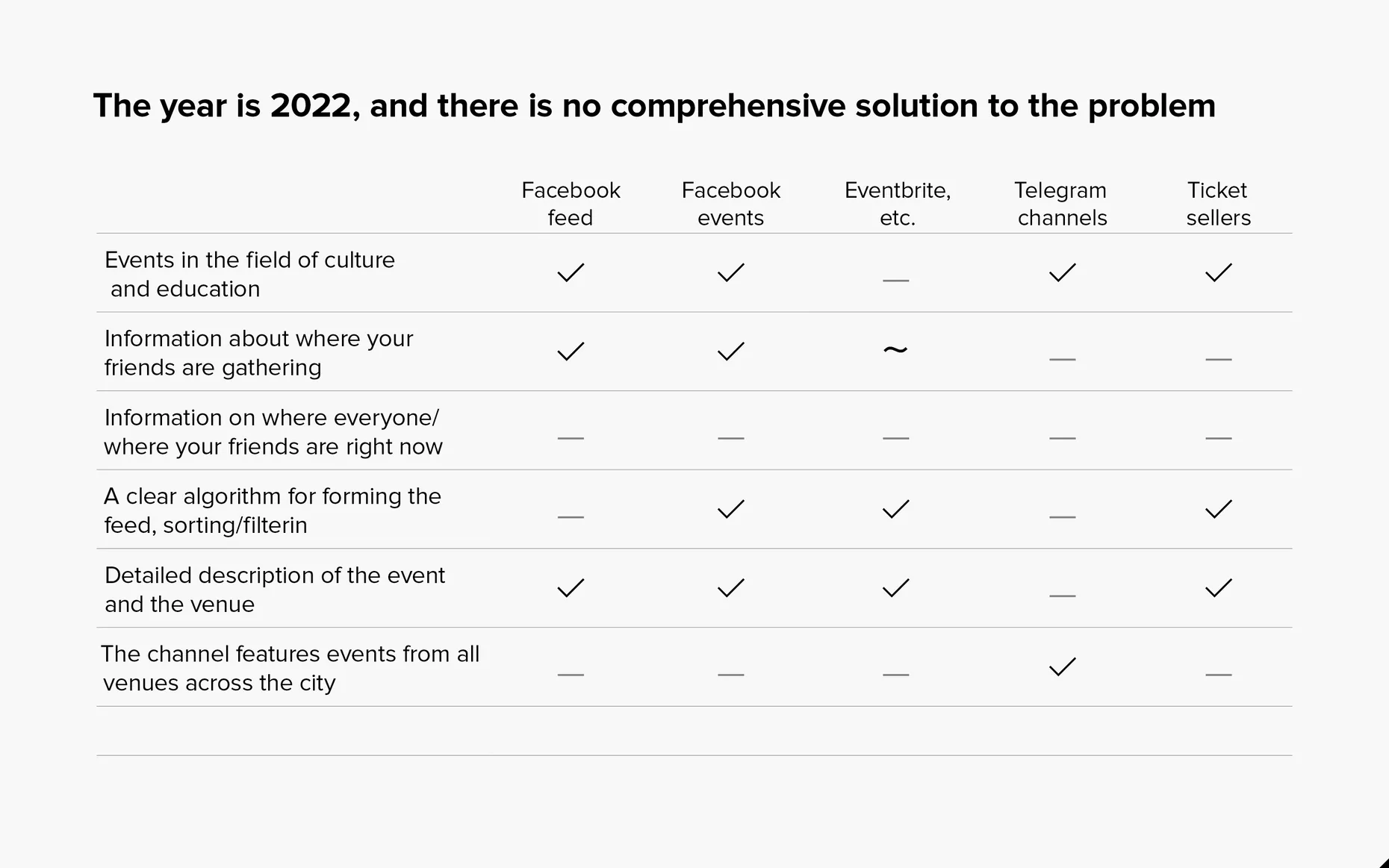
Competitors Overview
Based on competitor analysis, it is evident that there is currently no solution in the entertainment sector that fulfills all the needs of users.
"Most of it is doable — except automatic routing and text analysis. Those are too heavy for now."
Information about where your friends are going is fragmented, which can lead to missing something important.
There is no aggregated information about where your friends are right now anywhere; you have to call or message them personally or in a group chat (but they may not respond).
Sometimes, you miss something important where 'everyone was there'."
Economic Model
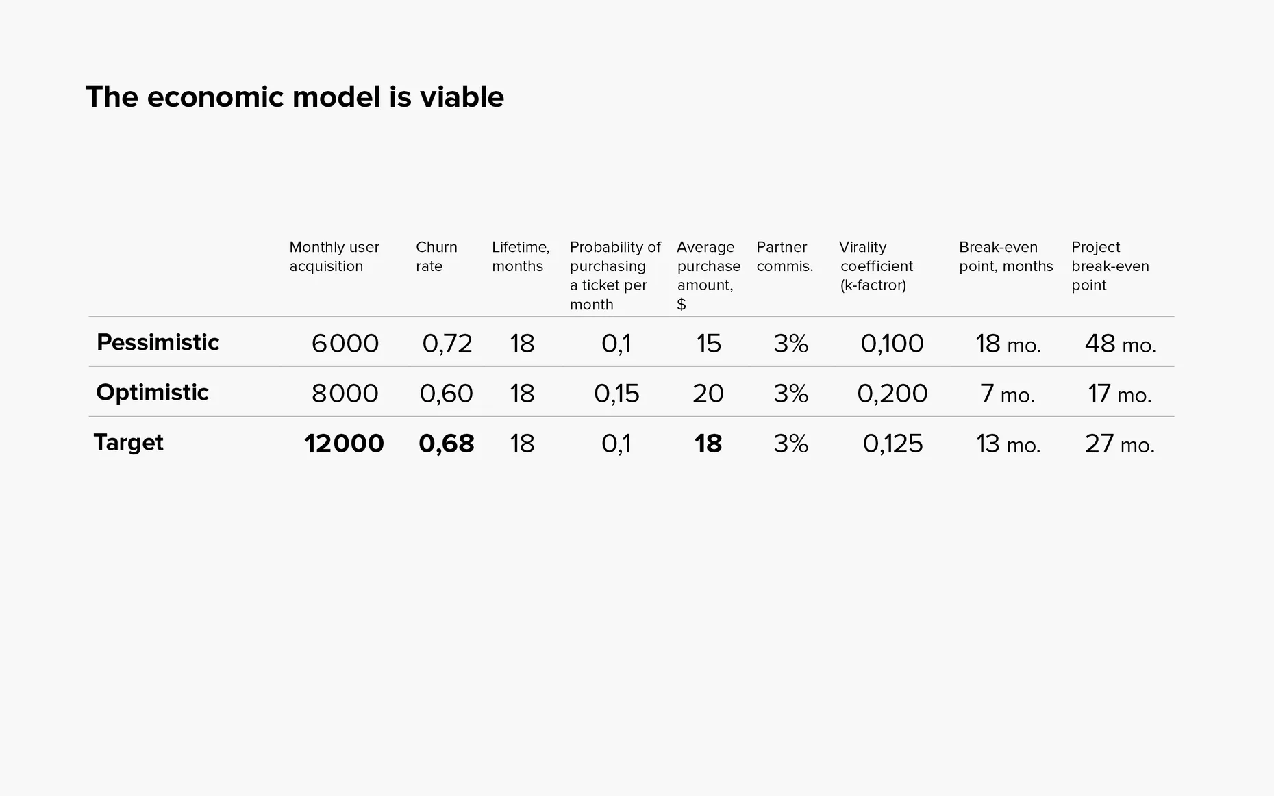
The economic model indicates that, based on the current budget for customer acquisition, the project is projected to reach the break-even point in 13 months and achieve full pay off in 27 months. However, it is important to note that these are calculated estimates, and it is crucial to monitor all key metrics and reassess the economic model after the launch.
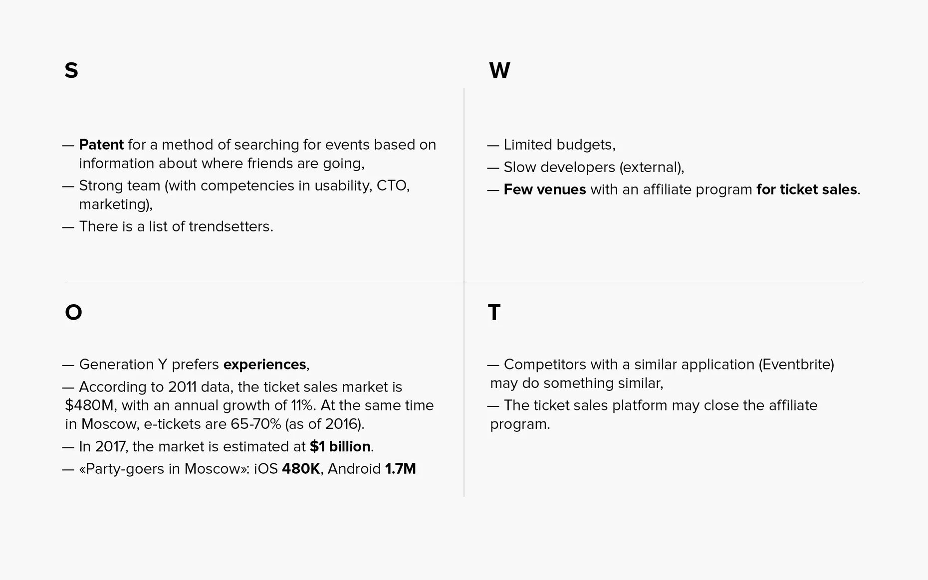
SWOT analysis
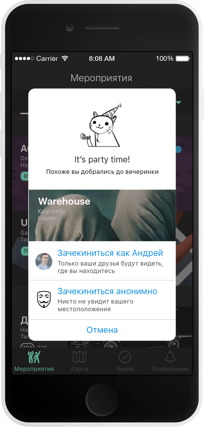
The SWOT analysis revealed that addressing threats and weaknesses can be achieved through funding. Additionally, patenting the event check-in mechanism will give us a distinct advantage, offering users fundamentally new opportunities.
Data Collection
Lonely people, tons of events, no clear way to sync with friends — the gap is hard to ignore. That’s exactly the space we’re stepping into.
61%
of Americans aged 18‑25 say they “constantly feel lonely.”
53%
have just 1–4 close friends, 38% have 5+ — coordination gets messy.
2500+
public events happen in NYC every single month.
$400B
size of the U.S. offline‑events market in 2023.
User Research
I kicked off with ten in‑depth interviews to see whether “FOMO + coordination chaos” was real or just a hunch. Short answer: it’s real.

“Where are my friends right now?” is too much work
Everyone can figure it out, but it means texting five group chats and scrolling stories—so they rarely bother.

No one attends alone
70 % said they’ll skip an event unless at least one friend is in.

Regret is common
Six of ten had missed a great event in the last three months and found out only after seeing photos.

Plans are spontaneous
Most decide same‑day or the night before; long lead times are the exception.
Design Exploration
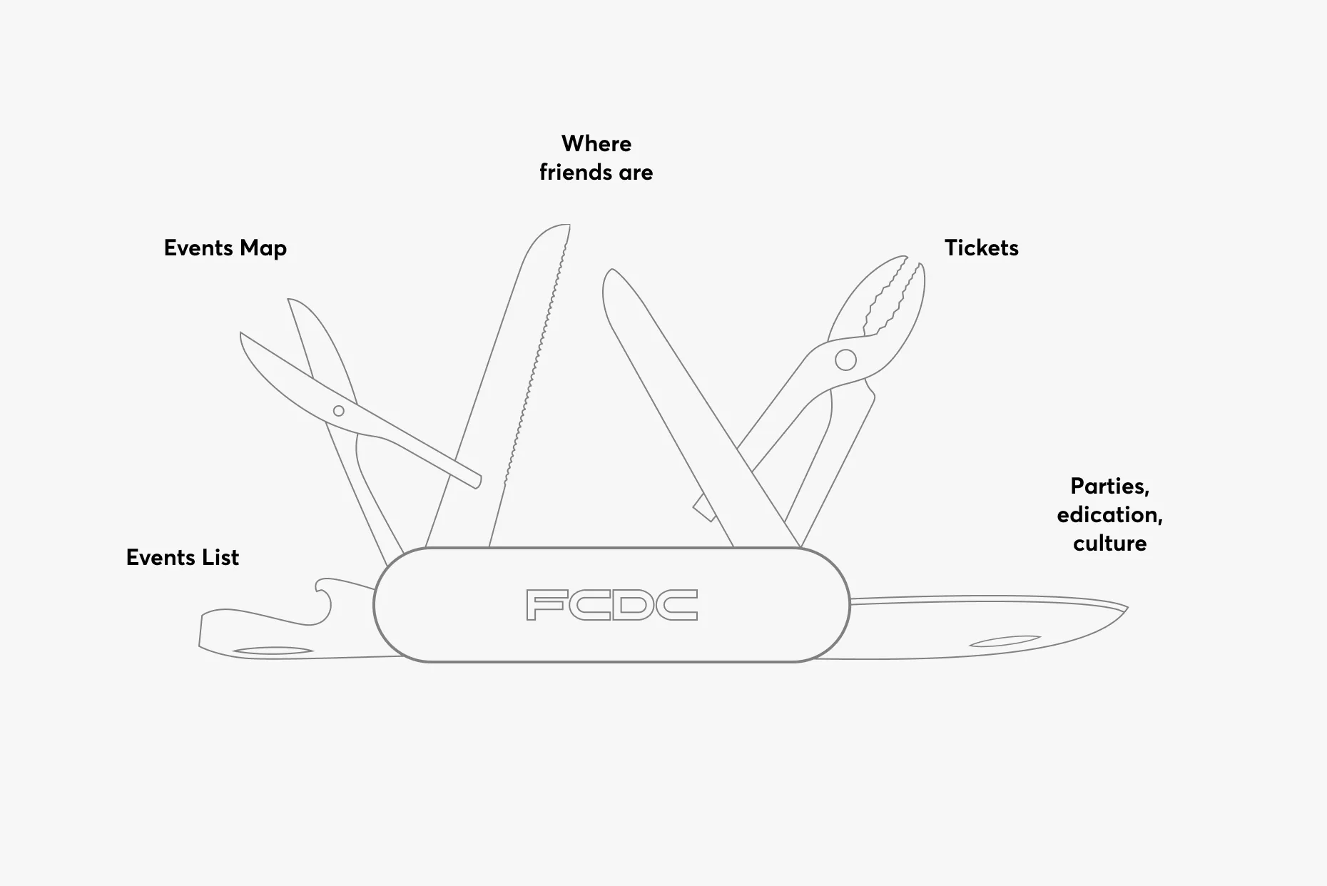
High‑level concept – a Swiss‑Army app for going out
One place to: browse events, see who’s going, buy tickets, and check in on the map. No tab‑hopping, no lost context.
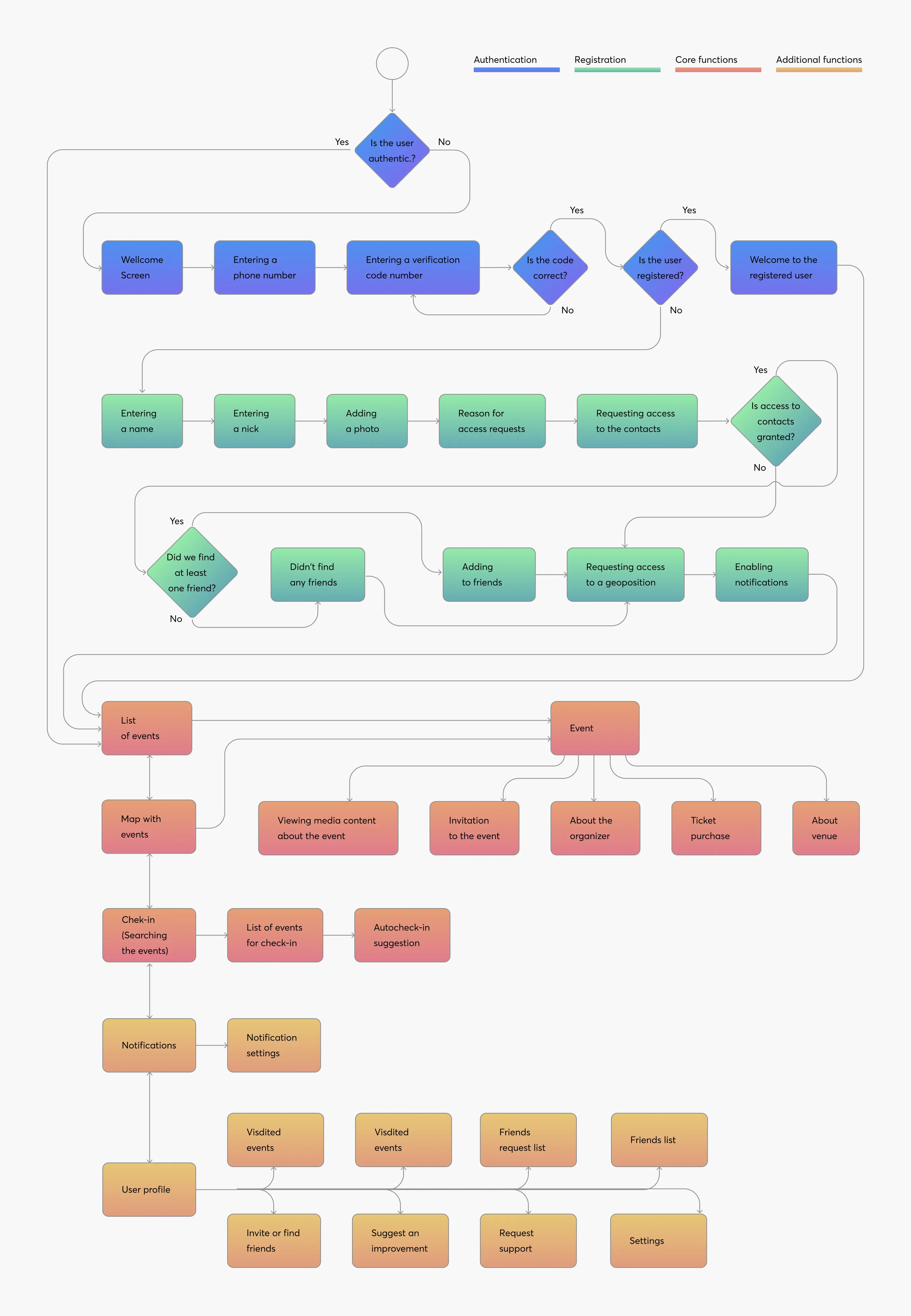
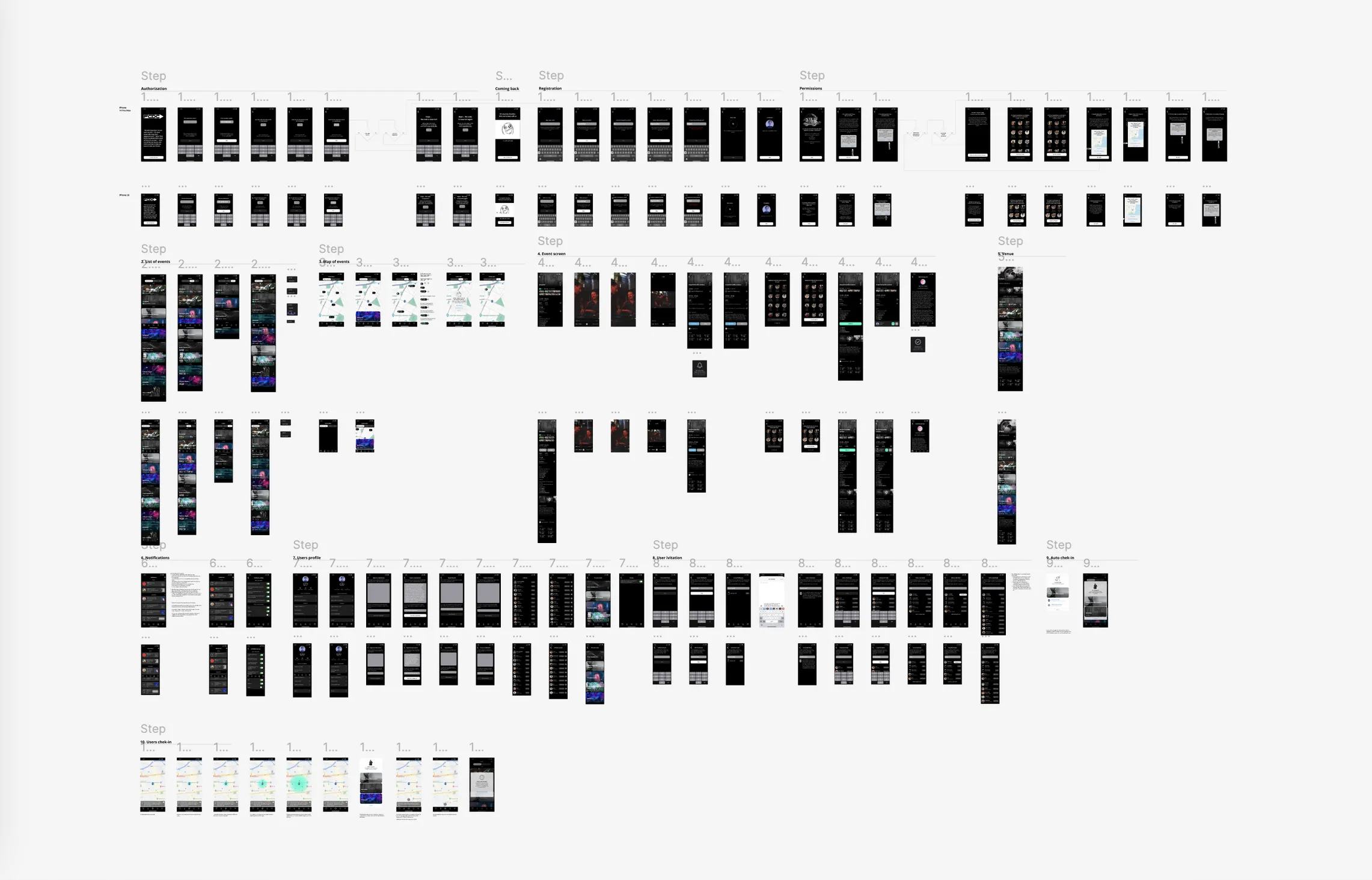
User flow – mapping every fork in the road
From onboarding to check‑in, I traced the green‑path and edge cases, color‑coding auth, core, and nice‑to‑have flows. The map kept scope honest and let engineering size features early.
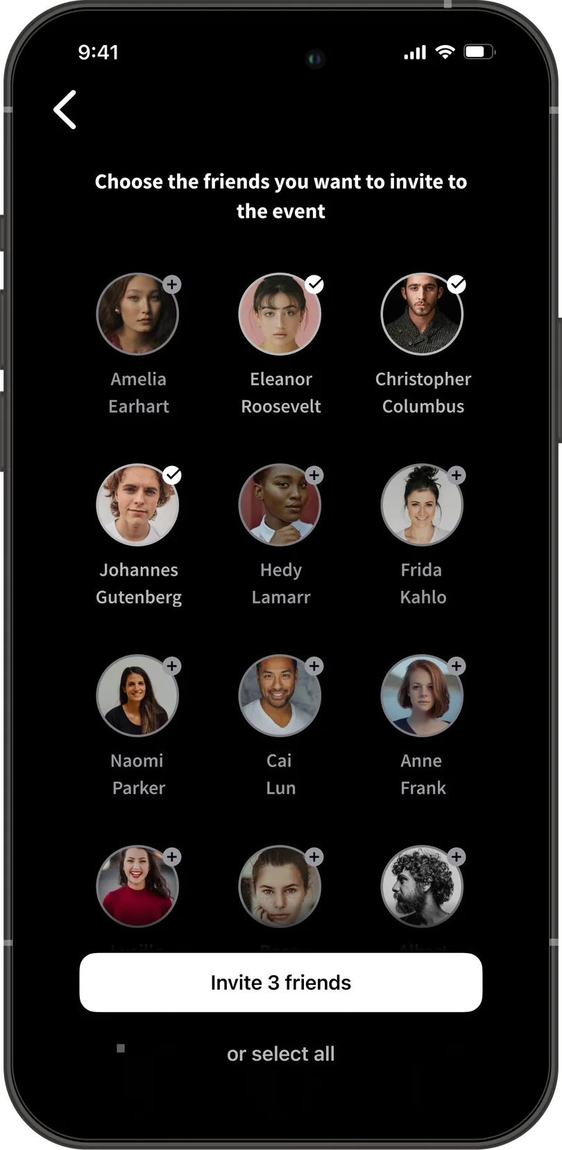
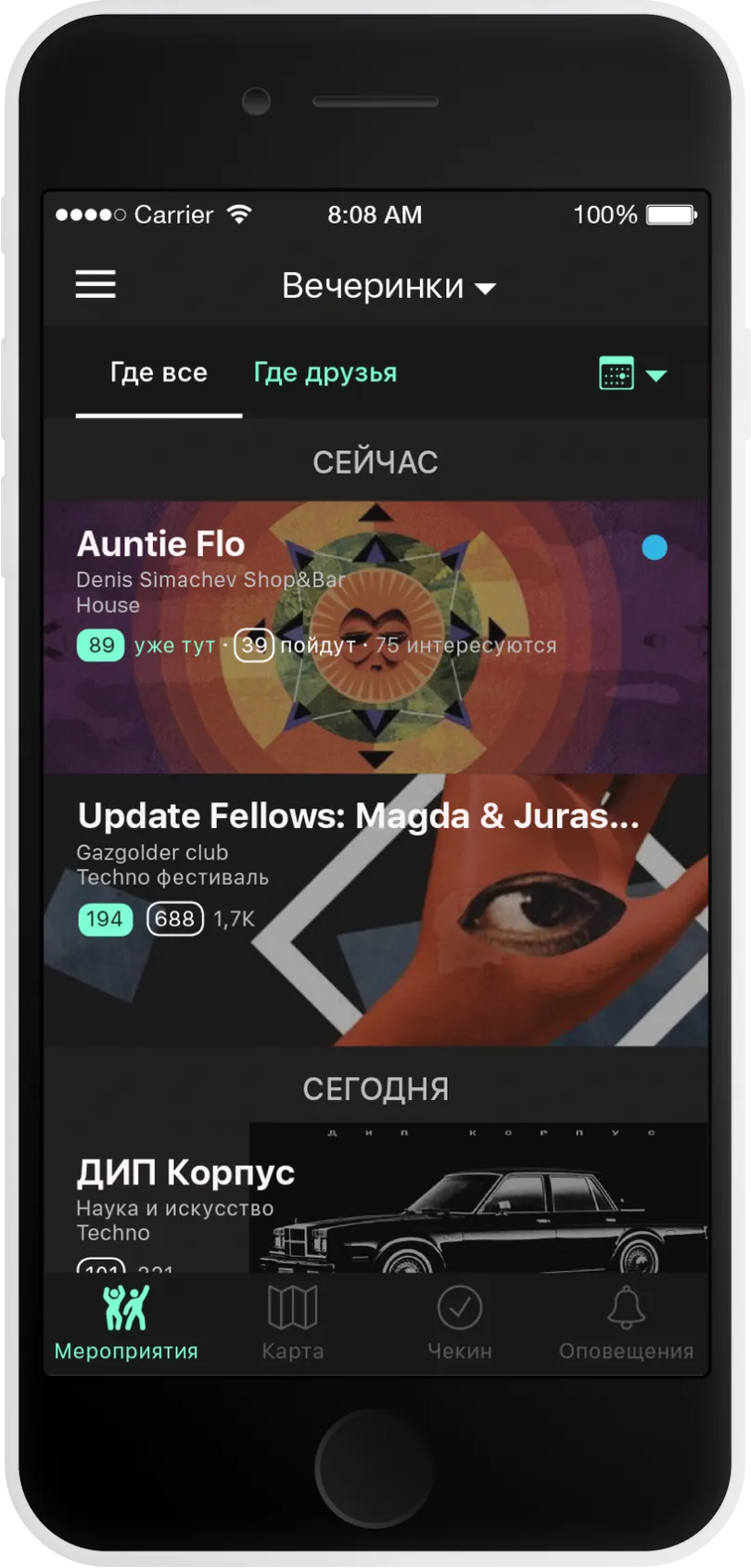
Wireframes – where assumptions meet pixels
Nine key screens covered the MVP: feed, event details, friend map, ticket purchase, and profile. I layered in quick social proof—tiny friend avatars—to nudge attendance without shouting.

User Testing – first look, brutal truths
Five usability sessions, five sharp hits:
- Event cards felt bloated – too many stats competing for attention.
- Iconography unclear – especially capacity vs. popularity.
- Visual overload – “Feels like Times Square.”
- Two menu styles confused – bottom tabs and hamburger.
- Overall look dated – typography and color lacked energy.
Each note rolled straight into a design‑polish backlog.
Feasibility review – reality check with engineering
I walked the mocks through a dev spike; here’s what we trimmed or re‑worked for v1:
- Onboarding needed a real flow (copy + empty states).
- Friend‑request logic too shallow; we specced edge cases.
- Smallest‑device breakpoints missing → added responsive rules.
- In‑app chat was a rabbit hole—parked for post‑launch.
Each note rolled straight into a design‑polish backlog.
Design Refinement
I moved from wireframes to polish in three parallel tracks: design system, scale, and story.
Design System – build once, reuse everywhere.
I started with a lean design system: 8‑pt grid, semantic color tokens, and one type ramp that flexes from 320 px to Pro Max. Componentized cards, buttons, and chips let me iterate without pixel drift.
Scale – smallest and largest screens side‑by‑side
To dodge “works‑on‑my‑Figma” surprises, I designed every flow simultaneously for the tiniest and biggest devices we support. Typographic rhythm and tap targets stay consistent whether you’re on an old SE or the latest iPhone 15 PM.
Story – designing the core loop first.
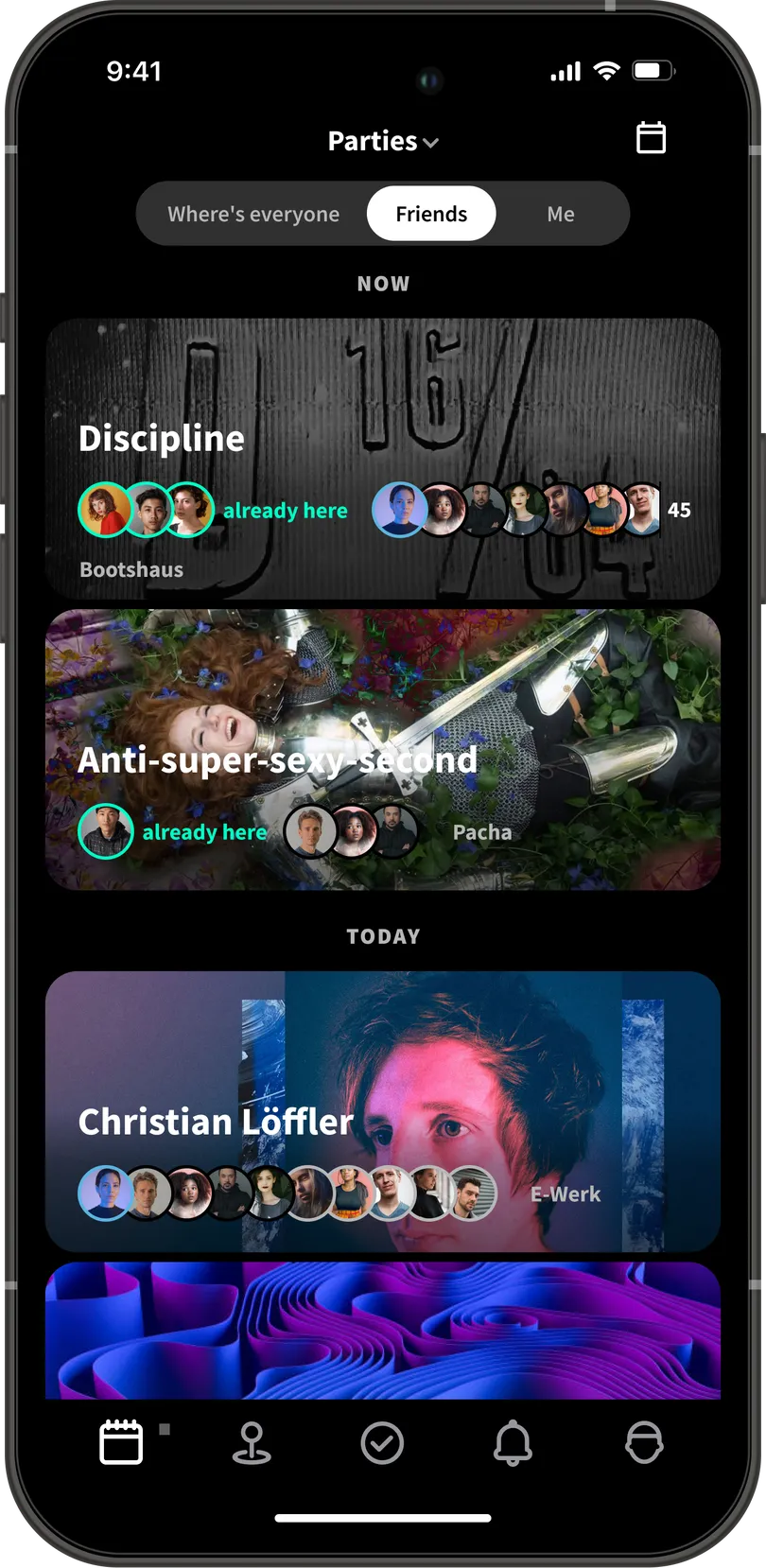
Users spend 80 % of their time in the event feed, so that’s where I sweated the details:
Feed as three lenses
- Where everyone is – popularity heat‑map for early adopters with few friends.
- Where friends are – avatars stack on each card so you instantly see who’s in.
- Where I am – a personal shortlist of bookmarked events.
Sorting events by date / by popularity
Customer development has shown that there are two scenarios for choosing an event: short-term planning — when a user wants to see what to attend on the upcoming weekend, and long-term planning — when a user wants to see what interesting events are happening in the city in the coming month. For the first scenario, sorting by date is suitable; for the second scenario, sorting by popularity is more appropriate.
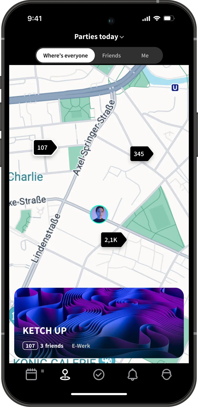
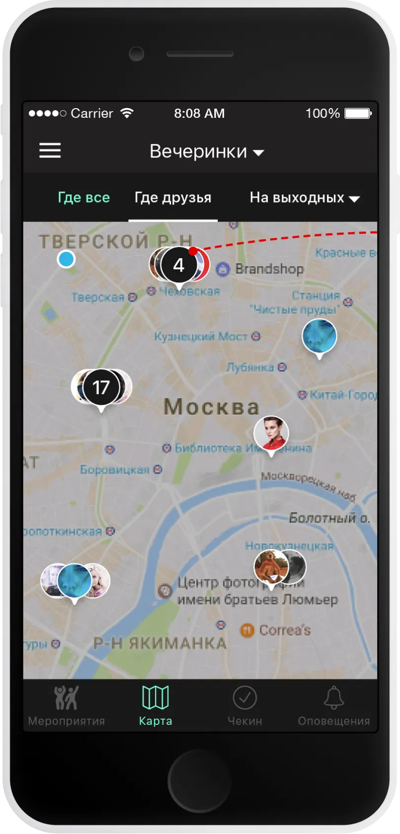
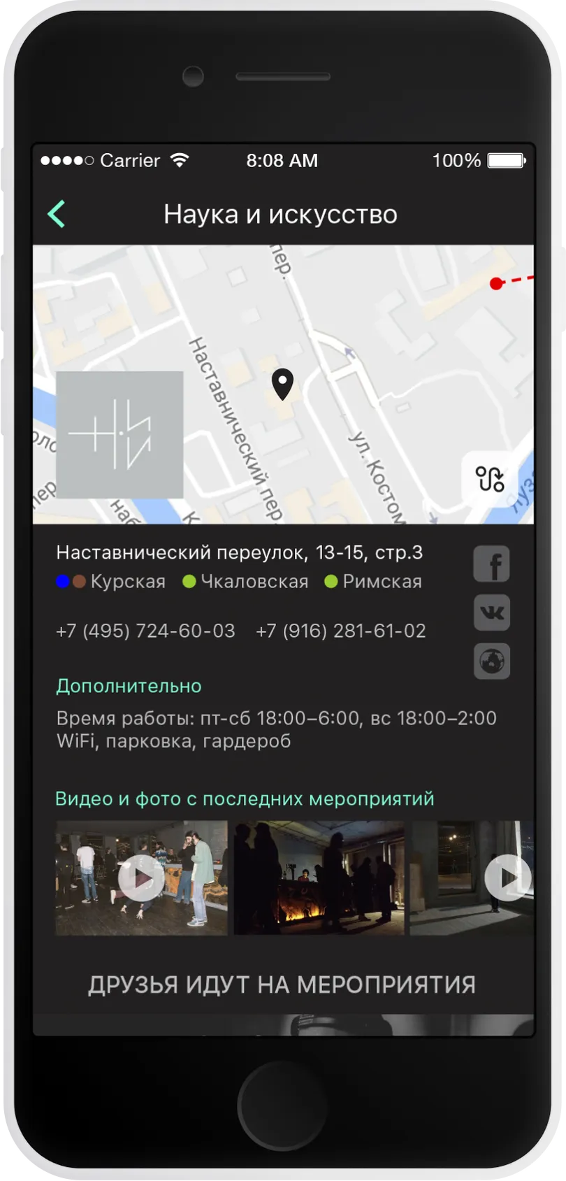
Map of Events
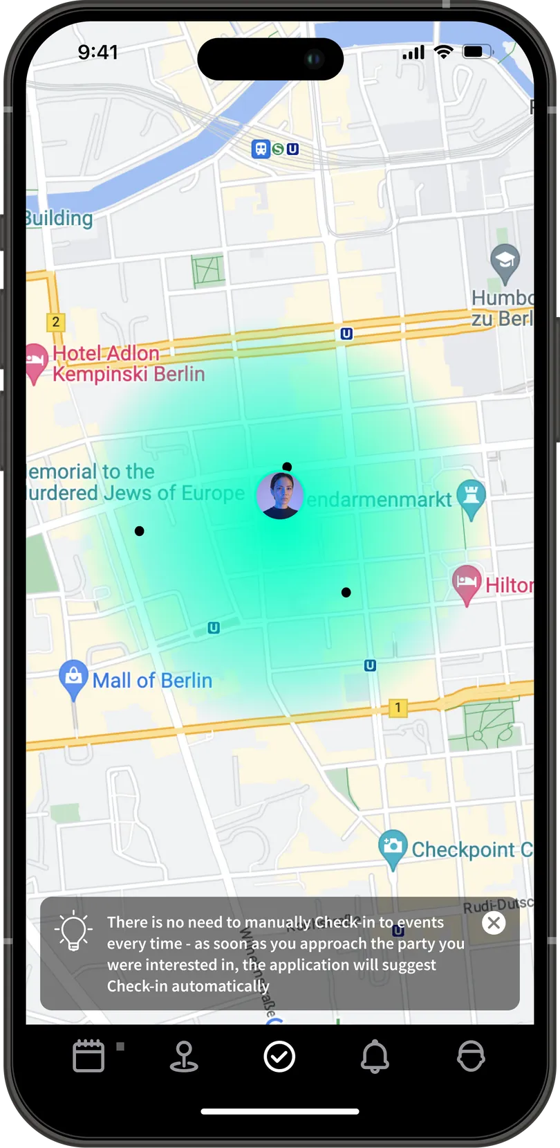
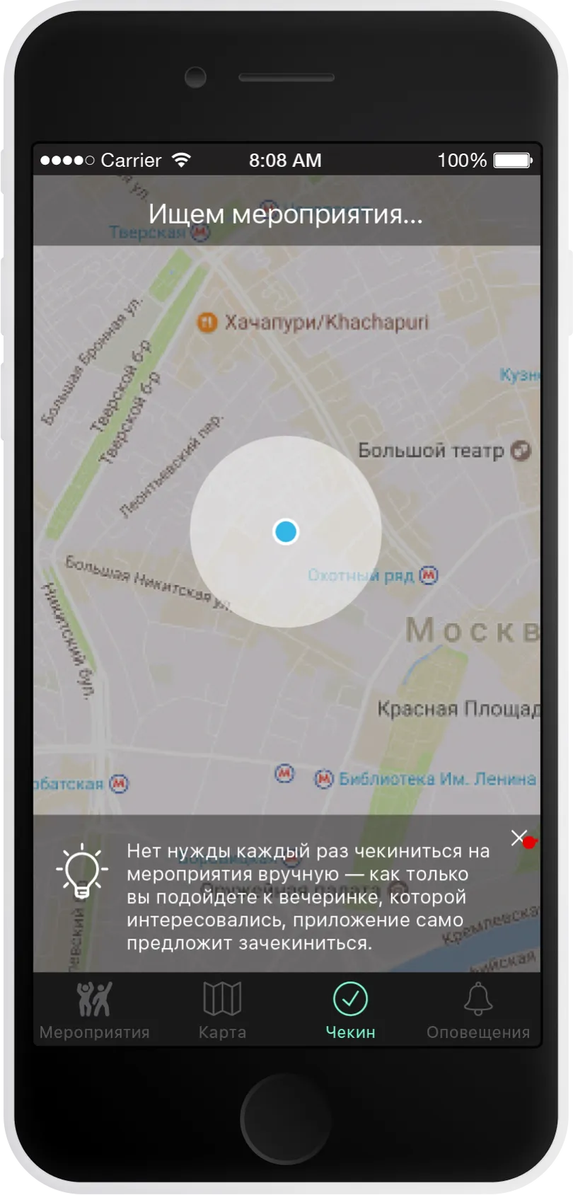
Research has shown that attending an event can sometimes be a spontaneous decision. Users may want to go somewhere immediately and it is important for them to see what interesting events are happening nearby. This is where the map becomes useful.
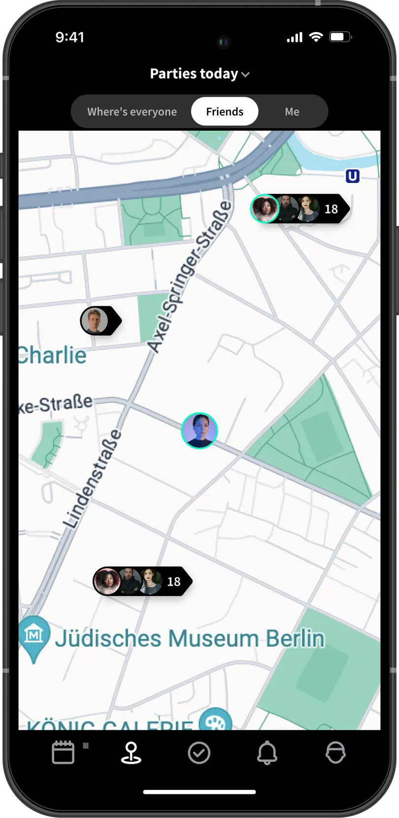
Similar to the list, events on the map are grouped based on the location of everyone, their friends, and themselves.
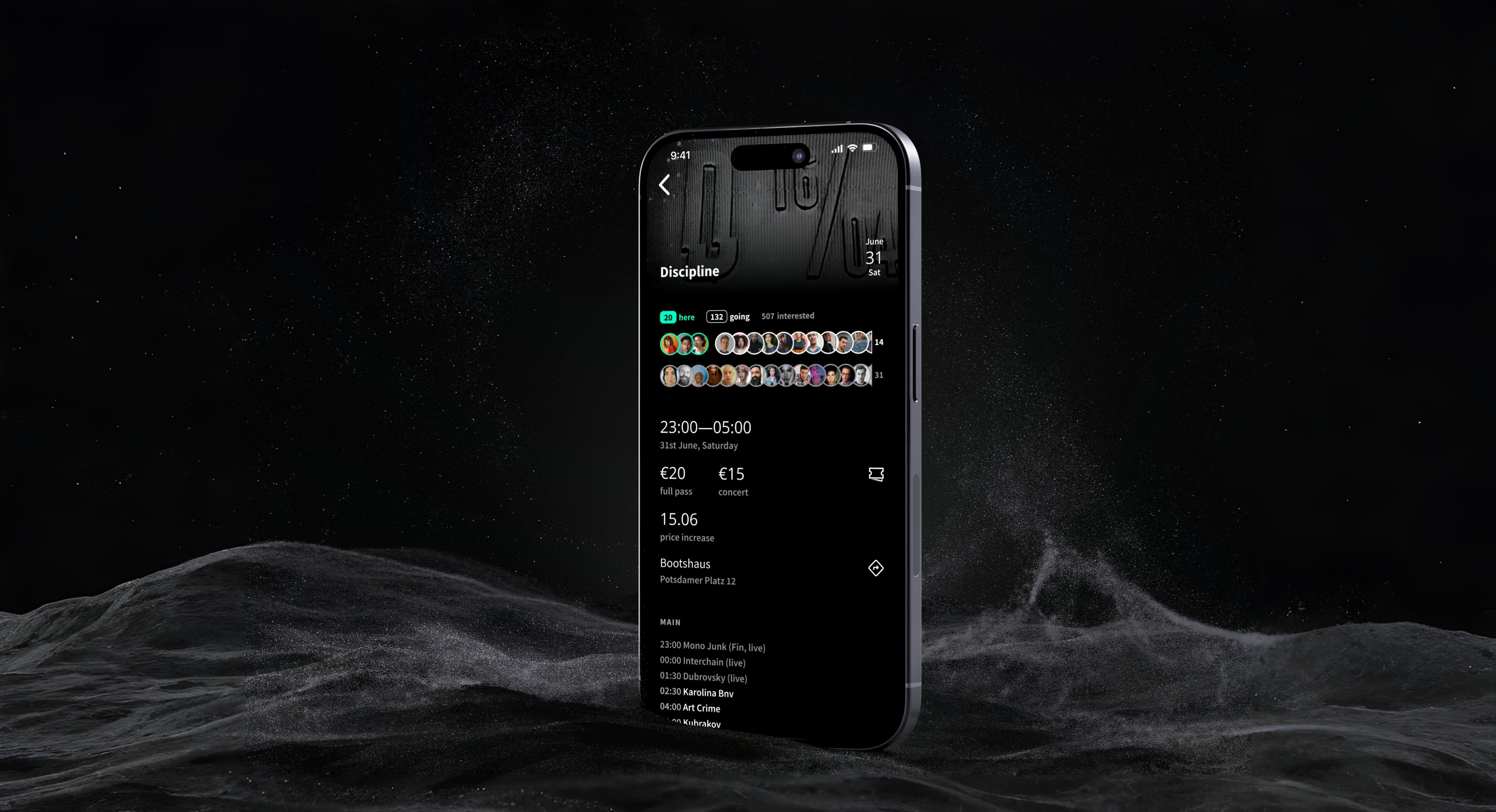
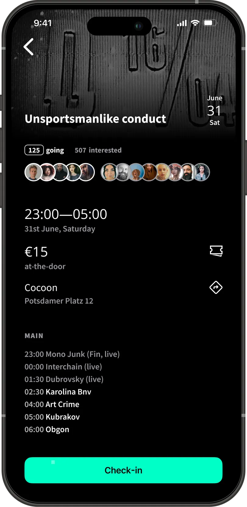
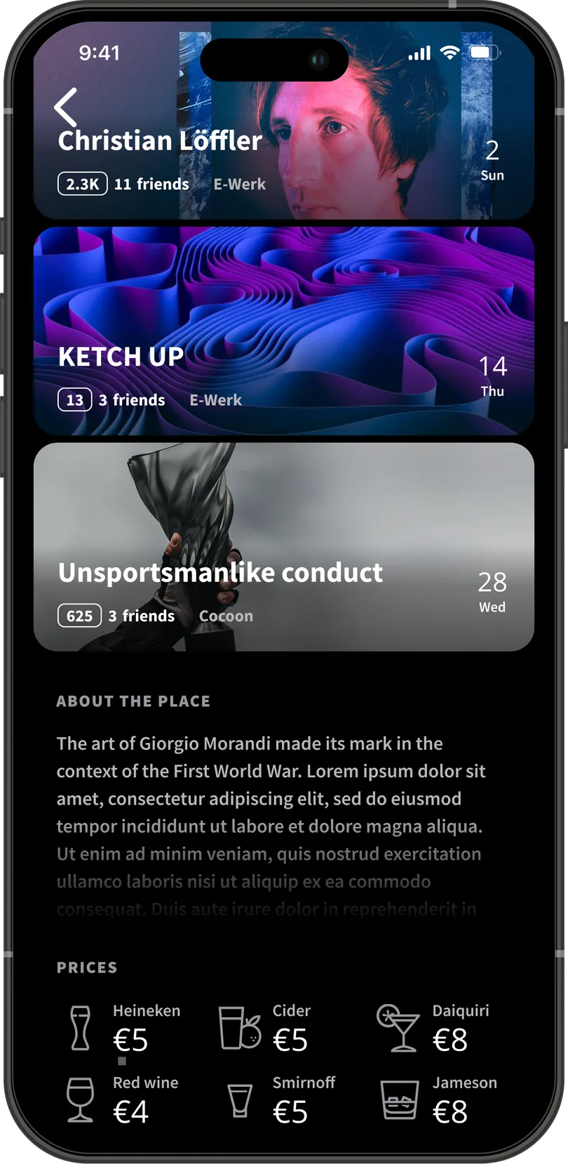
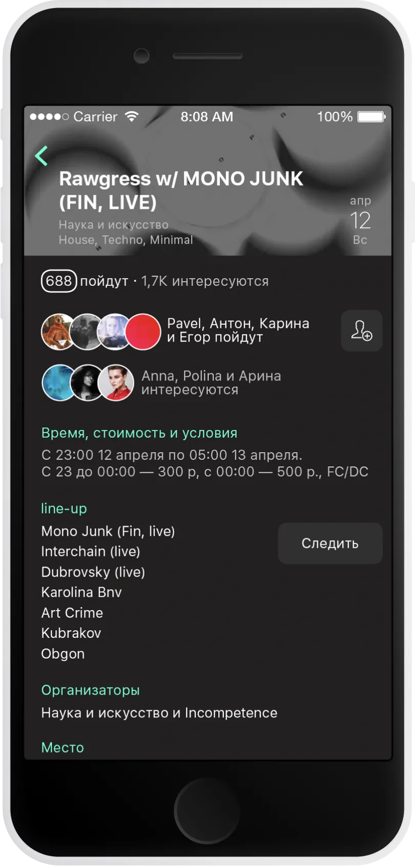
Event screen
The event screen is the second most important screen of the application. Here, the user makes their final decision about attending an event
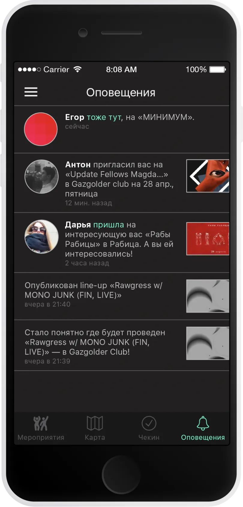
A block with the avatars of the user's friends clearly and quickly indicates who has already arrived at the event and who is planning to go.
And finally — here’s the fully interactive prototype: