challange
Create a visually rich and seamless online furniture shopping experience.
overview & problem
Online kitchen shopping struggles because customers can't visualize colors, dimensions, or textures. Unlike familiar products, furniture requires a tactile experience, limiting online sales. A new platform aims to replicate the offline shopping experience digitally, making selection and purchase as intuitive and immersive as in a physical store.
role & team
Role
- UX/UI Design
- 3D-visualization Direction
- Overseeing product development
Team
- 3D Designer
- Developers
result
+47%
in customer engagement compared to the previous website.
+16%
conversion rate due to an intuitive configurator and interactive product pages.
Process
Research
Problem
It's hard to imagine a future kitchen in your mind. People easily buy things online that they are familiar with, but they face serious difficulties when it comes to furniture, and especially kitchens. They want to see the colors in person, feel the dimensions, experience the texture. That's why online kitchen sales are very low.
Solution
Maximally transfer the offline shopping experience to online
Competitors Analysys
Current solutions are either too complex for novice users, like kitchen planners, or too simple, like product catalogs. There is a lack of an intermediate solution.
Data Collection
To better understand those who buy kitchens, their needs and challenges, let’s gather some data.
<1%
the average conversion rate from visitor to kitchen buyer on the company's current website.
$2400
is the average cost of a purchased kitchen.
46
of working hours were spent in transit, not fixing problems.
Design Exploration
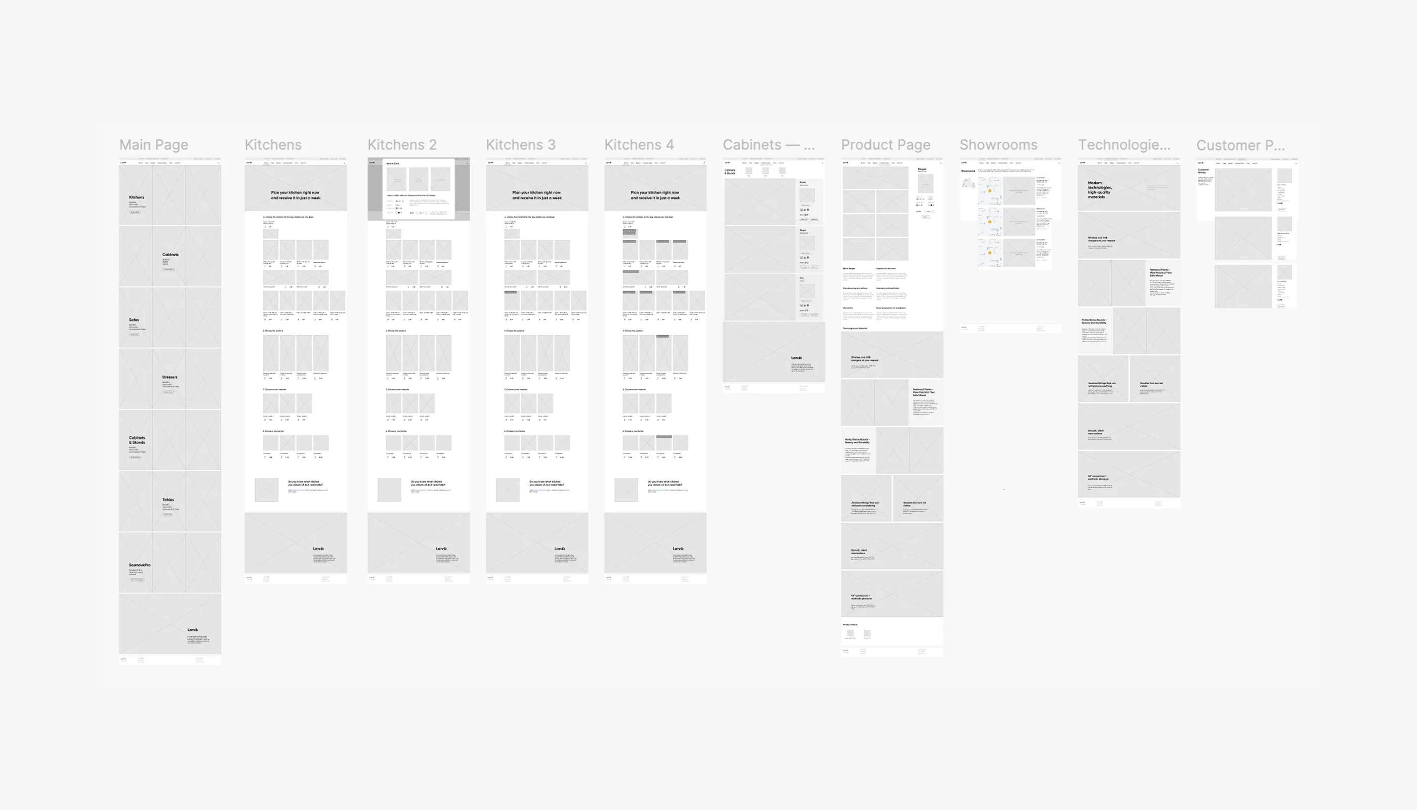
Wireframes
User Testing
- Overall, everything is clear, but to make a final assessment, it's necessary to see the design.
- It seems that there are too many pictures.
Feasibility Review
Before moving into detailed design, I shared my high-level concepts with the engineering team to align on technical feasibility.
"Everything is quite feasible, but one must be prepared for the need of a large number of high-quality renders of each furniture item. In all colors, angles, and with all options."
— Engineering Team
Received approval from both engineers and business - we proceed to work on the design.
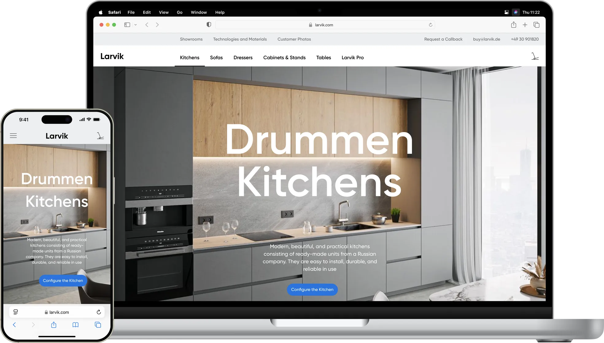
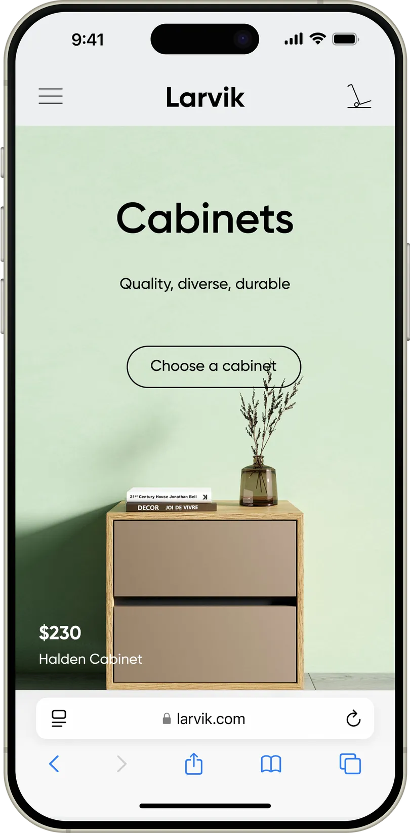
- Designing two versions right away: for mobile and desktop.
- Focusing on the kitchen designer.
- Searching for the best 3D visualizer.
Inspirations
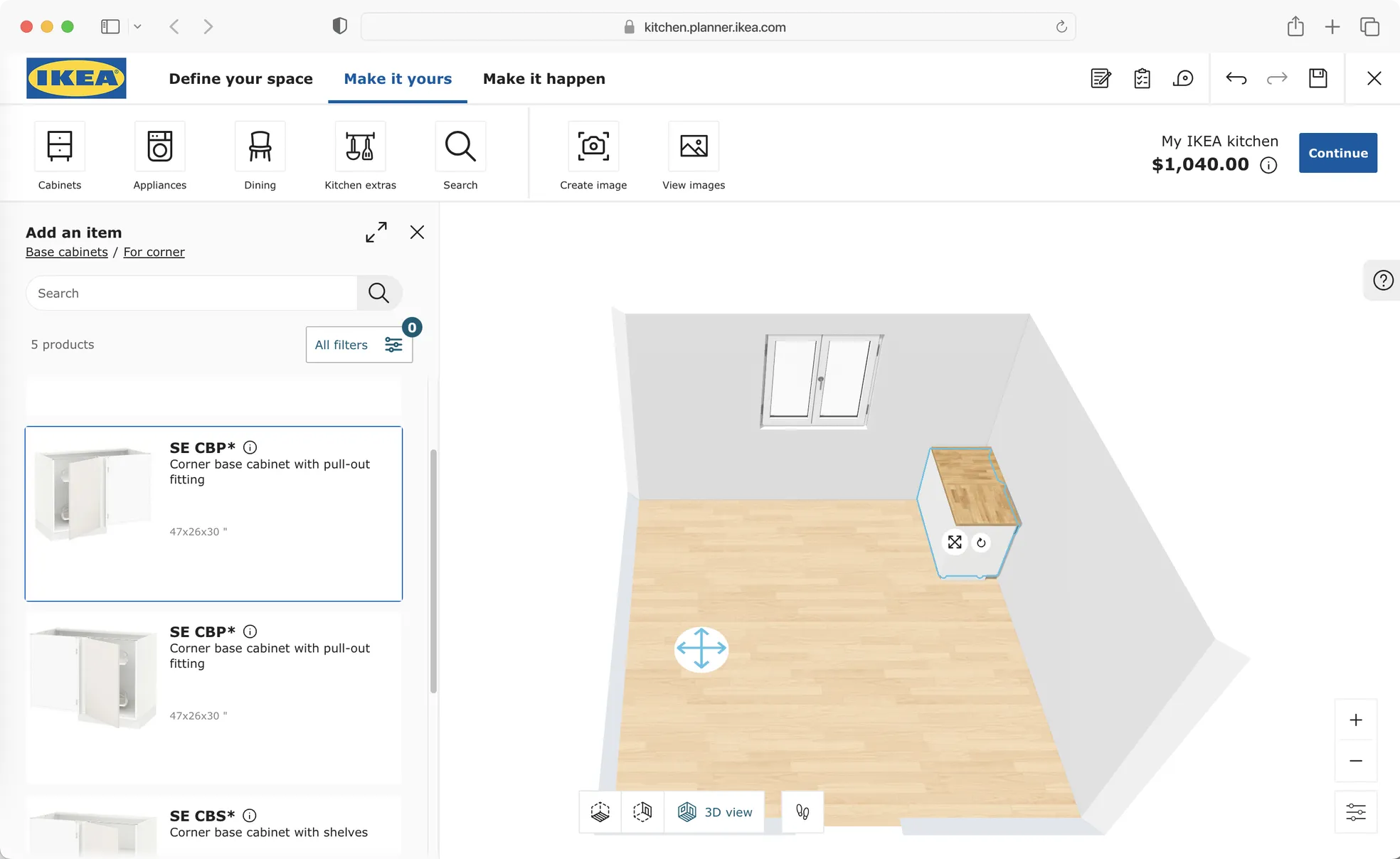
Given that Larvik stakes on the use of modern technology in furniture, as well as a balance between the quality of materials and affordable prices, IKEA™, a recognized world leader in creating practical furniture, and Apple™, a leader in the field of innovation and modern technology, were taken as references.
IKEA's style is one of the best representatives of Scandinavian design, which includes simplicity, functionality, succinctness, and bright colors. The IKEA website is characterized by strict layout, straight lines, sans-serif fonts, colorful photographs of furniture in the interior, allowing consumers to visualize how furniture might look in their own homes, as well as a large number of interactive elements that allow website visitors to understand all the features and advantages of their furniture.
Apple, on the other hand, is known for its unique visual style characterized by minimalism, quality, innovation, and simplicity. The Apple website features images of products perfected to an ideal, strict yet innovative layout, strict typography, predominantly white and black background colors to maximize the emphasis on product images, clear navigation, and interactivity.
Colors
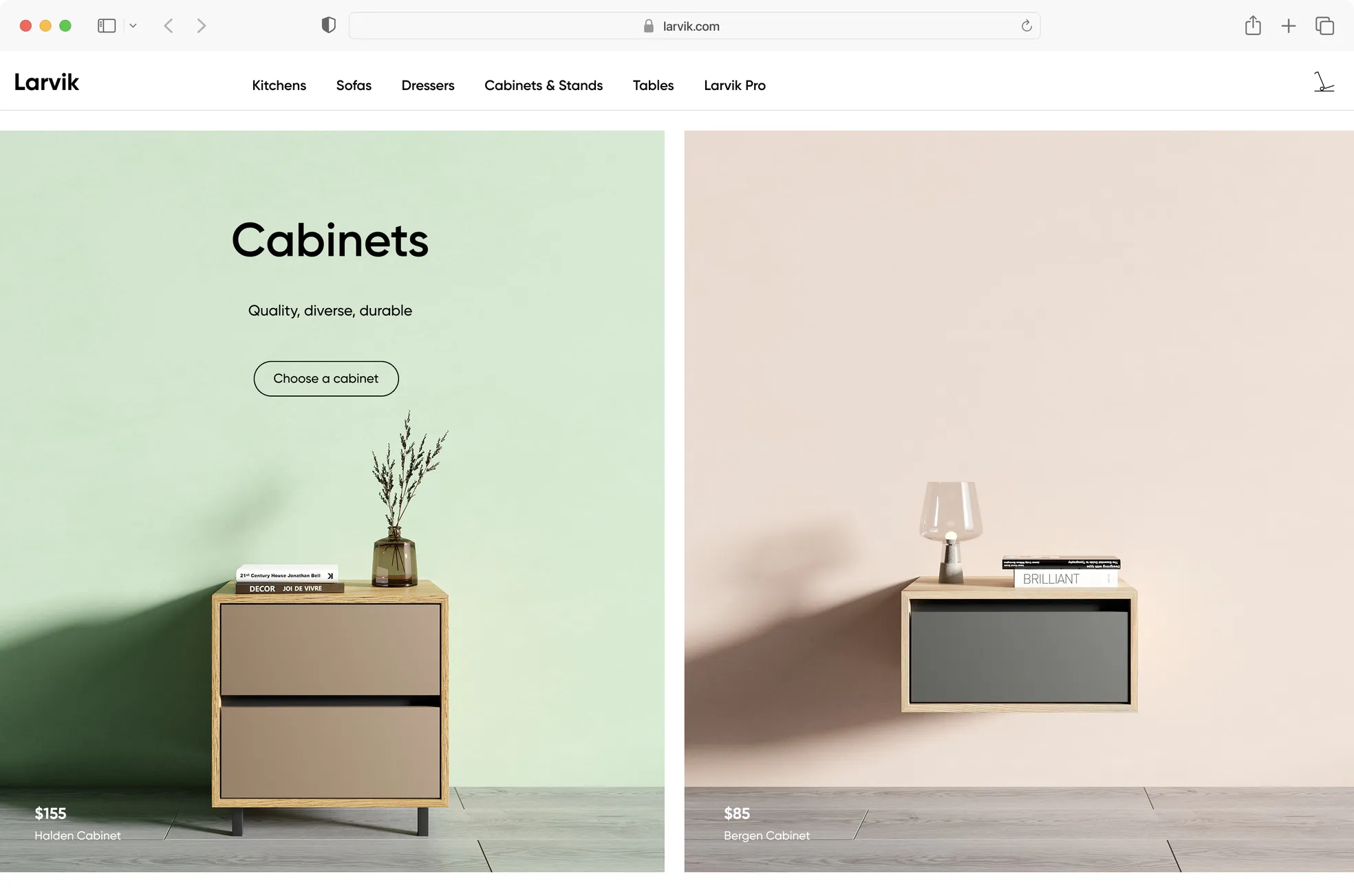
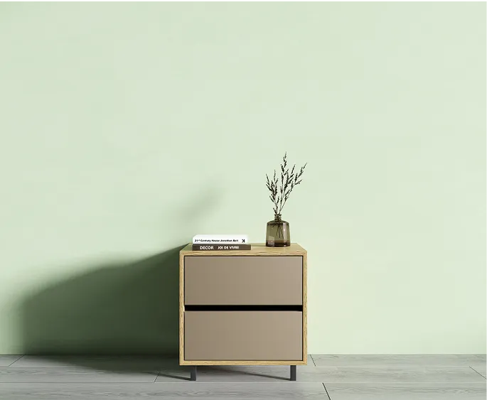
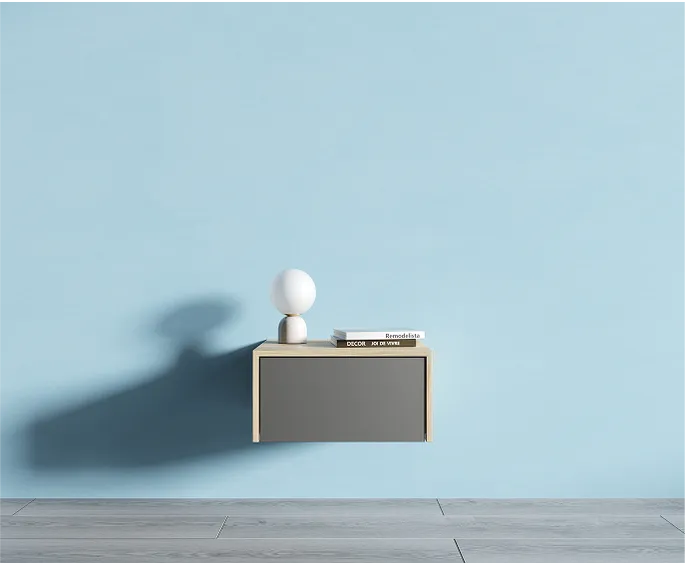
For the main background, we take white - it makes the design cleaner and allows you to maximize the focus on the company's products. We build the color palette on the three pillars of the world of colors - RGB, but we take their pastel versions - light green, soft blue, and peach. The three basic colors make the design of the pages not boring, but at the same time not fanciful.
Since materials imitating natural stone are often used in the decoration of residential premises, we take gray and all its shades as the fourth color.
Typography
To convey a sense of reliability, succinctness, but at the same time modernity and practicality, a grotesque font with a strict drawing is best suited. Gilroy is a perfect font for this situation - simple, graphic, strict. Its semi-bold drawing in headlines gives the statement weight and solidity, and interesting details, like the diagonal slants of the lowercase 't' or the perfectly round lowercase 'o', reflect attention to detail.
Graphical Elements and Textures
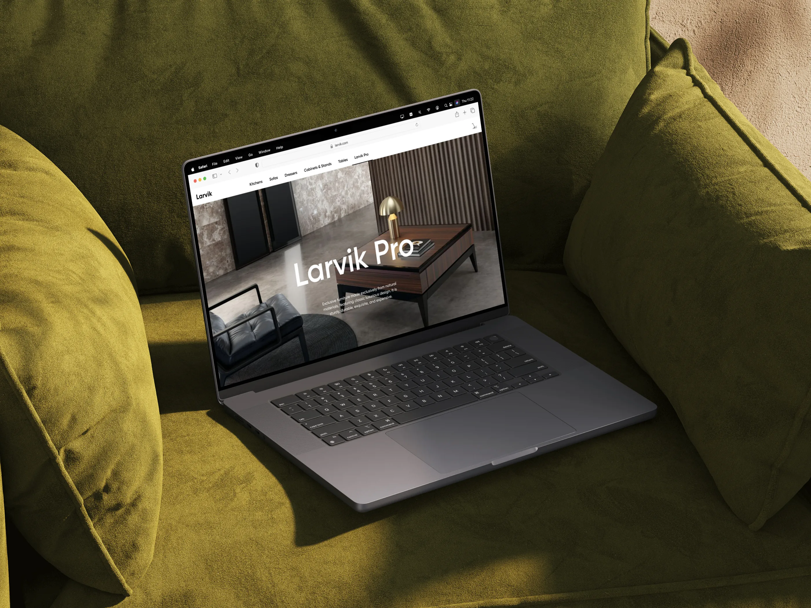
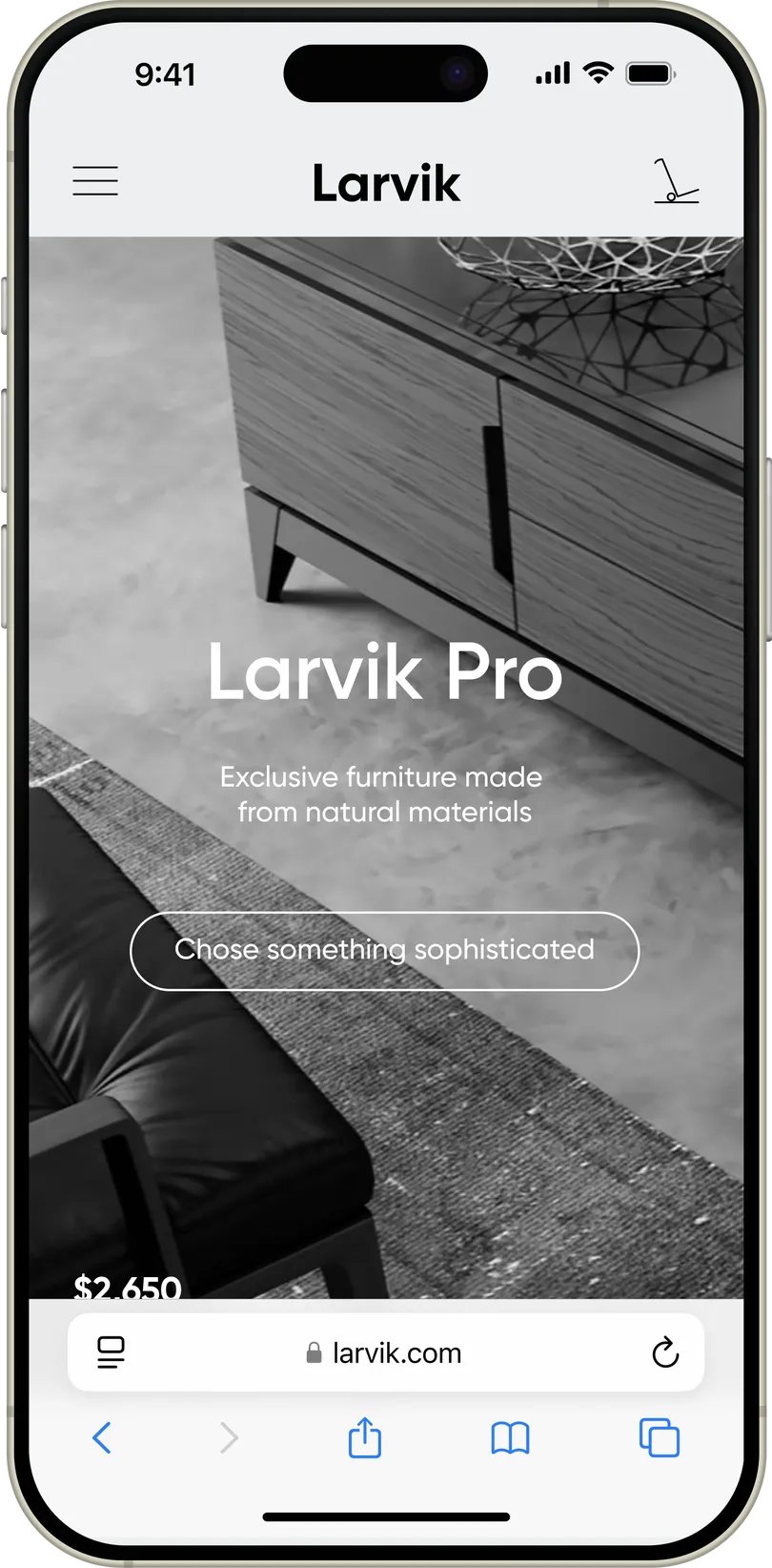
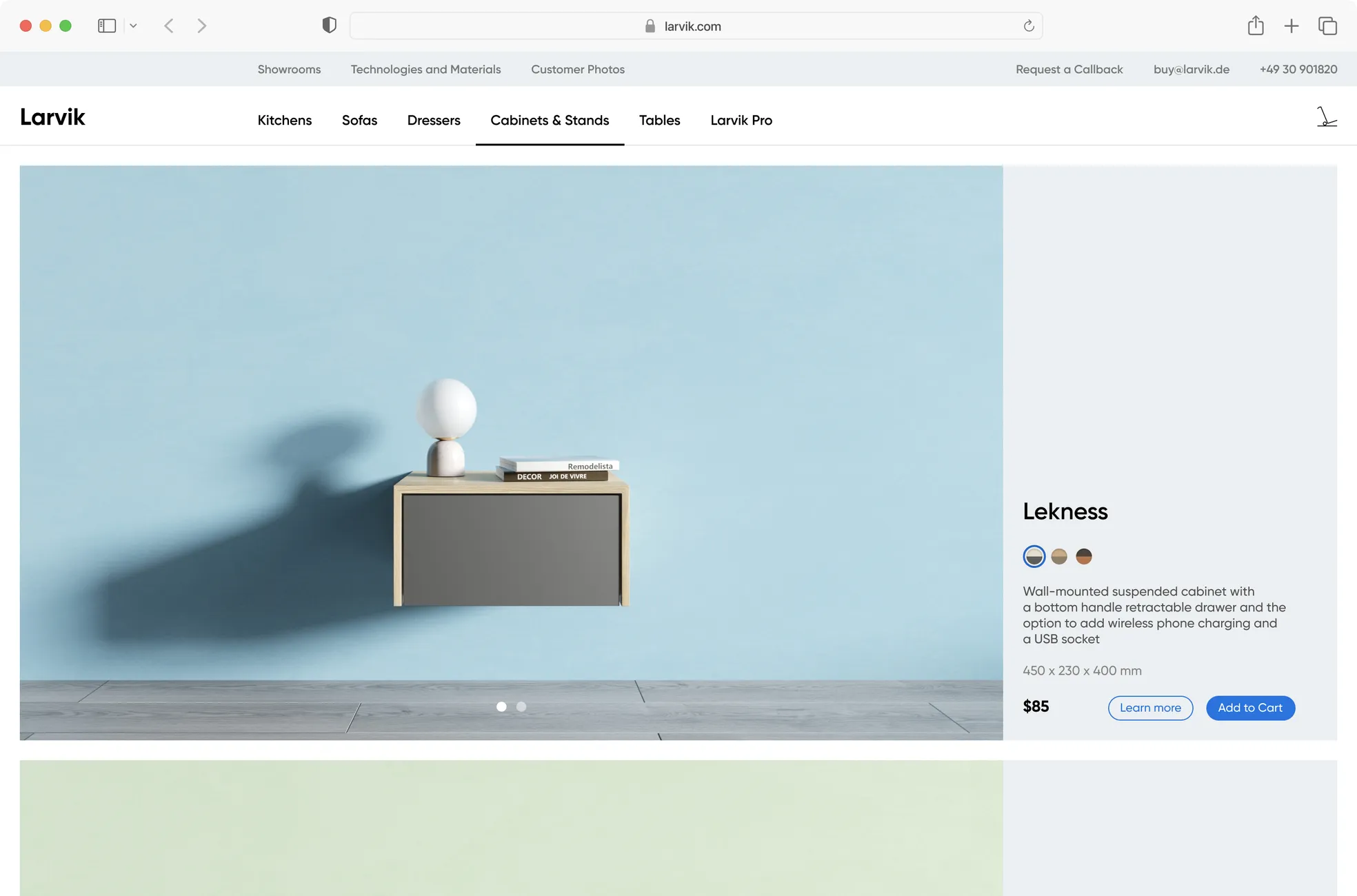
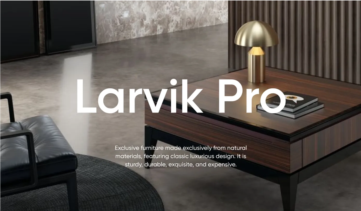
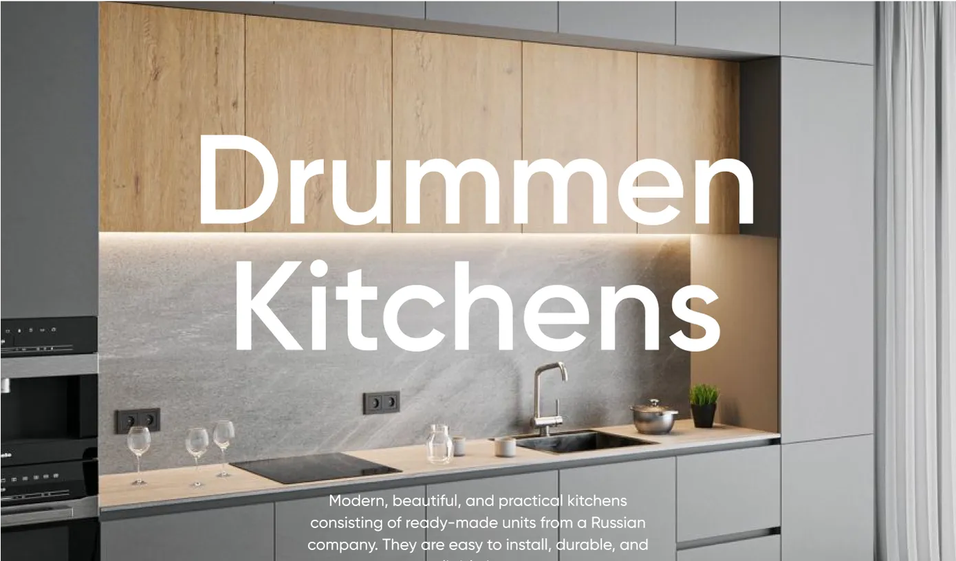
Larvik has two product lines — affordable for the mass consumers, with an excellent price/quality ratio, and the exclusive Larvik Pro line, in which only natural finishing materials are used.
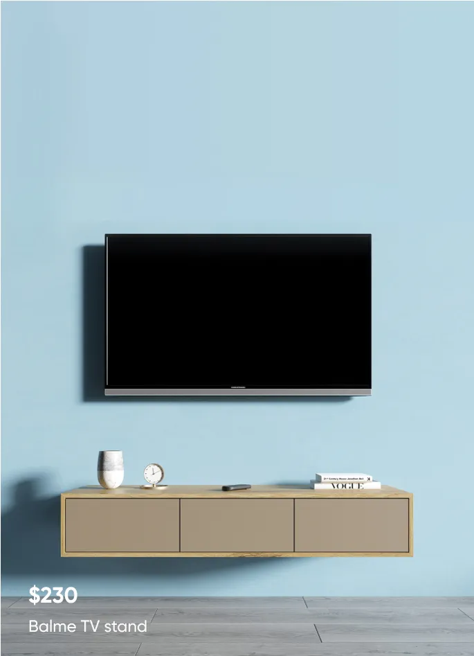
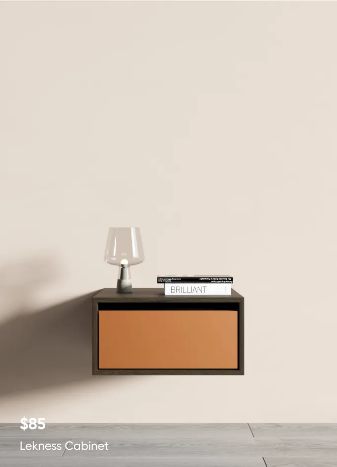
For displaying and promoting products from the affordable line, a monotonous or gradient colored background with a photo or render of the object in the foreground is used. This allows to focus on the product while providing a wide variability.
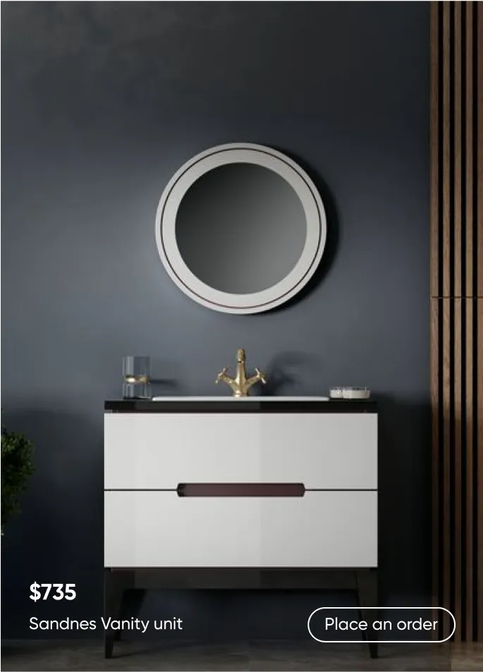
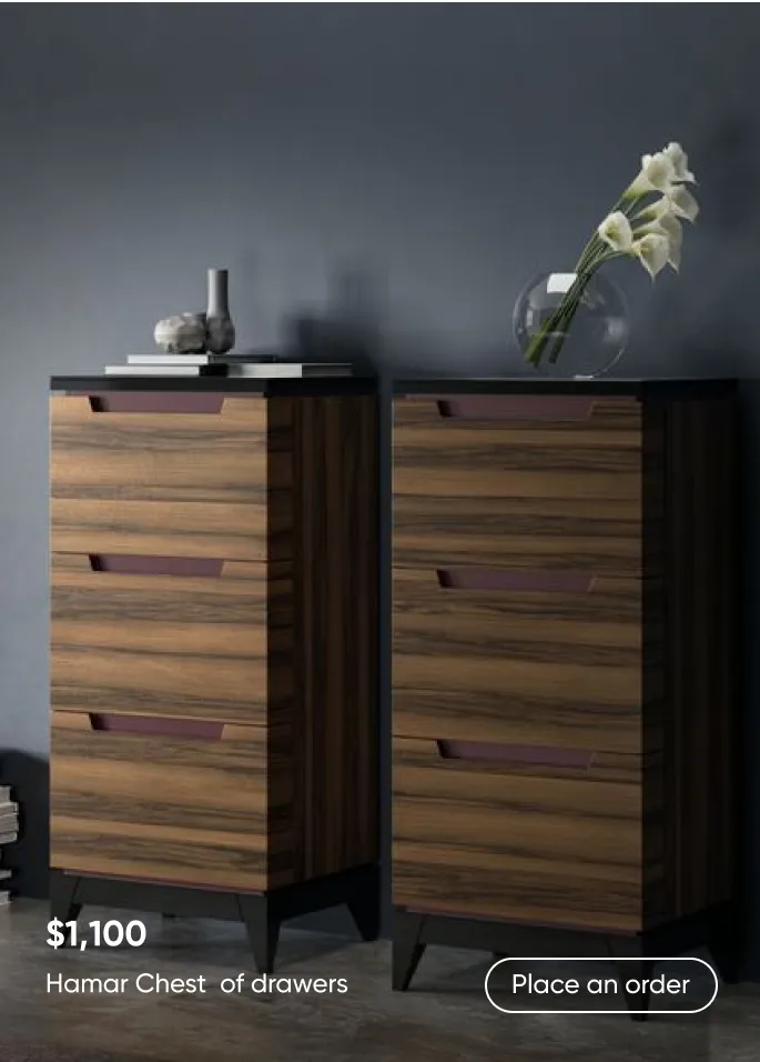
For displaying products in the Larvik Pro category, high-quality photos or renders in expensive designer interiors are used. This underlines the exclusivity of Larvik Pro furniture.
Detailed mockups
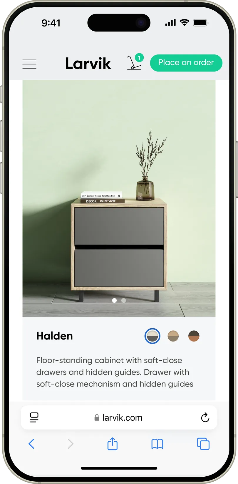
Product Page
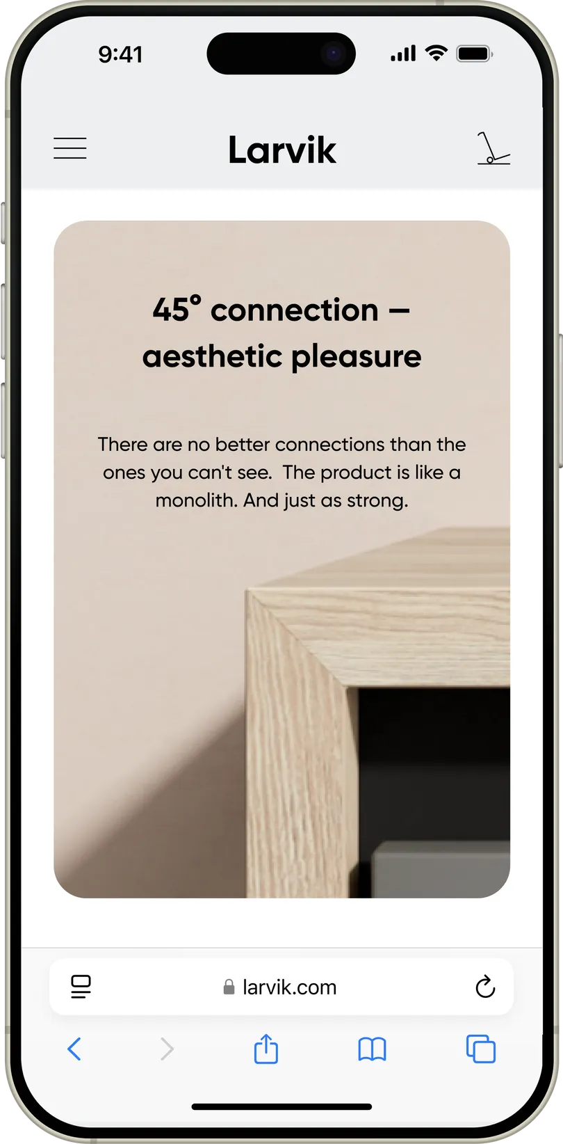
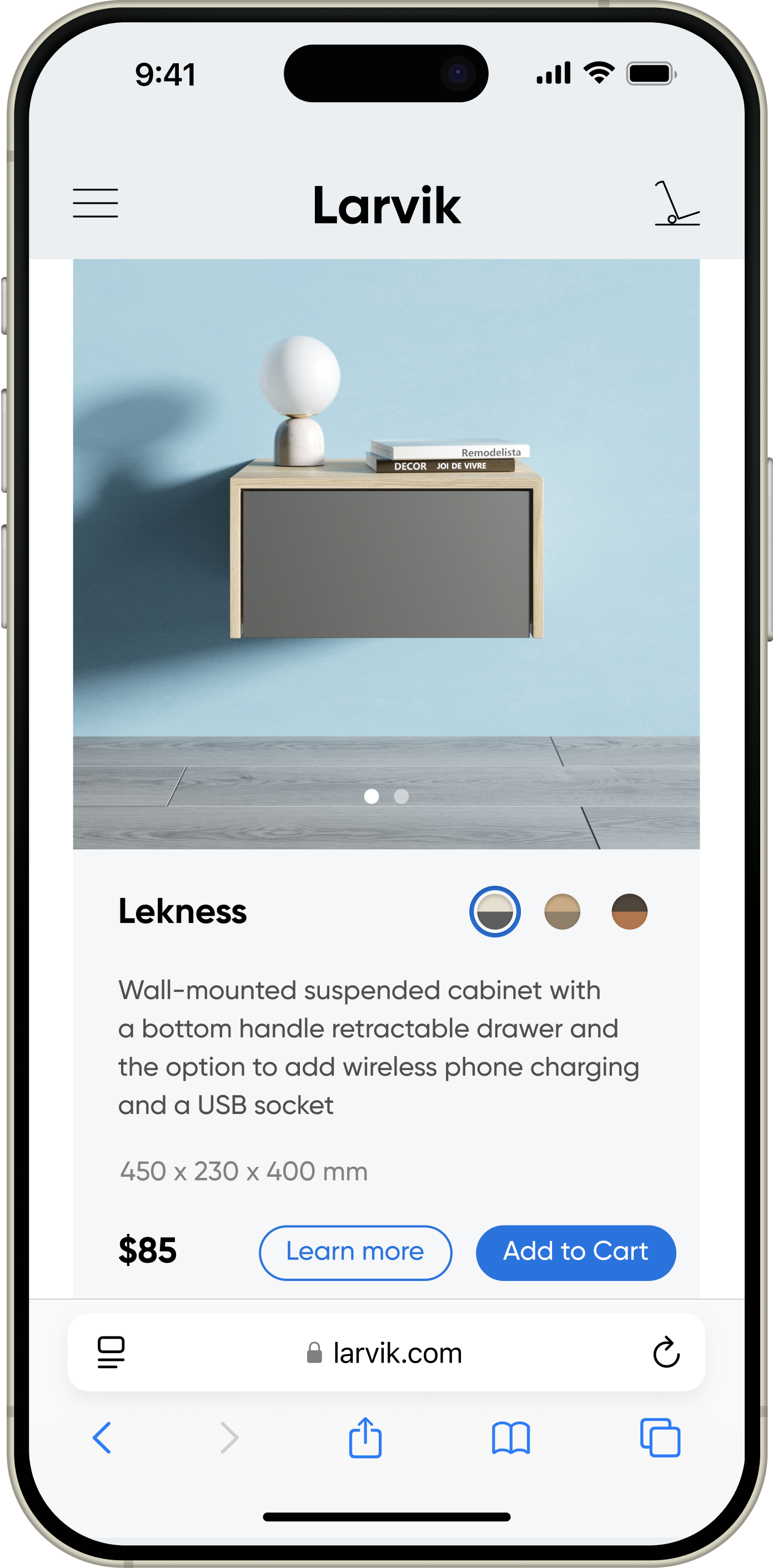
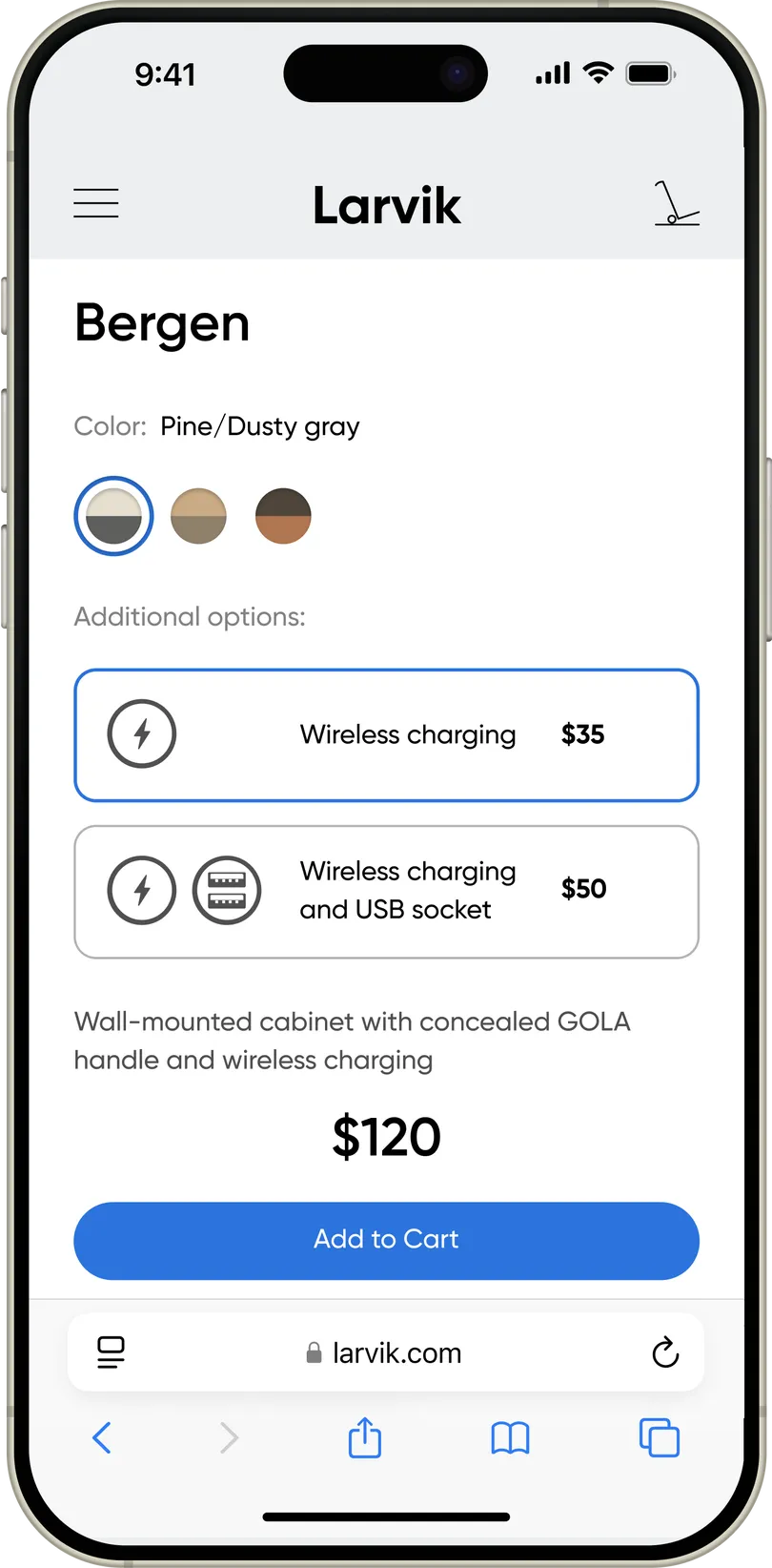
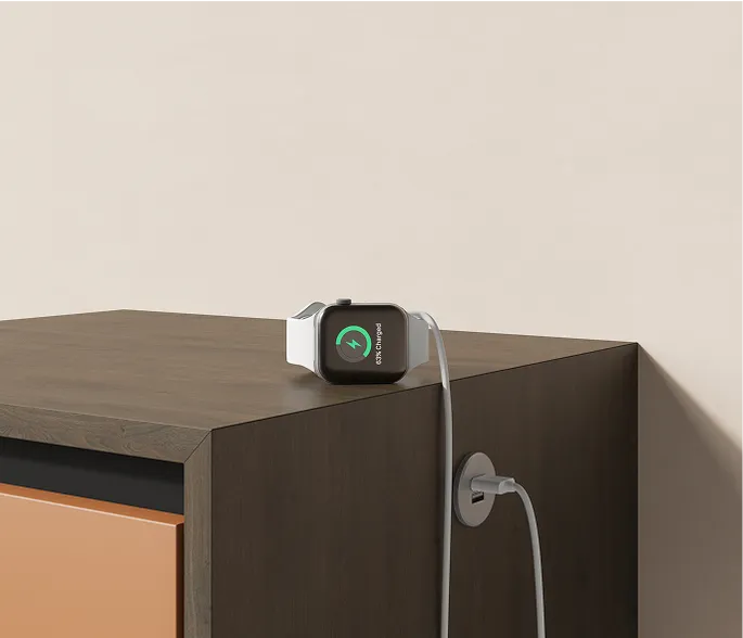
Larvik furniture can optionally be equipped with technical features, such as wireless phone charging or a USB port. To highlight this, when an option is selected, all the furniture images are updated. That is, the buyer clearly sees how the option selection will affect their furniture.
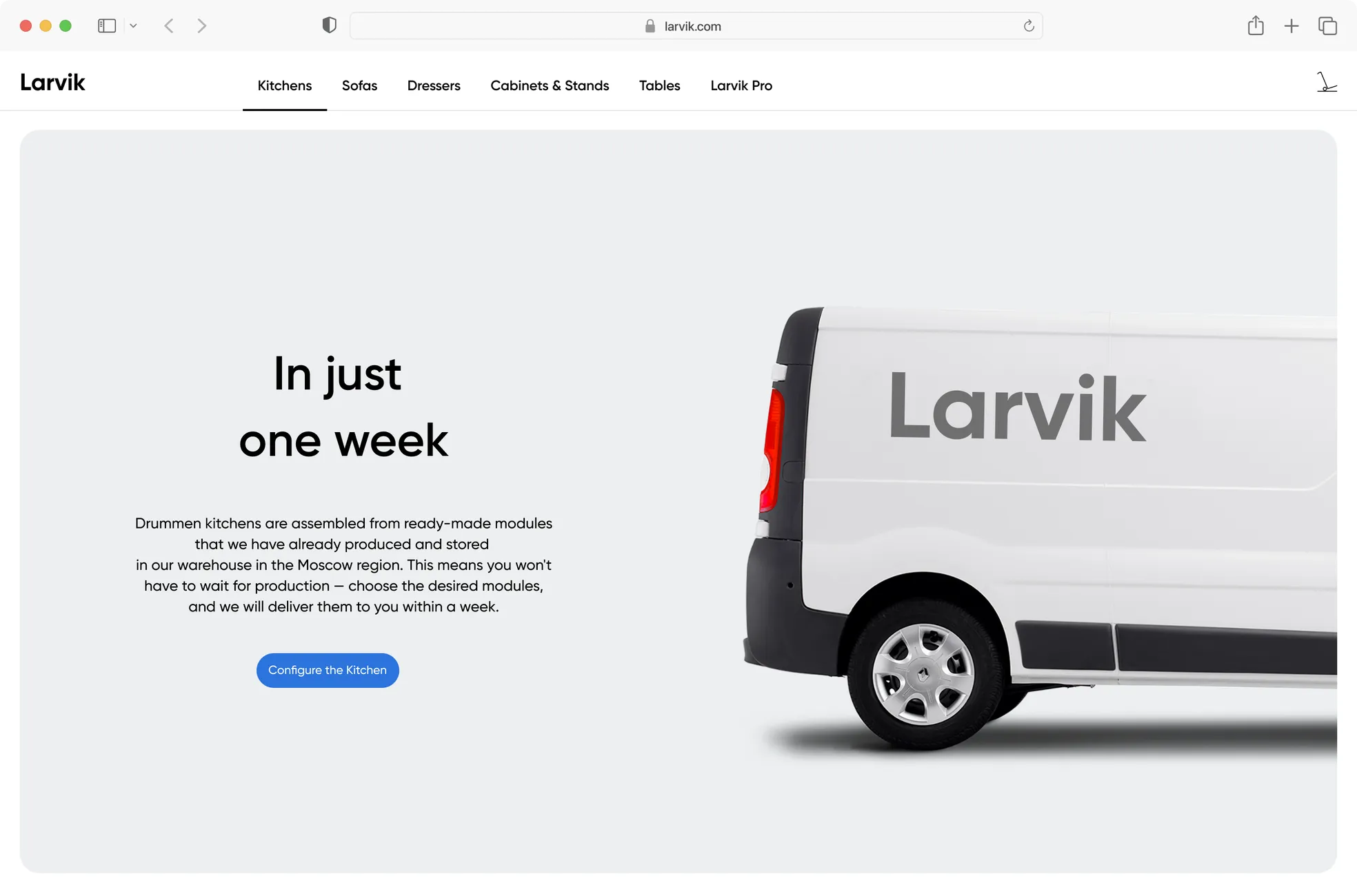
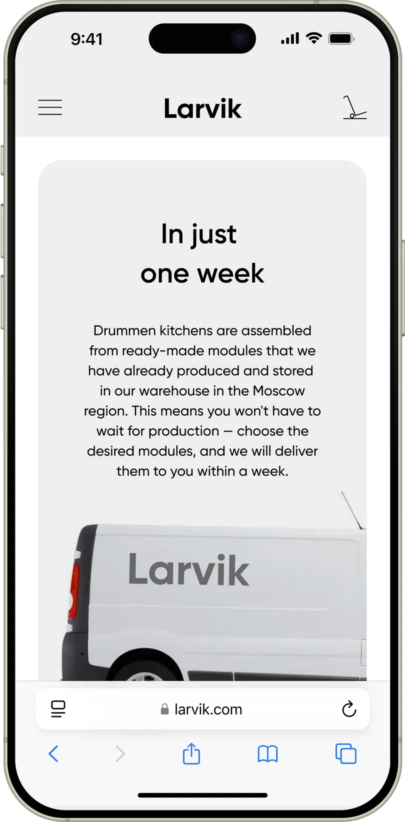
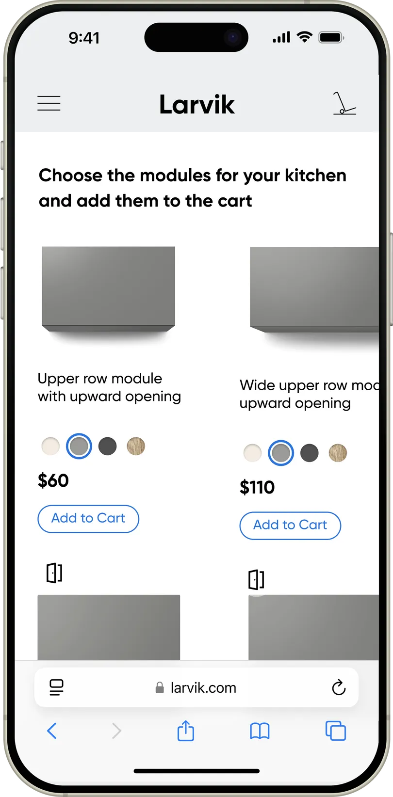
Kitchen Configurator
The main idea of the kitchen configurator is to make the online shopping experience at Larvik as similar as possible to the usual offline showroom experience. That's why in the kitchen builder, all modules are displayed at the same scale, and during the virtual walk along the modules, you can "peek inside" by simply hovering over them with your mouse. And to see how the module looks with a different finish, you can select it right here, in the module list, without going inside.
And finally — here’s the fully interactive prototype: