challange
Reduce the company's expenses on maintenance workers.
overview & problem
June Homes rents out mid-term apartments in the US, including maintenance services. However, maintenance workers handle only 2-3 visits daily due to inefficient task management, long travel times, and a lack of necessary tools. A mobile app is needed to optimize routes, improve scheduling, and enhance communication, reducing costs and boosting service quality.
role & team
Role
- UX/UI Design
- Research
Team
- Project Manager
- CPO
- Developer
result
75%
contribution to operational cost decrease achieved within 6 months.
26%
increase in successful visit report rate.
Process
Research
Overview
June Homes is a U.S.-based company that leases buildings, renovates them, splits them into individual apartments, and offers fully furnished units for mid-term stays (typically 4–6 months). Rent includes maintenance services: tenants can easily submit requests through the app, and the company dispatches a technician to handle the issue.
This project focused on improving the efficiency of maintenance workers, ultimately driving down operational costs for the company.
Problem
Low productivity among maintenance technicians was impacting both customer experience and operational efficiency. On average, each technician completed only 2–3 visits per day. Much of their time was spent commuting, often arriving without the right tools, missing urgent requests, or learning about cancellations only after showing up. Daily task management relied on a basic web interface, which made coordination even harder.
Current Solution
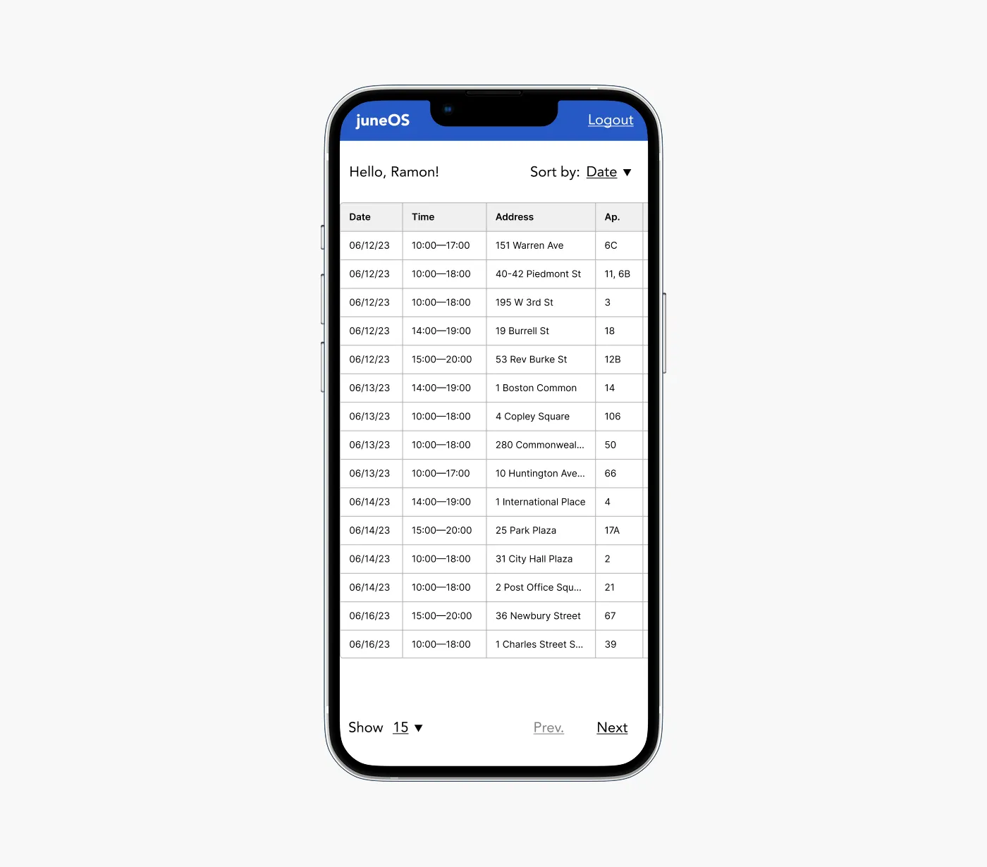
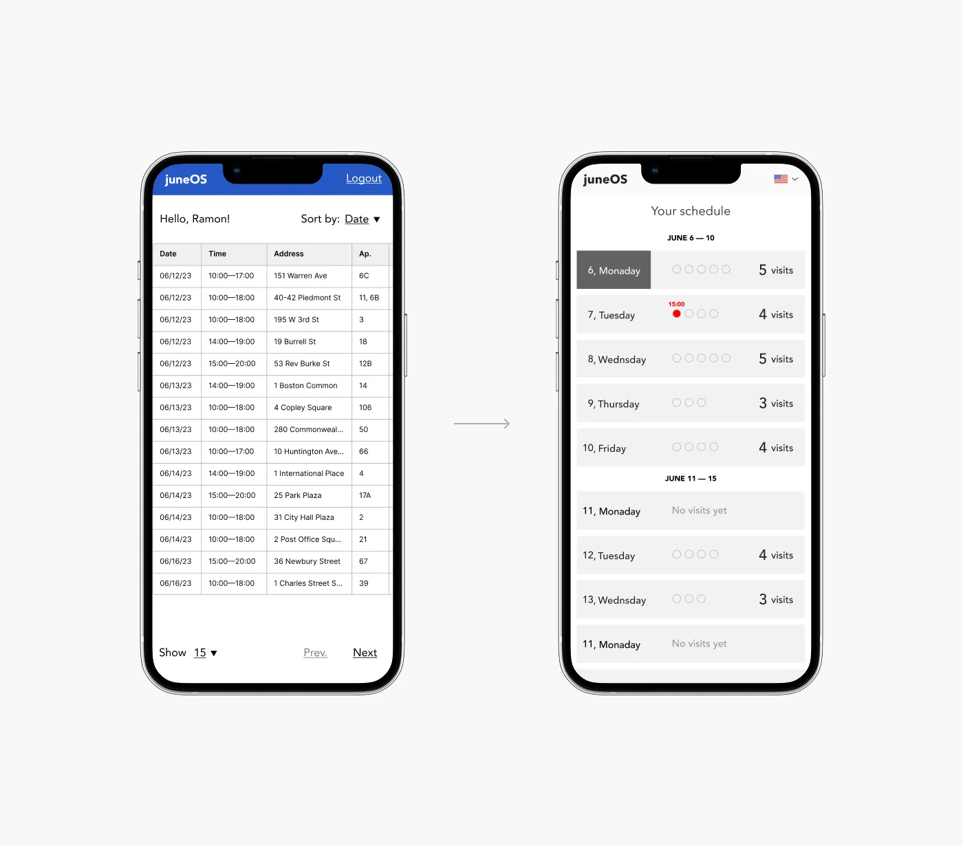
The existing tool provided no real support in helping technicians work smarter. Tasks weren’t grouped, prioritized, or contextualized in any meaningful way. The UX was minimal — just raw data dumped into a table, with little consideration for usability or workflow optimization.
As a result, productivity suffered, response times increased, and the company faced higher operational costs and lower customer satisfaction.
Data Collection
Before the redesign, the numbers painted a clear picture of inefficiency:
2,7
average daily visits despite full shifts.
19%
of visits didn’t lead to resolving the tenant’s issue.
45%
of working hours were spent in transit, not fixing problems.
12%
cancellations found on technician arrival.
User Research
Why things were breaking down? To better understand the root causes behind low productivity, I conducted 6 in-depth interviews with maintenance technicians. The conversations revealed 5 recurring pain points:

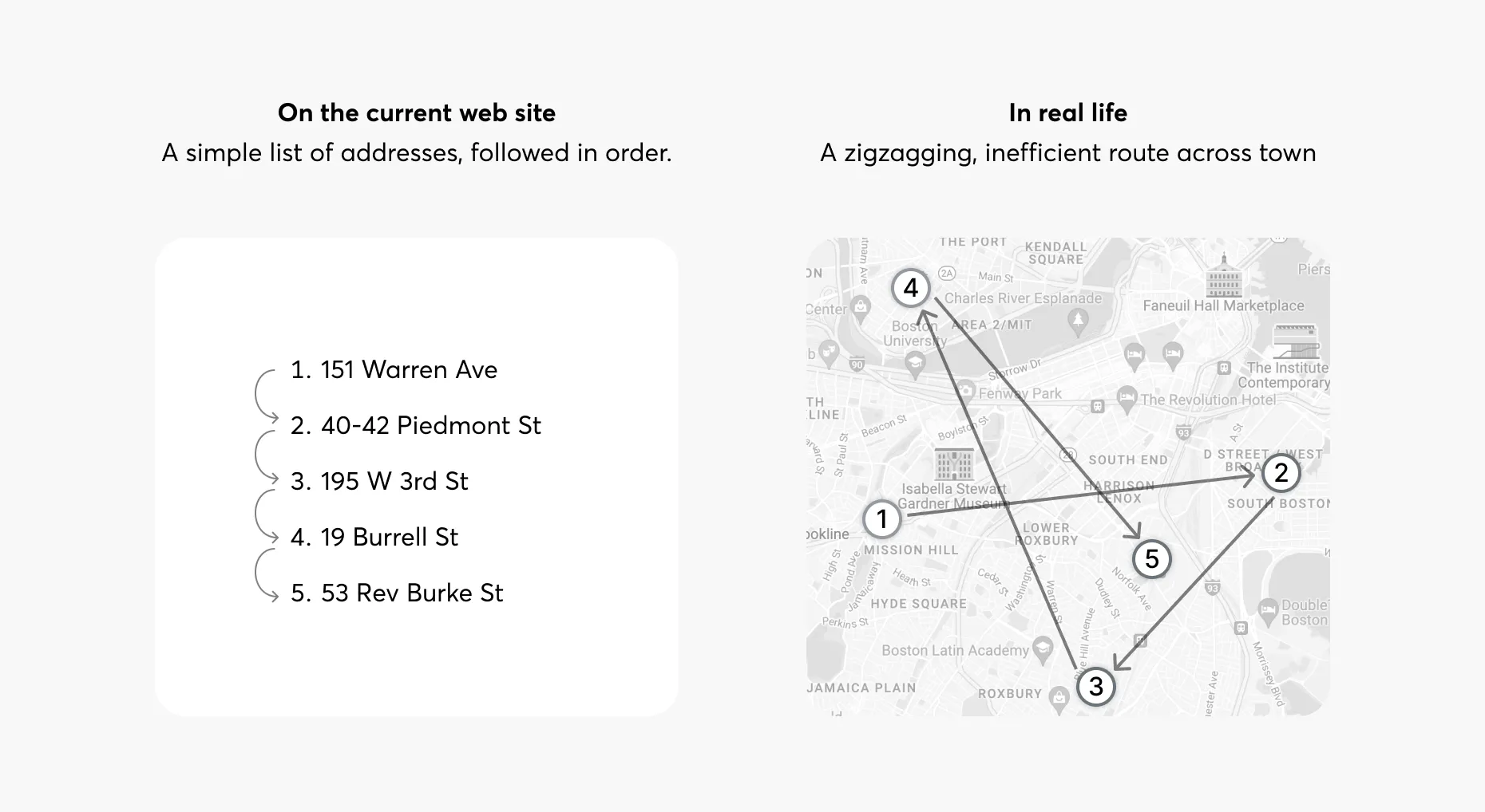
No route optimization
Without a map view or smart scheduling, workers simply follow tasks in the listed order — often zig-zagging across the city and losing hours in transit.

No real-time updates
Cancellations and changes aren’t pushed to workers. They have to manually refresh the site, which means some only find out a visit is canceled after they’ve already arrived.

Clunky reporting workflow
Uploading photos or writing reports isn’t possible from a phone. Workers have to transfer images to a desktop, slowing down the process and killing motivation.

Forgotten tools = wasted trips
Technicians often miss important task details and show up without the right tools — leading to repeat visits and tenant frustration.

Language barriers
For many, English isn’t their native language, making text-heavy interfaces hard to navigate quickly under time pressure.
Design Exploration
High-level Concept
My design exploration started by prioritizing the core issues uncovered in research — starting with the most critical one: inefficient routing.
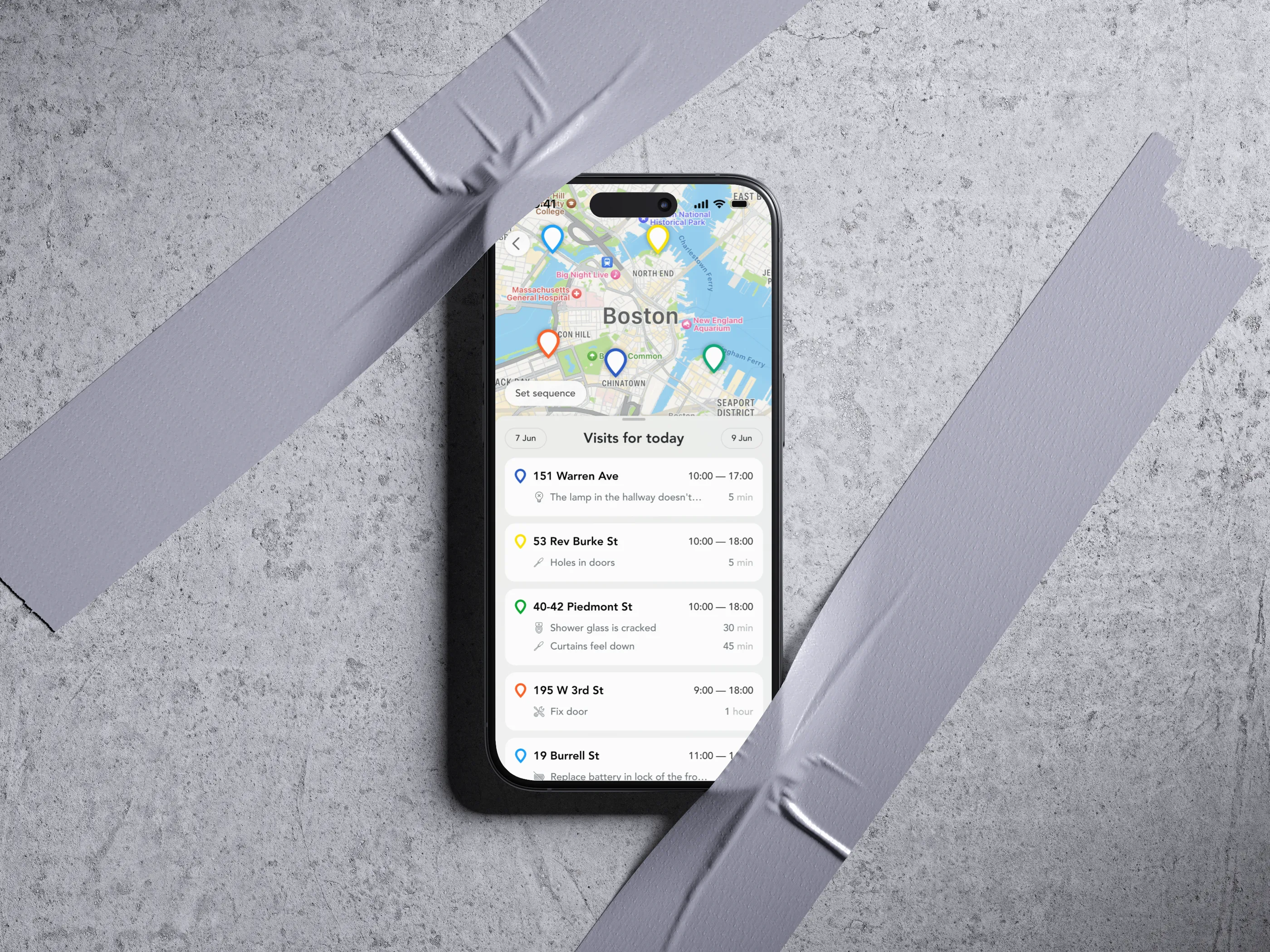
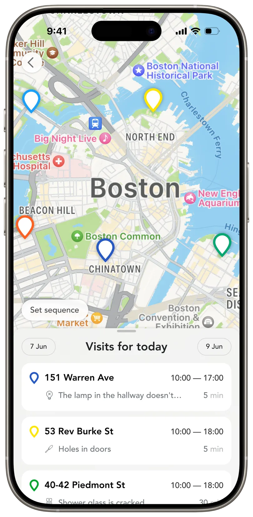
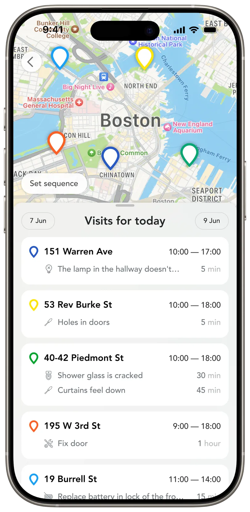
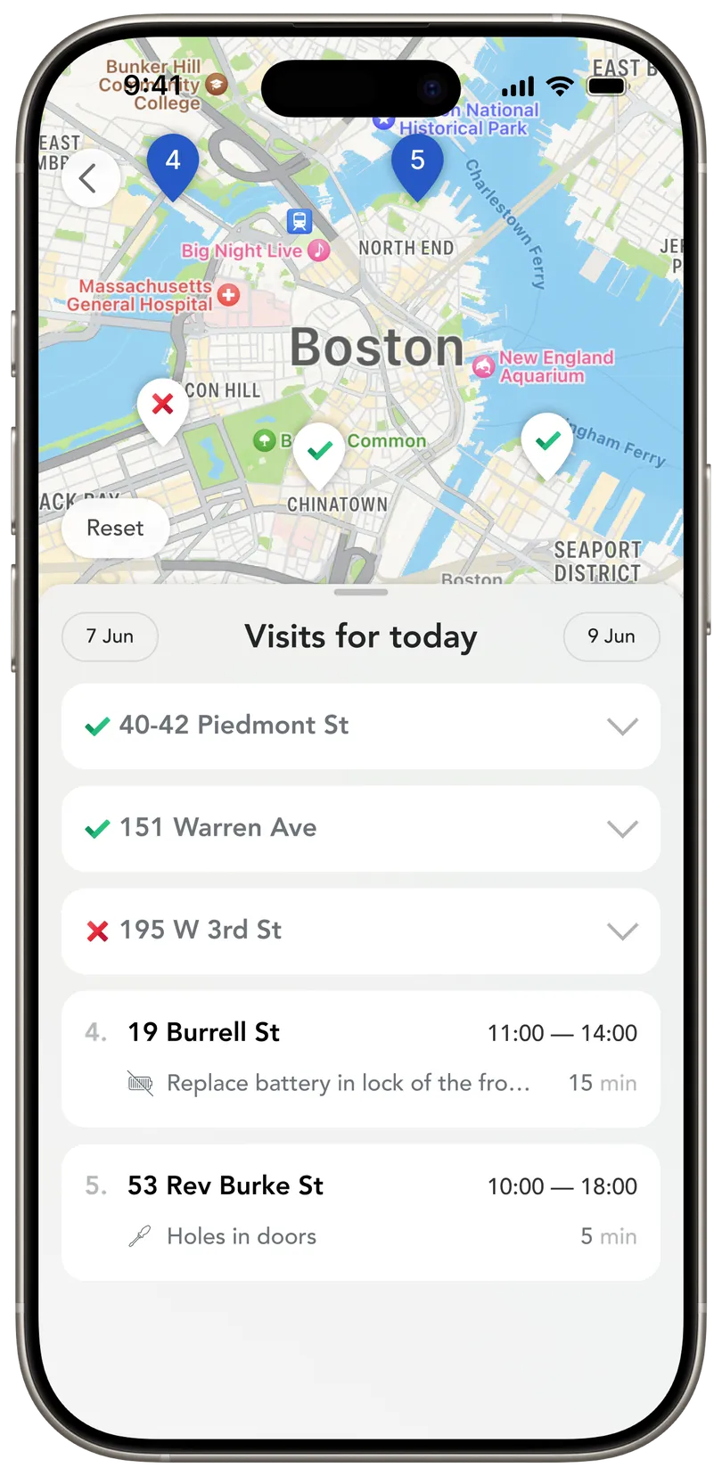
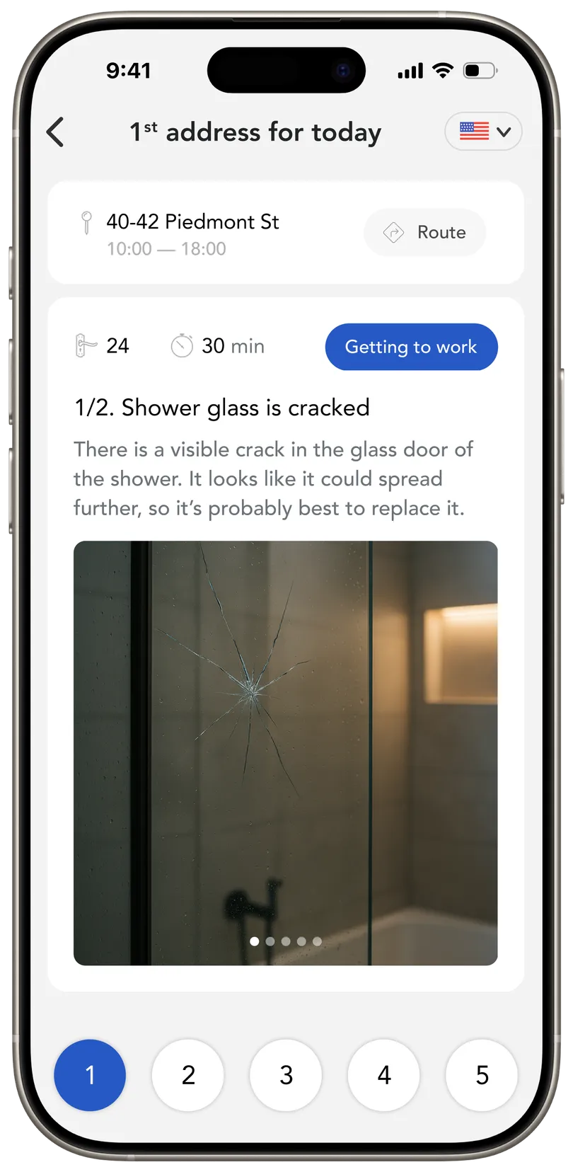
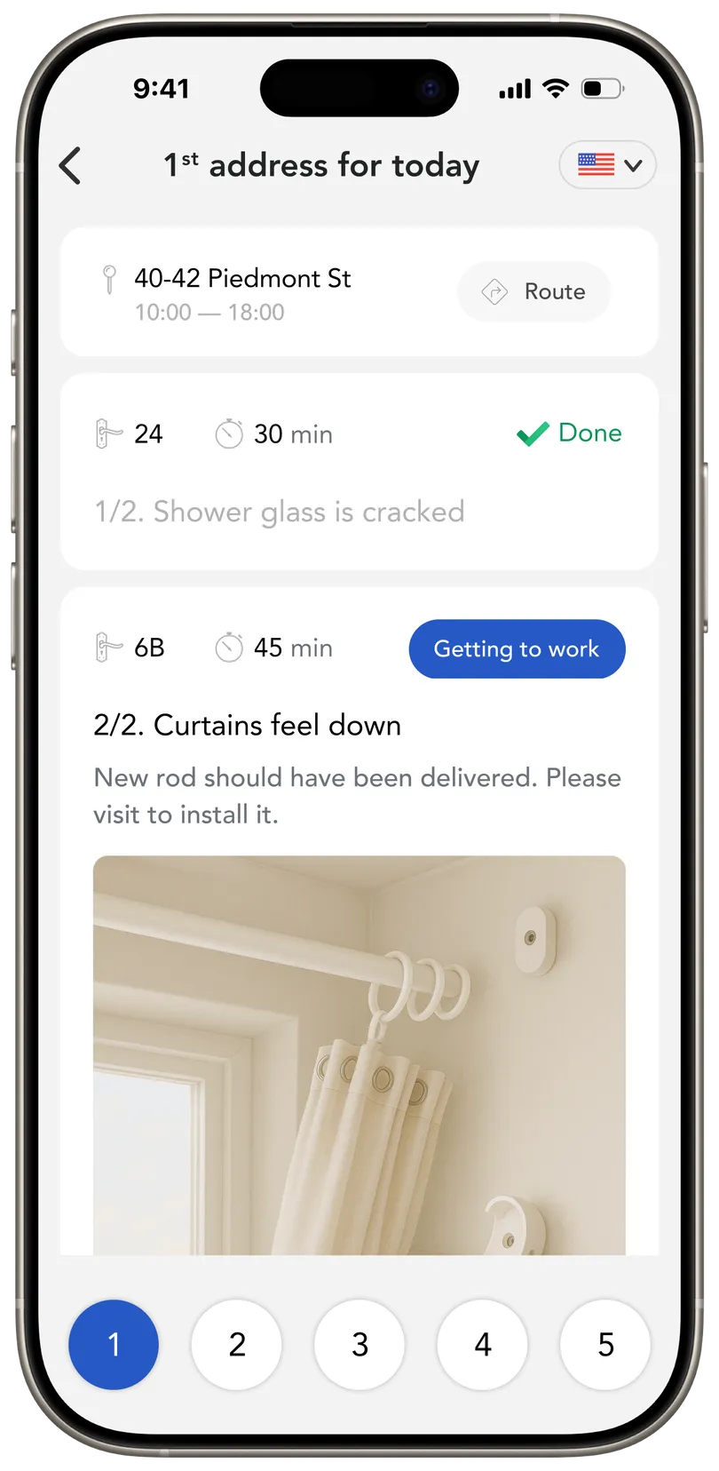
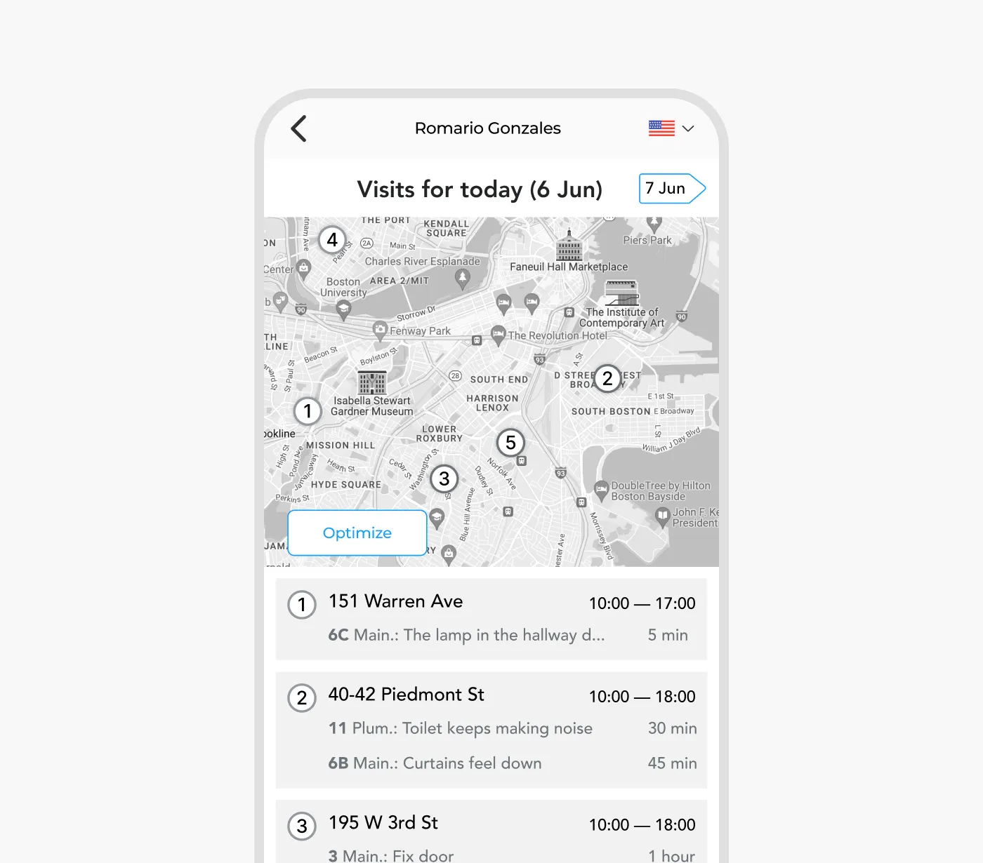
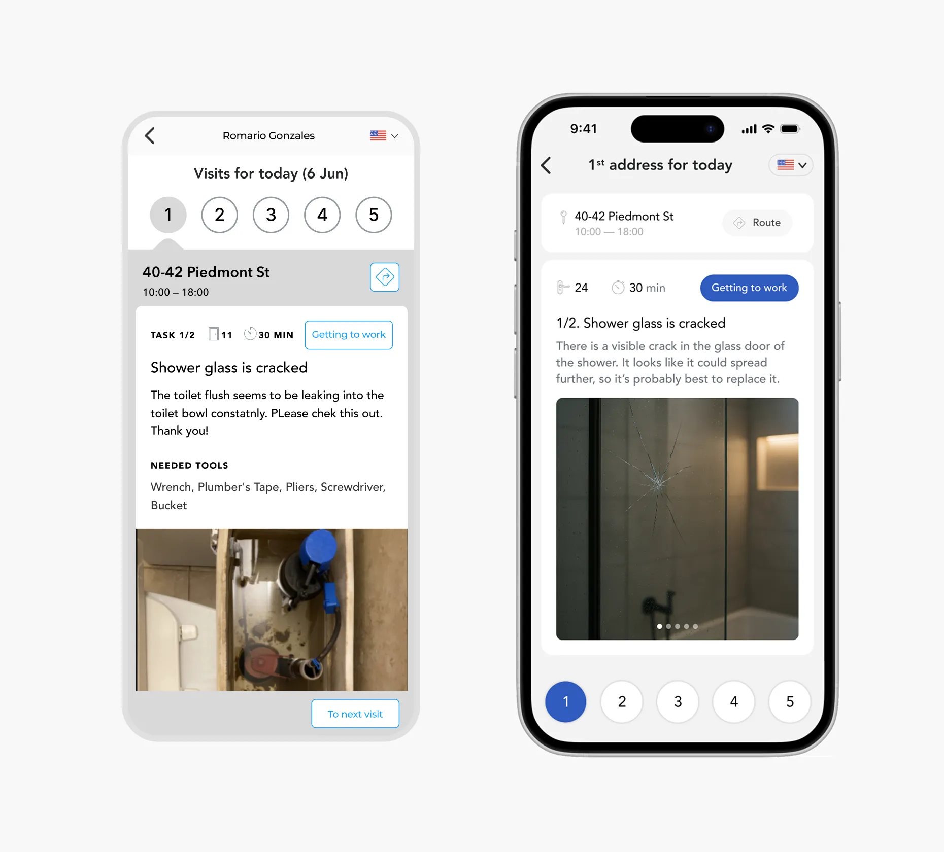
Optimized daily routing. I introduced a dedicated screen showing all scheduled addresses for the day, paired with a map for better spatial understanding. To avoid confusing users with sudden reordering of tasks (since visits get added throughout the day), I made route optimization a manual action triggered by a “Optimize Route” button rather than an automatic process.
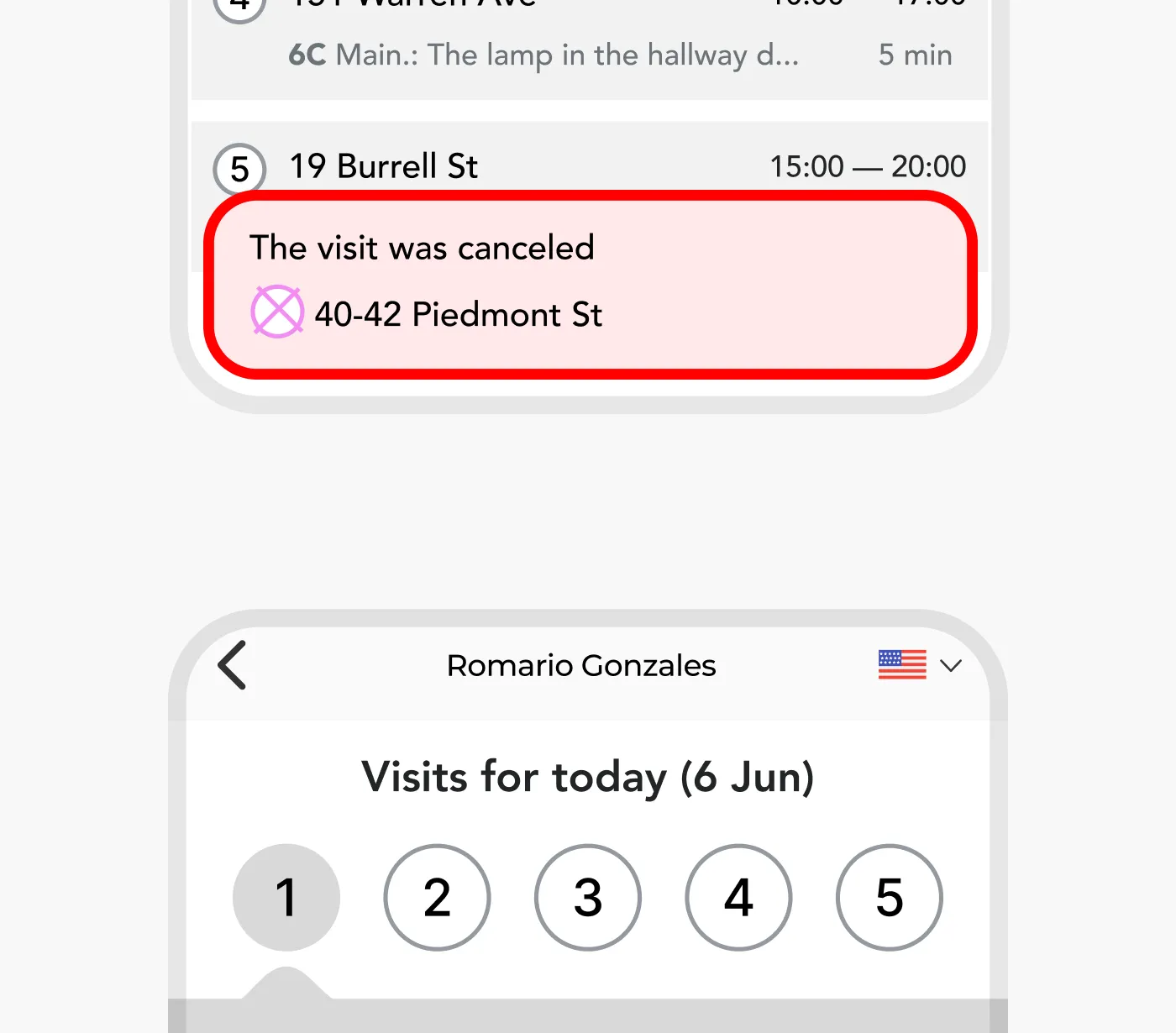
Real-time alerts & language settings. Next, I tackled two issues at once. I added clear in-app alerts for urgent changes — like last-minute cancellations or high-priority visits — and a language toggle accessible from any screen.
This helped workers react faster and feel more in control, especially those with limited English proficiency.
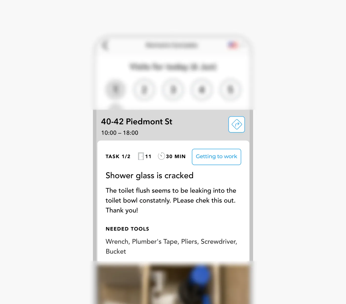
Tool preparation assist. To reduce failed visits due to missing tools, I designed a feature that analyzes the task description and shows a checklist of suggested tools directly within the request screen.
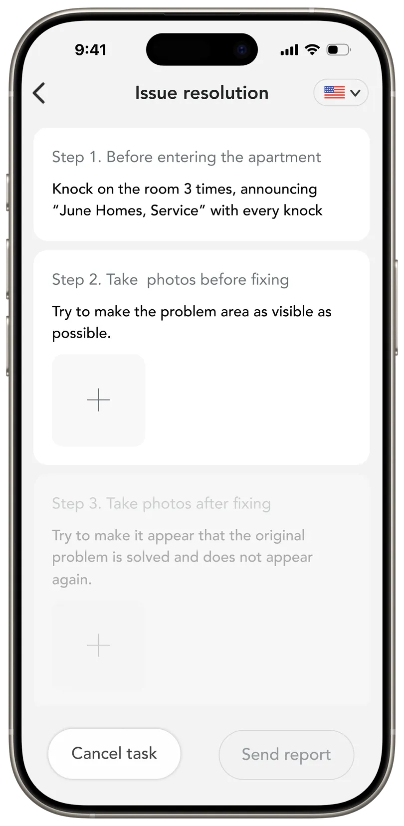
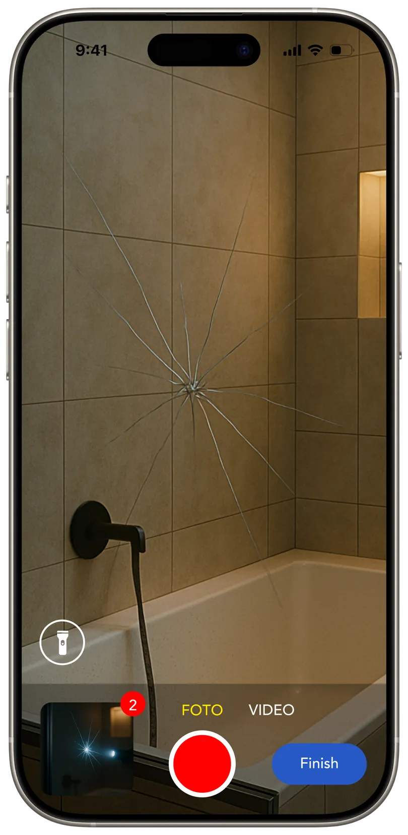
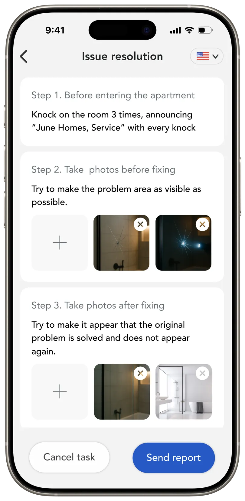
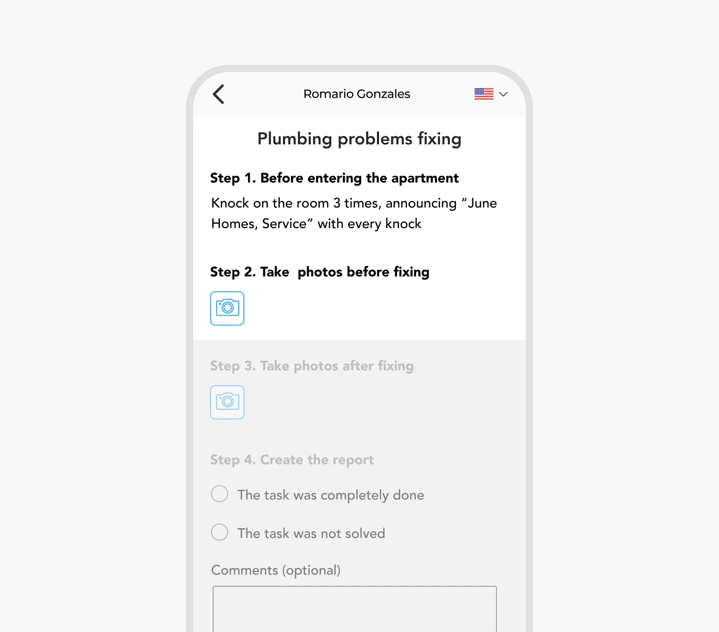
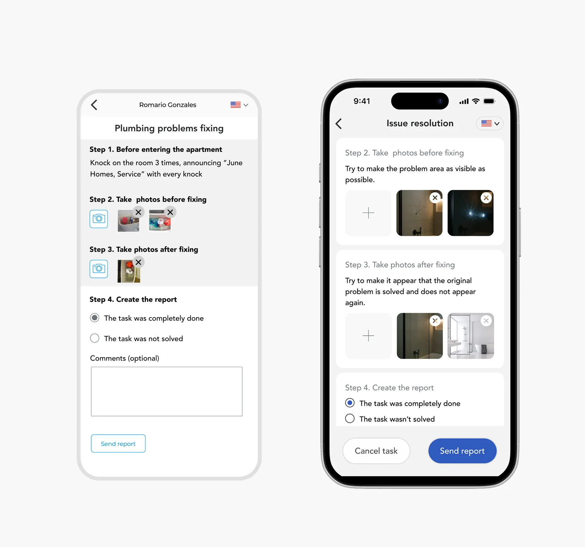
Report submission, reimagined. I streamlined the reporting flow with a mobile-first, step-by-step interface that guides technicians through each task, letting them upload photos as they go. Once complete, the app automatically compiles a final report — no desktop needed.
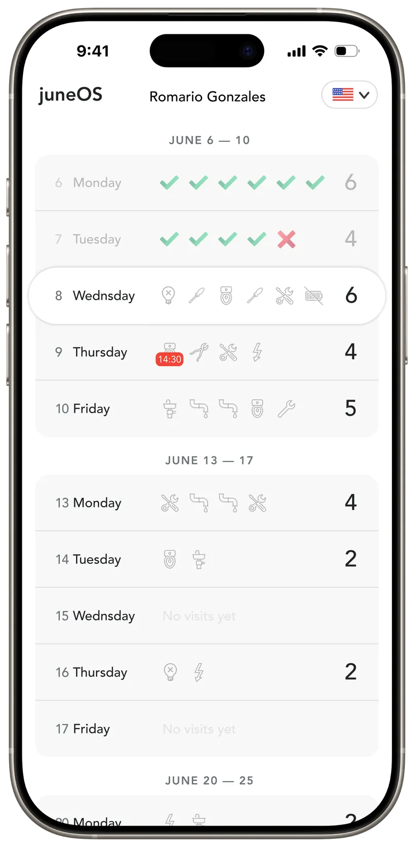
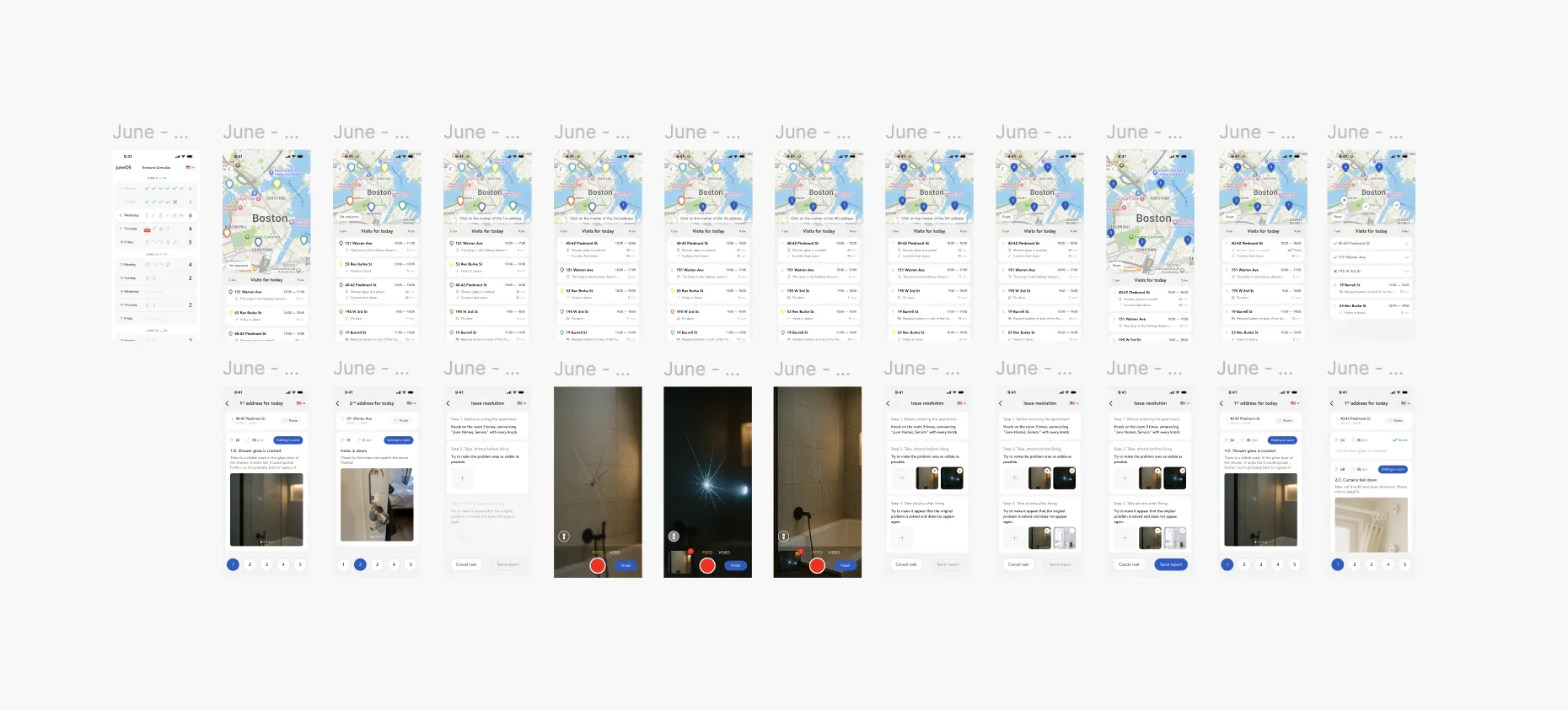
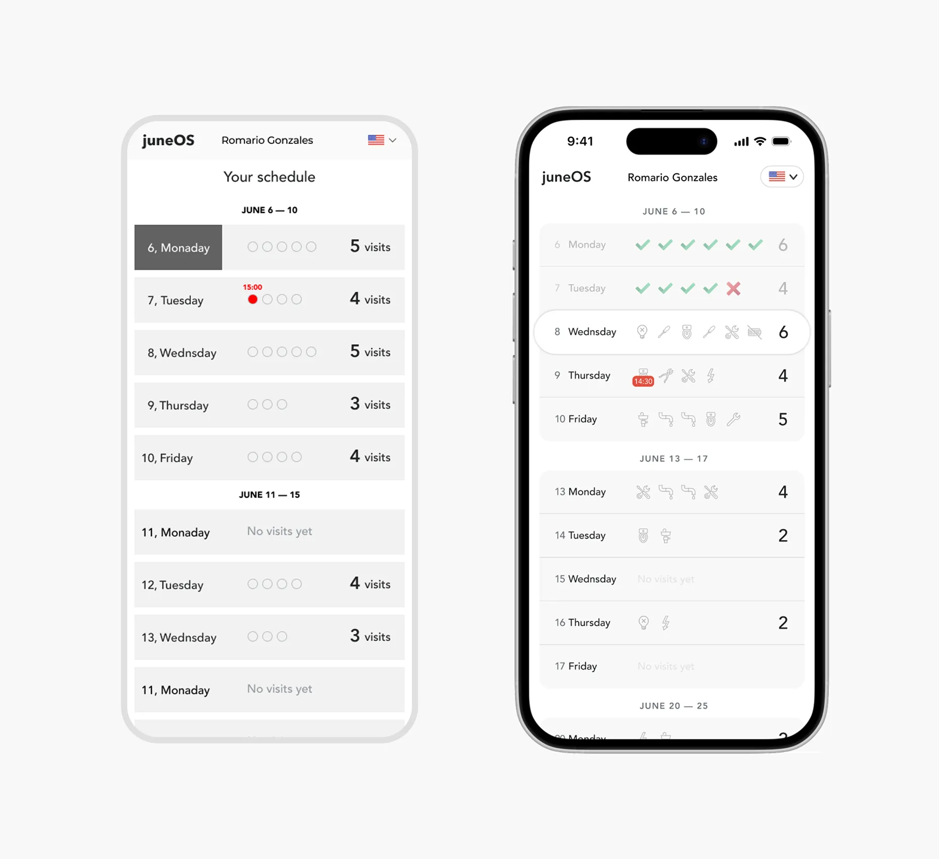
A smarter view of workload. Finally, I replaced the overwhelming flat table of all visits with a calendar-style layout that groups visits by day and week.
This gave workers a clearer view of their schedule and made it easier to plan their day at a glance.
Feasibility Review
Before moving into detailed design, I shared my high-level concepts with the engineering team to align on technical feasibility.
"Most of it is doable — except automatic routing and text analysis. Those are too heavy for now."
— Engineering Team
The feedback was encouraging overall — most ideas were greenlit. However, two features were identified as not feasible for the current release:
- Automatic route optimization.
Real-time routing logic would require complex integration with external mapping APIs and wasn’t viable within our current scope.
- Tool suggestions from task descriptions.
This feature depended on natural language processing, which the backend couldn’t support at this stage.
So instead of dropping the route optimization idea altogether, I reframed it as a design opportunity.
Turning a Tech Limitation into a UX Opportunity. The original tool listed addresses in the order they were created — with no map. As a result, workers often followed that sequence blindly, wasting hours crisscrossing the city.
To fix this without complex engineering, I designed a simple, visual interaction that gives workers control over their own route planning.
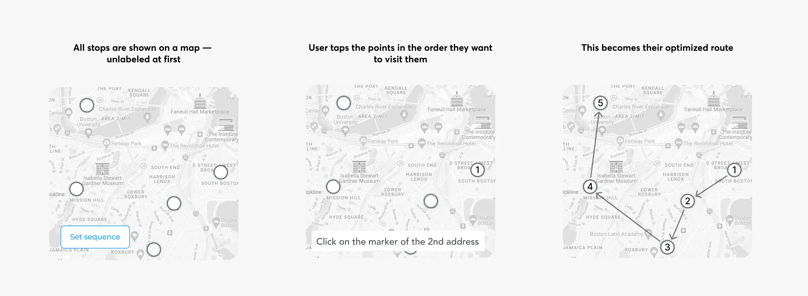
This low-lift UX solution empowers technicians to build smarter routes without needing backend-powered automation — a great example of solving constraints through design.
Design Refinement
After aligning on wireframes with engineering and product, we moved into high-fidelity design.
We refined layout structure, tuned spacing, and carefully crafted the color palette to balance clarity and warmth.
Micro-interactions were added to make the experience feel smoother, more responsive, and human.
And finally — here’s the fully interactive prototype: