Thirty
Park Palace
Design and development of an online store for non-obvious wine based on the existing corporate style. The goal is to captivate customers and turn wine consumption into an exciting adventure.
2015 · UX/UI Design · Art Direction
Homepage
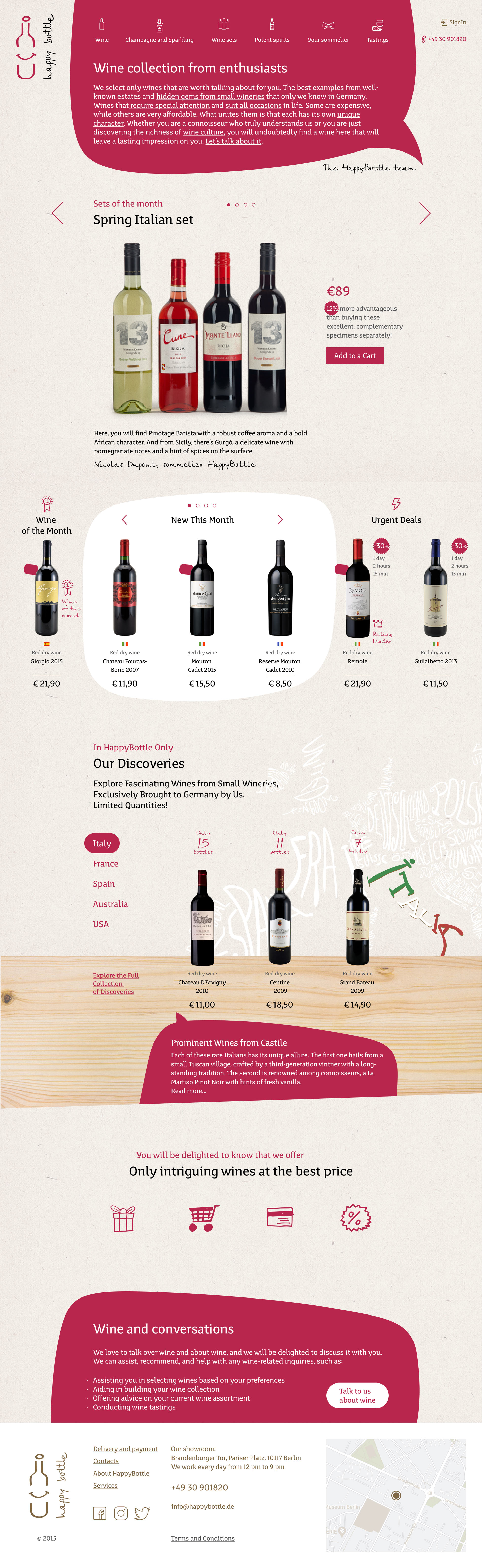
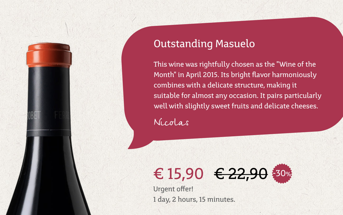
The homepage sets the tone for the entire website with its vibrant and juicy design, featuring wine bottles and bubbles that represent conversations about wine. The content reflects the company’s concept, as seen in the “Our Discoveries” section, which showcases our effort to seek out rare and unusual wines, not just sell them. The comments from our sommelier on the wines demonstrate our individual approach to each bottle.
Catalog
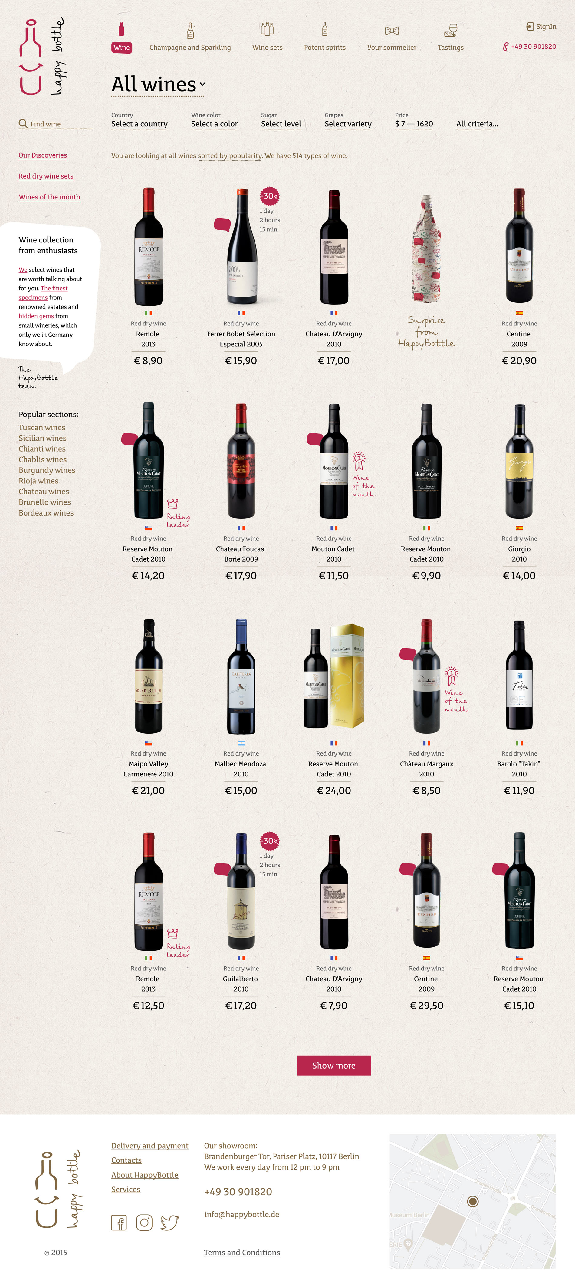
The catalog is equipped with a detailed filter, allowing every visitor to find exactly what interests them. In addition to standard criteria, we have added options such as “Food Pairing,” “Grape Growing Region,” and “Wine Spectator Rating.
Wine Page
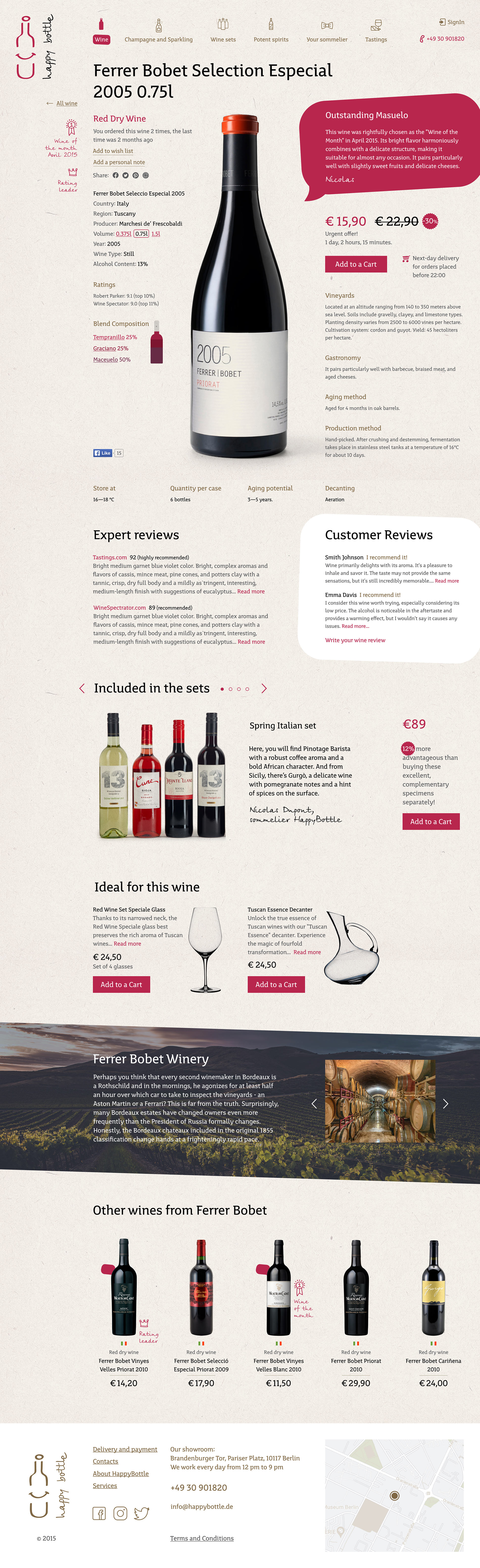
In my opinion, the best-designed page in the project is the wine page. The centerpiece is a wine bottle, displayed almost in its natural size, and it is surrounded by comprehensive but well-organized and ranked information about the wine. Neither more nor less.
Process
Defining project goals
Responsibilities
Analyze competitors, develop website design considering the established corporate style, design UX and UI of the online store, assign tasks to web designers and developers, and oversee the implementation.
Goal and Context
The Happy Bottle brand was founded in 2014 by two enthusiasts: a businessman and a sommelier who shared a love for wine and could talk about it for hours. One day, during another long conversation, they decided to start their own company focused on importing and selling wine. The sommelier would travel to small private wineries in Italy, Spain, France, and Portugal to select unique and interesting but not well-promoted wines, while the businessman would sell these wines to other wine enthusiasts. Thus, Happy Bottle was born, with the slogan “Wine and Conversations.”
In 2014, they approached me to design the UX and UI of their online wine store. The site needed to be light, beautiful, and engaging to visitors while conveying the main idea of selling unadvertised wine brands from small wineries.
Existing Brand Style
Logo and signature “wine” color
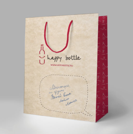
A background with a craft paper or wood texture
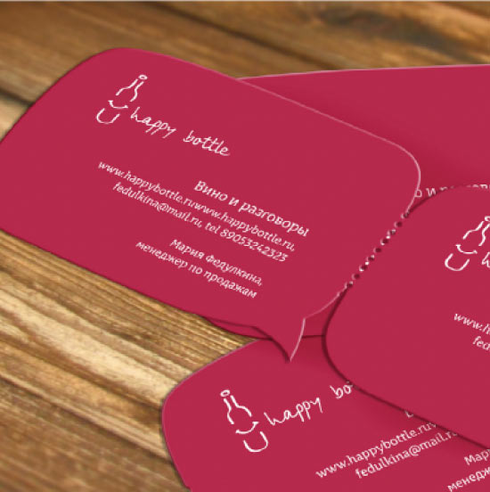
A dialogue bubble, similar to those in comics, as the primary graphic element
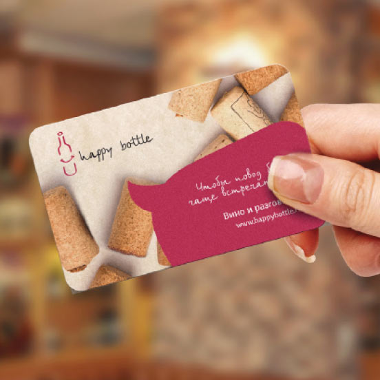
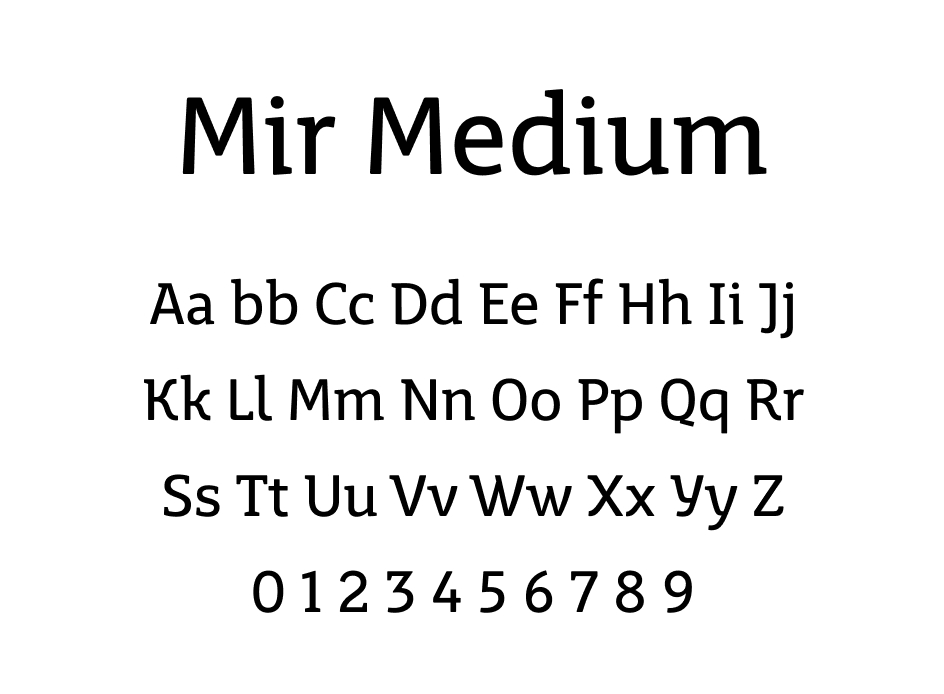
Main text and header font MirMedium, and handwritten font BirchCTT for accent inscriptions
Development of Visual Style for Website
Colors
Starting with a basic beige background color and a “wine” accent, we added a darker “wine” shade for the on-hover states of interactive elements, as well as a dark purple for special cases. A unique addition was the use of a “golden” color as a secondary accent. It pairs wonderfully with both the craft background and the black primary text, adding a touch of elegance.
Wine Dark
#931839
Wine
#B8264D
Gold
#806744
Violet
#793352
Typography
Given the original brand style, we retained two fonts: MirMedium for primary text and BirchCTT for accents. BirchCTT’s unique, vintage flair adds depth and character, resonating with our visual intent. It pairs seamlessly with the craft paper texture, enhancing the website’s overall feel.
Graphic Elements and Textures
Similar to the printed materials, we use the texture of craft paper as the main background. However, we have made it lighter than in the printed version to ensure better readability of small inscriptions. This is because the website contains more information than the printed materials.

Photos and Illustrations
A user’s first impression of a product and the store as a whole is formed visually, and it is the images that become the main factor in this assessment. High-quality, detailed photos allow the customer to feel more confident in their choice, as they demonstrate the product precisely and vividly. This is especially relevant for such an aesthetic and refined product as wine. The buyer evaluates not only the wine itself but also the design of the label, the shape of the bottle, which directly affects the perception of the product’s quality. Thus, high-quality images become not just a design element but also a tool for building trust, enhancing brand perception, and stimulating sales.
Additional Elements
We retain the dialogue bubble in the “wine” color as the primary graphic element — a bright, distinctive, and memorable feature that harmoniously complements both the craft background and images of wine bottles. Additionally, it serves as a perfect illustration of the site’s concept, “Wine and Conversations.
Result and Successes
Since the launch of the Happy Bottle website in 2015, we have witnessed the brand’s remarkable growth and popularity. The website design I developed not only embodied the company’s core ideas and philosophy but also played a pivotal role in attracting and retaining customers. People admired the uniqueness, creativity, and intuitiveness of the user interface, which made the wine selection and purchasing process delightful. As a result, sales grew steadily, and customer feedback affirmed that we genuinely created something special. Thanks to this success, Happy Bottle has solidified its position in the market, offering unique and intriguing wines from small European wineries while maintaining its authenticity and friendliness. Our team is proud of our work and the part we played in this amazing success story.