MATÜ
Online clothing store
UX/UIDesign
Art Direction
2020
![]() Figma:
Figma:
View Prototype
View Mockups
This is an online store for the up-and-coming brand MATU. The store mirrors its core values of eco-friendliness, simplicity, minimalism, and attention to detail.

Process
Defining project goals
Responsibilities
Goal and Context
Research and Strategy
To ensure potential users that MATU’s products are not inferior to prestigious brands, the website’s perceived quality must be on par with the competition. Therefore, high-end websites such as Louis Vuitton, Gucci, and Loro Piana were chosen as benchmarks. At the same time, it was beneficial to examine solutions from more affordable, mainstream brands such as Zara, H&M, and Mango. Every aspect of the competitors’ visual style — colors, typography, main page templates, and UX patterns — will be analyzed to identify successful strategies, serving as a foundation for creating MATU’s unique style. The website’s design must also reflect the brand’s values of simplicity, minimalism, and attention to detail.
Furthermore, it is important to consider that the primary target audience for the website is young women who follow fashion trends and are open to new and exciting experiences.
Development of Visual Style


Colors
In terms of color palette, there is a consensus among both top-tier brands and mass-market: interface elements and texts are mostly black or white, with color introduced through model photographs wearing the brand’s apparel.
I agree with this approach. The use of neutral colors sets a tone of seriousness and minimalism while allowing the focus to be on the brand’s product photographs. Therefore, our color palette will primarily consist of black and white, supplemented by various shades of gray.

Typography
LOUIS VUITTON, Louis Vuitton Web
Gucci, Gucci Sans
Loro Piana, Garmond
ZARA, Neueu Helvetica

H&M, HM Sans Bold

Mango, Mango Sans
While examining six competitors may not be enough to definitively speak about established trends, certain tendencies can still be noted. Sans-serif fonts with strict lettering prevail in headlines. This is a highly utilitarian type of font that doesn’t distract from the design’s main focus: model photographs featuring the brand’s clothing.
The same font is typically used for the main text but with a lighter, less bold variant. I agree with this solution as well. For MATU, I’ve selected Gilroy font, a simple but graphic and strict one, with nice details like diagonal cut-offs on the lowercase ’t’ or a perfectly round lowercase ’o’.

Graphical Elements and Textures
Additional Elements
![]()
Photographs and Illustrations
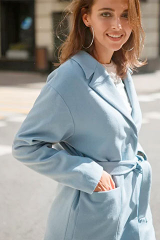
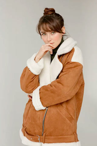
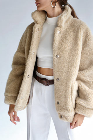
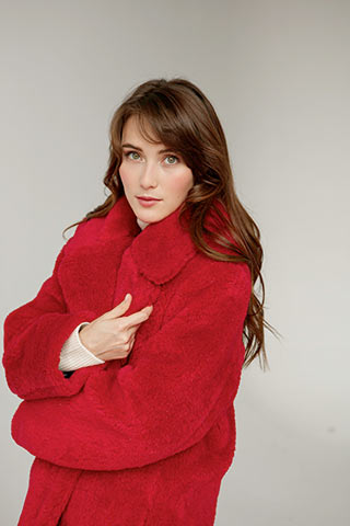
In the fashion industry, the quality and aesthetic value of images are crucially important. The impressions and emotions conveyed through visual materials often play a major role in shaping the consumer’s relationship with the brand.
That’s why the design of the MATU online store was built around high-quality photographs. This approach allows for the creation of emotionally rich pages where images are the main focus.
Fortunately, the client fully embraced this approach and had already ensured that each product was professionally photographed with models and lighting. This provided vast opportunities for creating a captivating design.


Designing individual pages
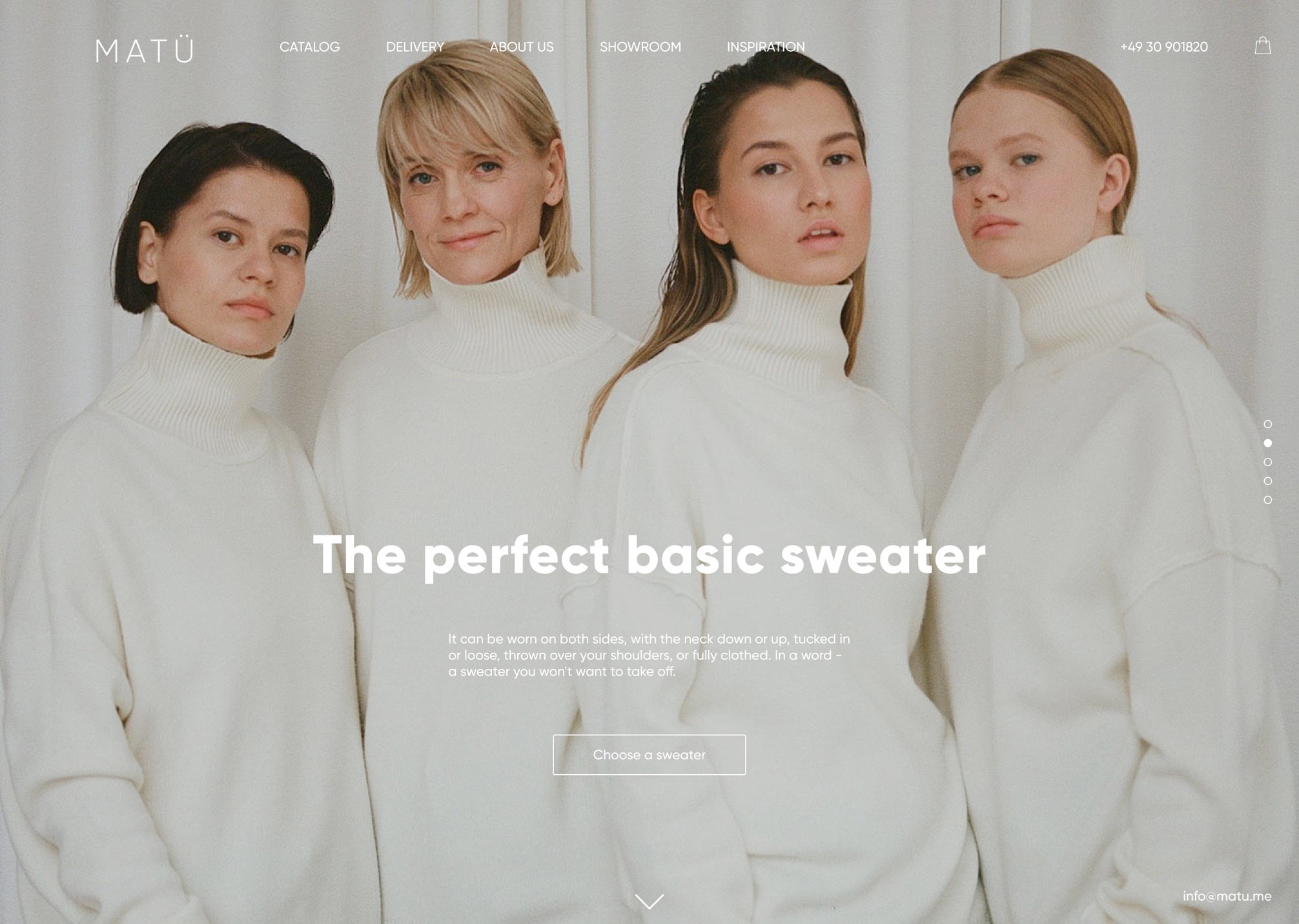
Main Page
The main objective of the homepage is to introduce the brand and its values, as well as the product line. As the visual style of MATU relies on large and striking photos, the homepage employs fullscreen slides. This enables us to showcase the clothing in the most favorable perspective — on models in natural settings and to emphasize the beauty of the clothes to the fullest extent.
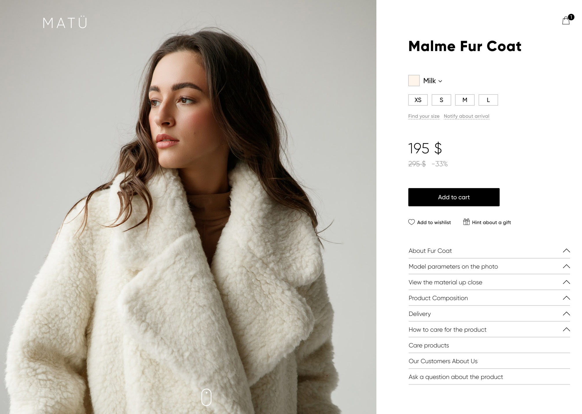
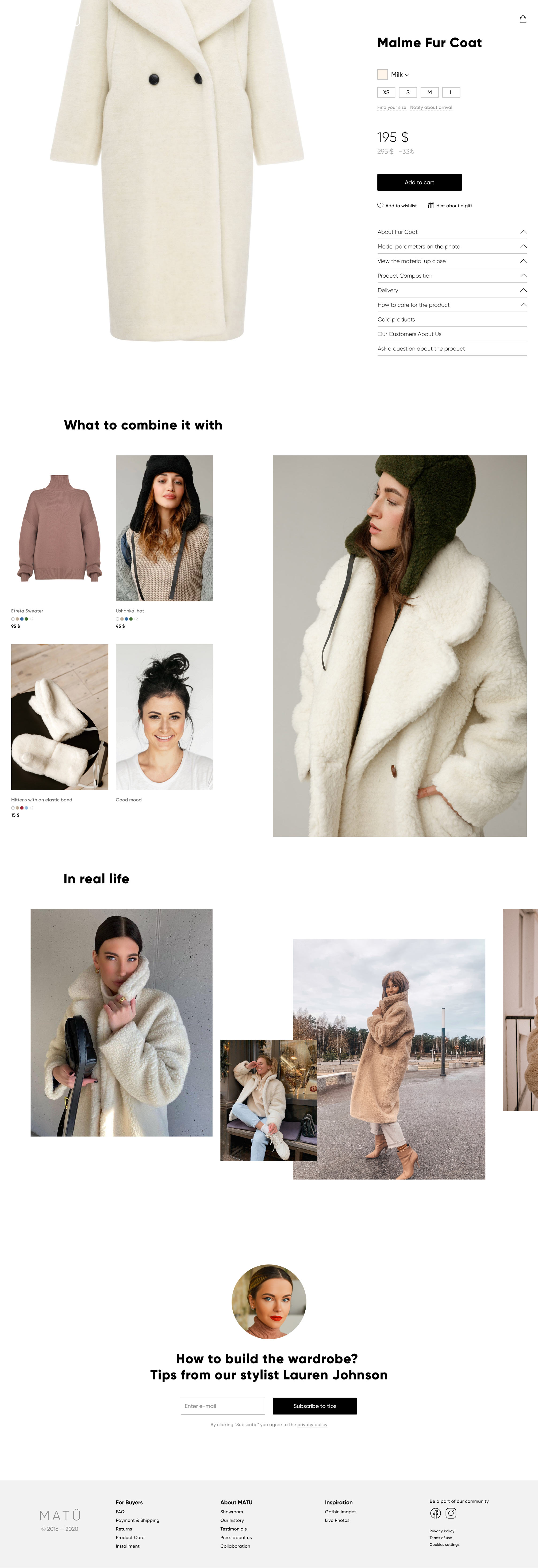
Product Page
In online stores, the product page is the most important. It is where a visitor, viewing photos of an item, becomes a buyer. To maximize the conversion to a buyer, emphasis has been placed on the product photos, and anything that could distract from the photos has been removed. Simultaneously, a complex layout has been created. When scrolling through the page, only the photos are initially scrolled through (while the block with the purchase button and product information remains in place). Only after all the photos have been scrolled through do additional blocks appear.
Adding to Cart and Checkout
Adding a product to the cart should be seamless and not interrupt the process of choosing clothes. The user should be confident that they are selecting the right item, see that it has been added to the cart, and continue browsing without interruption. This process should mimic an offline store experience.
To reduce the conversion rate to buyers, the order placement form should contain only essential fields. Additionally, the selected products should be visually emphasized.
Results and Successes
The website was launched in September 2020, and the first order was placed on the same day. Just three months later, more than 200 orders were being placed through the site each month, accounting for 45% of the total number of orders.
Although no customer satisfaction surveys were conducted, customers highly praised the website in their conversations. The brand owner was so pleased with the proposed design that there were no comments, which is a first in my 15 years of practice.