This project involves developing a visual style and website for the furniture manufacturer, Larvik. The work includes website interface design, supervising the creation of 3D visualizations, and overseeing the layout and programming.
2022 · UX/UI Design · Art Direction · 3D-visualization Direction
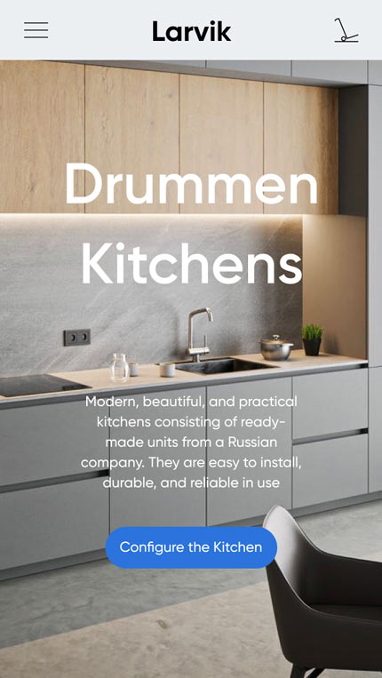
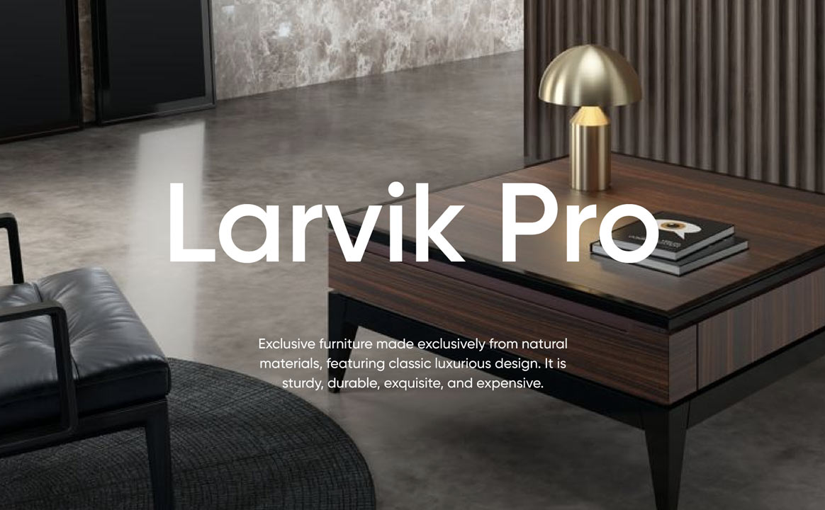
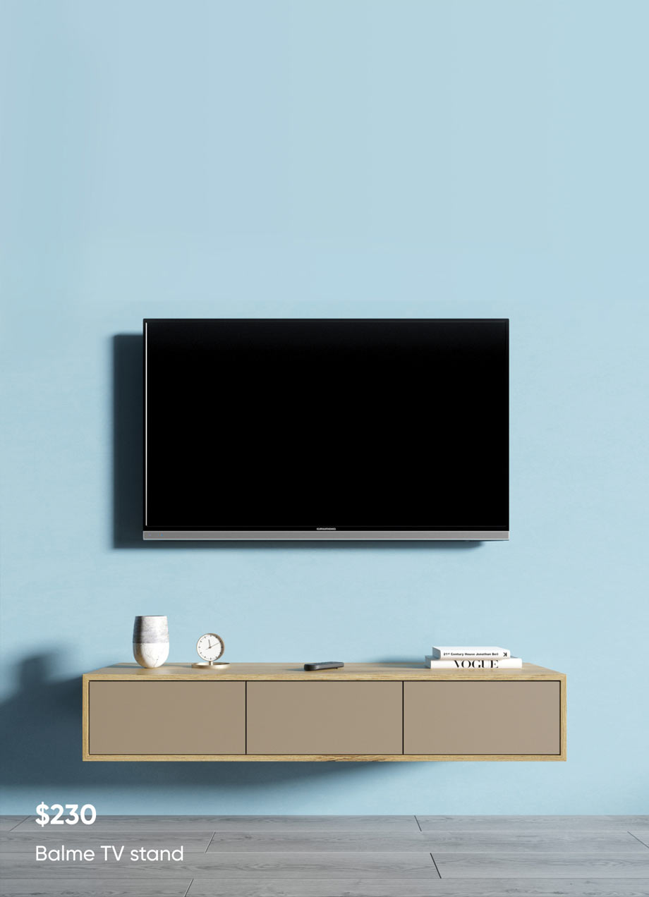
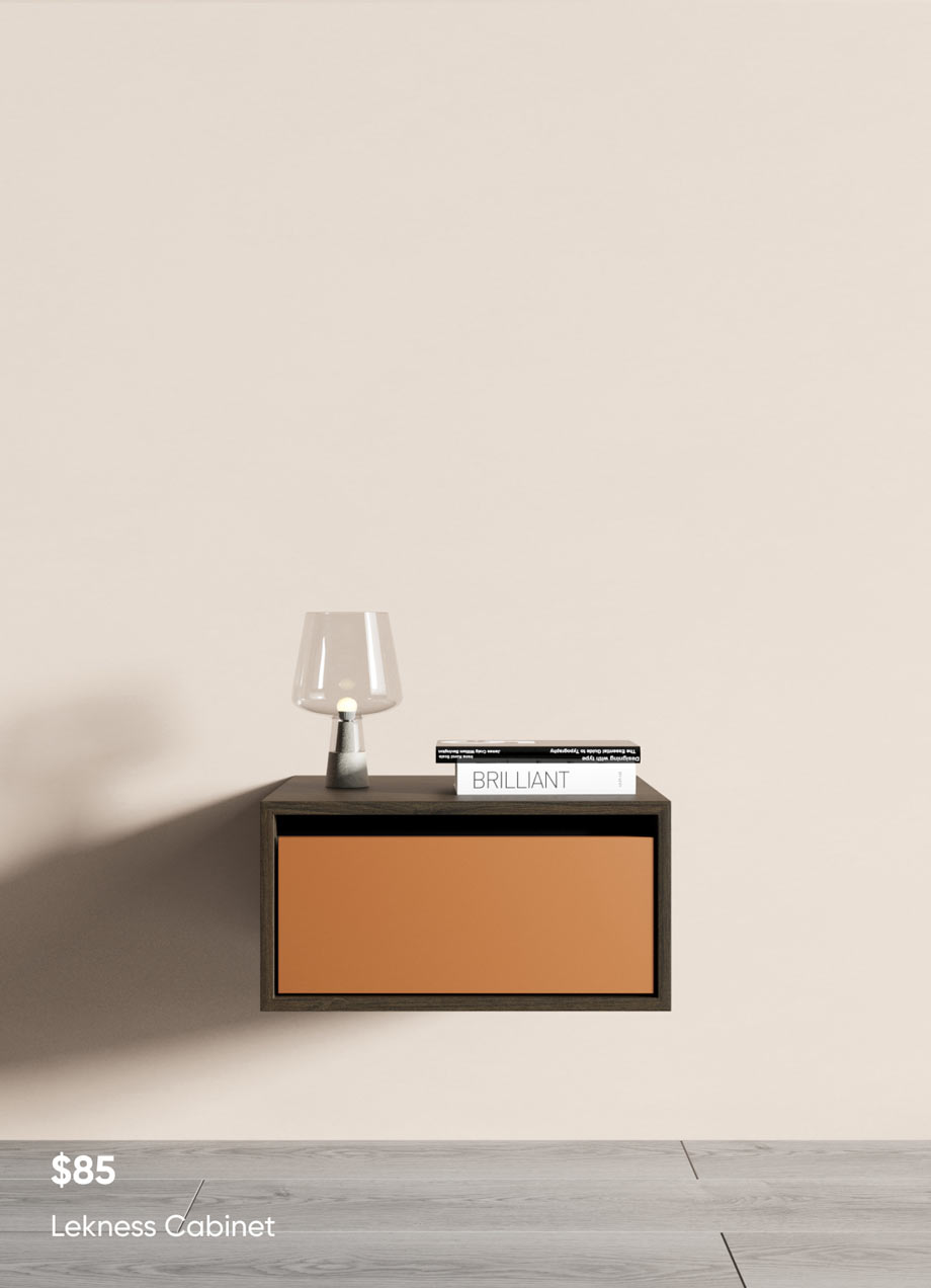
Promo blocks showcase Larvik furniture’s benefits on desktop and mobile.
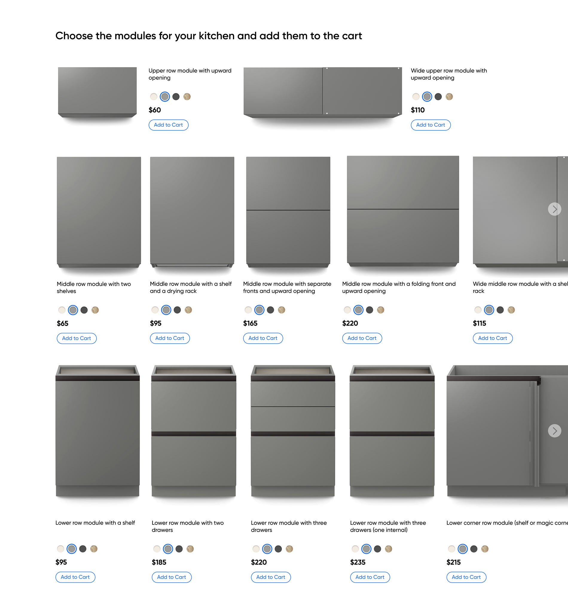
The kitchen constructor presents all modules on a single scale, creating the feeling of a customer walking through a showroom.
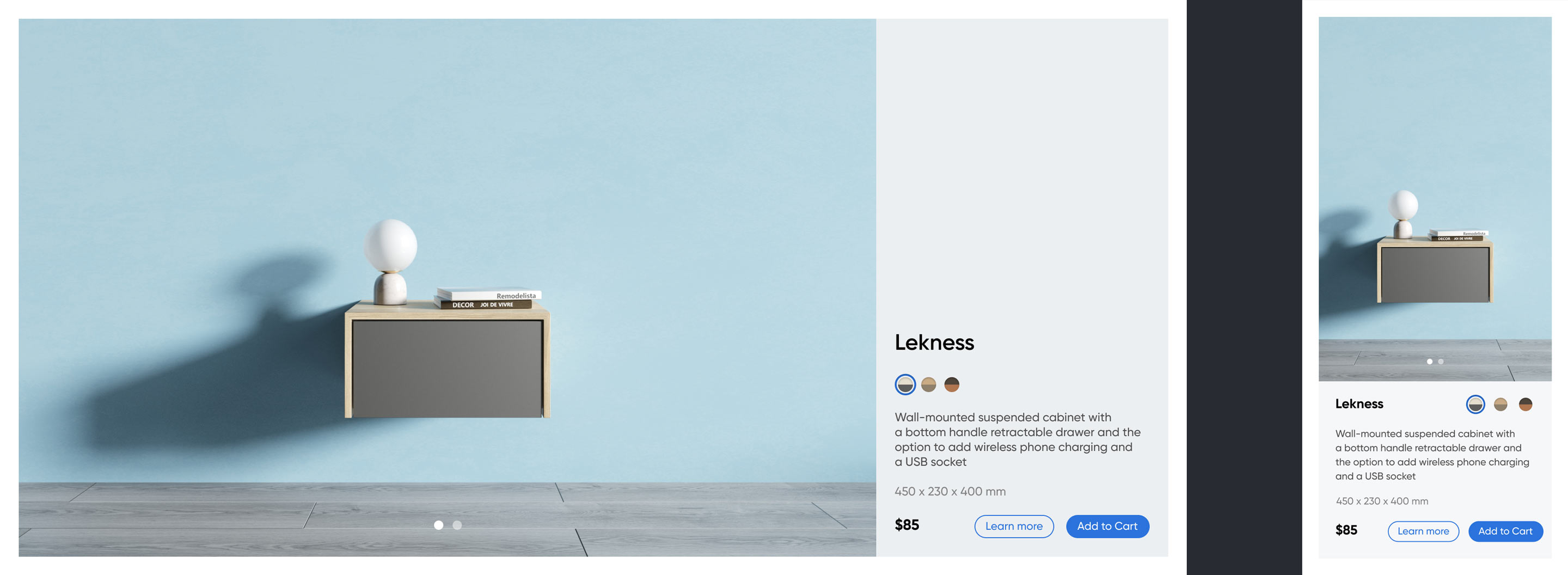
Product card in the product list. The desktop version is displayed on the left, and the mobile version is displayed on the right.

Process
Defining project goals
Goal and Context
Create a website that offers a fully immersive experience equivalent to visiting a physical showroom for selecting and purchasing furniture. The website should enable customers to easily choose options for finishes and additional equipment, as well as visualize how different pieces of furniture combine with each other. It is also important to convey the brand’s core values to customers, including a balance between quality and price, as well as a commitment to modern technologies.
Responsibilities
Tasks include analyzing competitors, developing a brand’s corporate style, designing the UX and UI of an online store, setting tasks for a 3D illustrator, layout designers, and programmers, and overseeing their implementation.
Competitors and inspirations


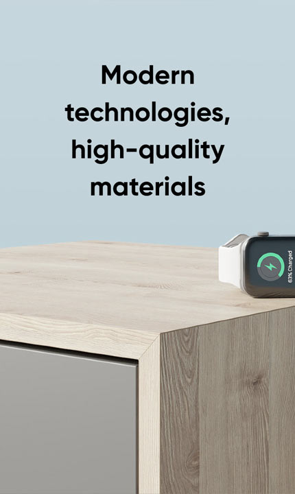
Larvik prioritizes the use of modern technology in furniture, aiming to strike a balance between high-quality materials and affordable prices. To achieve this, they take inspiration from two world-renowned companies: IKEA™ and Apple™.
IKEA is one of the best examples of Scandinavian design, which emphasizes simplicity, functionality, succinctness, and bright colors. The IKEA website is characterized by a strict layout, straight lines, sans-serif fonts, and colorful photographs of furniture in an interior setting. This allows consumers to visualize how furniture might look in their own homes and offers a large number of interactive elements that help visitors understand the features and benefits of their products.
Apple, on the other hand, is known for its minimalistic, innovative, and high-quality visual style. The Apple website features images of products with a strict yet innovative layout, strict typography, and predominantly white and black background colors. This design maximizes the emphasis on product images, clear navigation, and interactivity.
Development of Visual Style
Colors
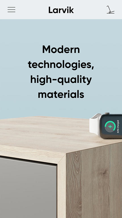
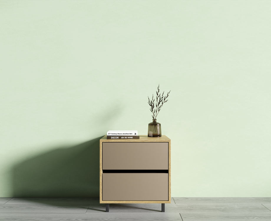
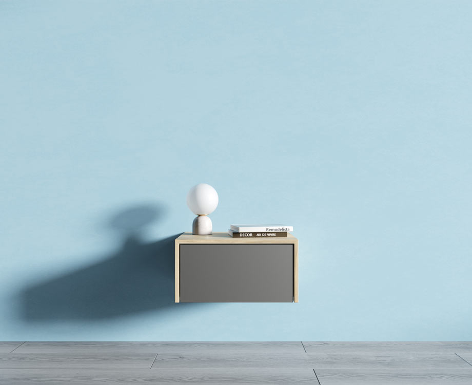
For the main background, we use white because it makes the design cleaner and allows maximum focus on the company’s products. The color palette is based on the three pillars of the world of colors — RGB, but we use their pastel versions — light green, soft blue, and peach. These three basic colors make the page design interesting without being too flashy.
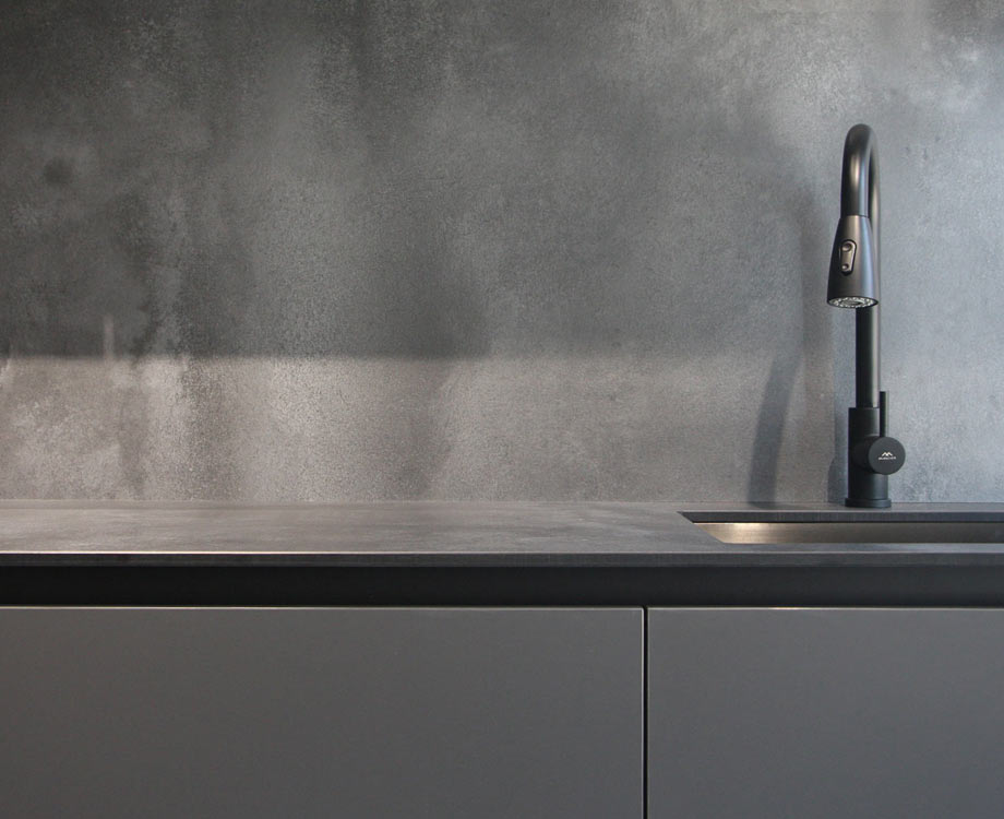
As materials imitating natural stone are often used in the decoration of residential premises, we choose gray and all its shades as the fourth color.
Typography
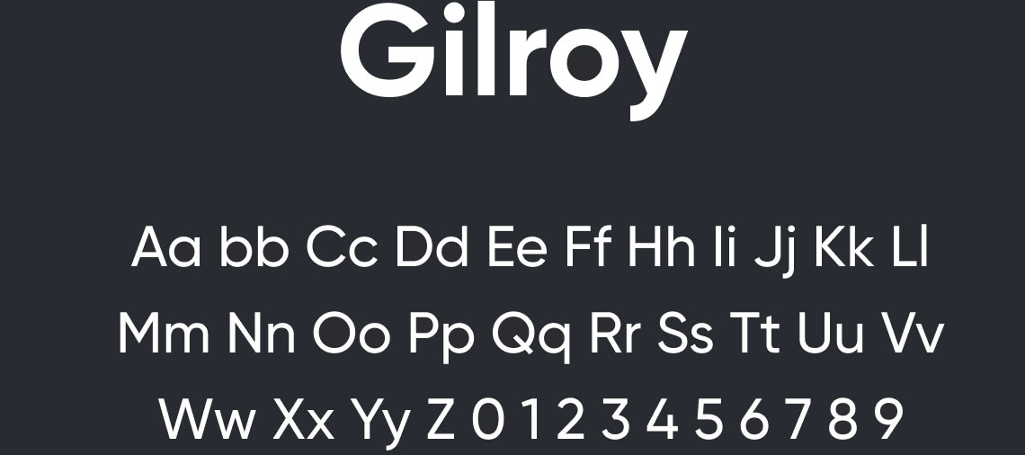
To convey reliability, succinctness, modernity, and practicality, a grotesque font with a strict drawing is best suited. Gilroy is the perfect font for this situation — simple, graphic, and strict. Its semi-bold strokes in headlines give the statement weight and solidity, while interesting details such as the diagonal slants of the lowercase ’t’ or the perfectly round lowercase ’o’ reflect attention to detail.
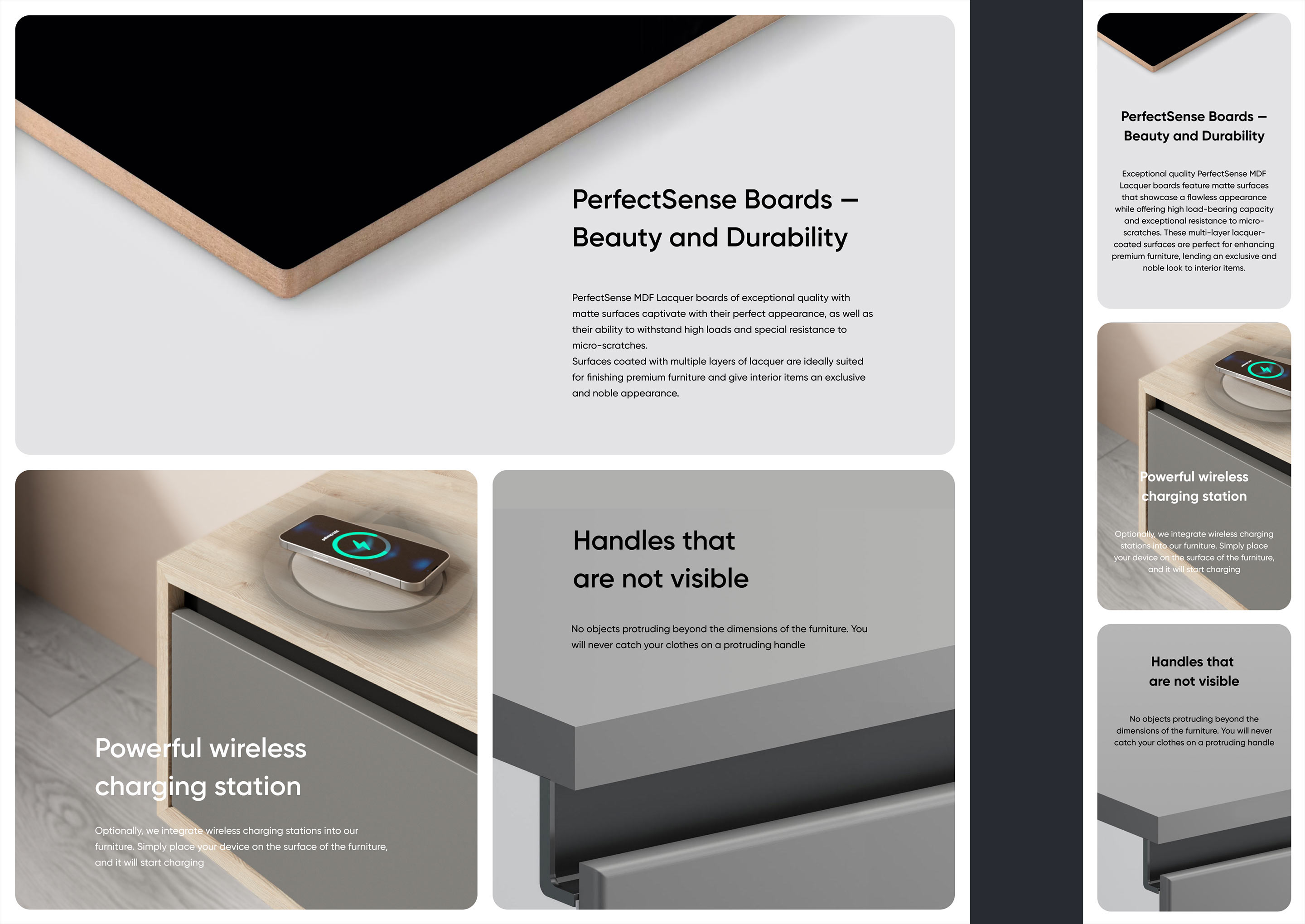
Graphical Elements and Textures
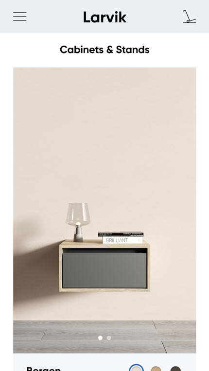
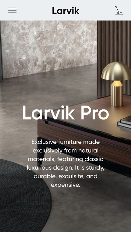
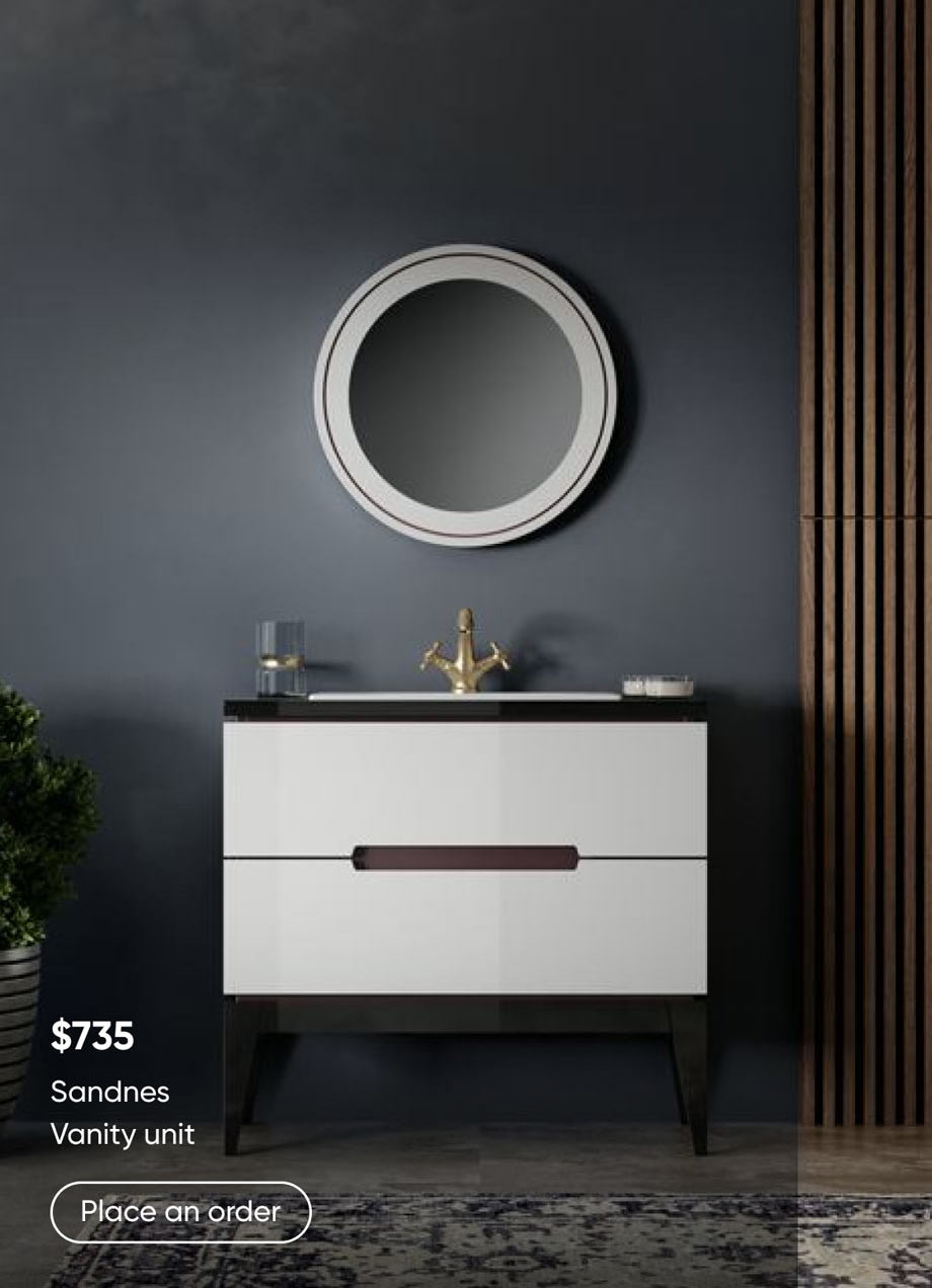
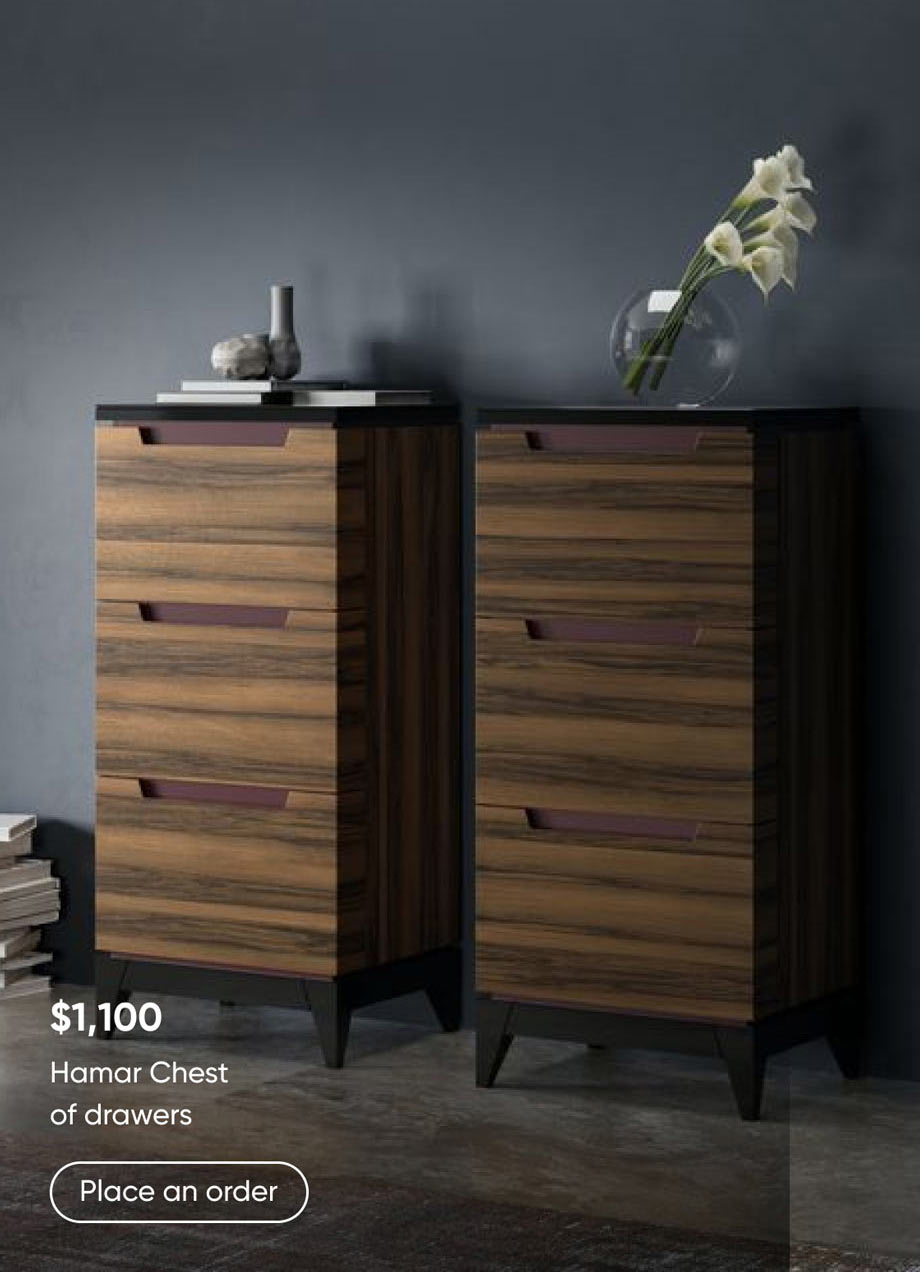
Larvik offers two product lines: affordable options for mass consumers with an excellent price-to-quality ratio, and the exclusive Larvik Pro line which uses only natural finishing materials. To display and promote affordable line products, a monotonous or gradient-colored background is used with a photo or render of the object in the foreground. This allows for a focus on the product while providing a wide range of variability.
Designing individual pages
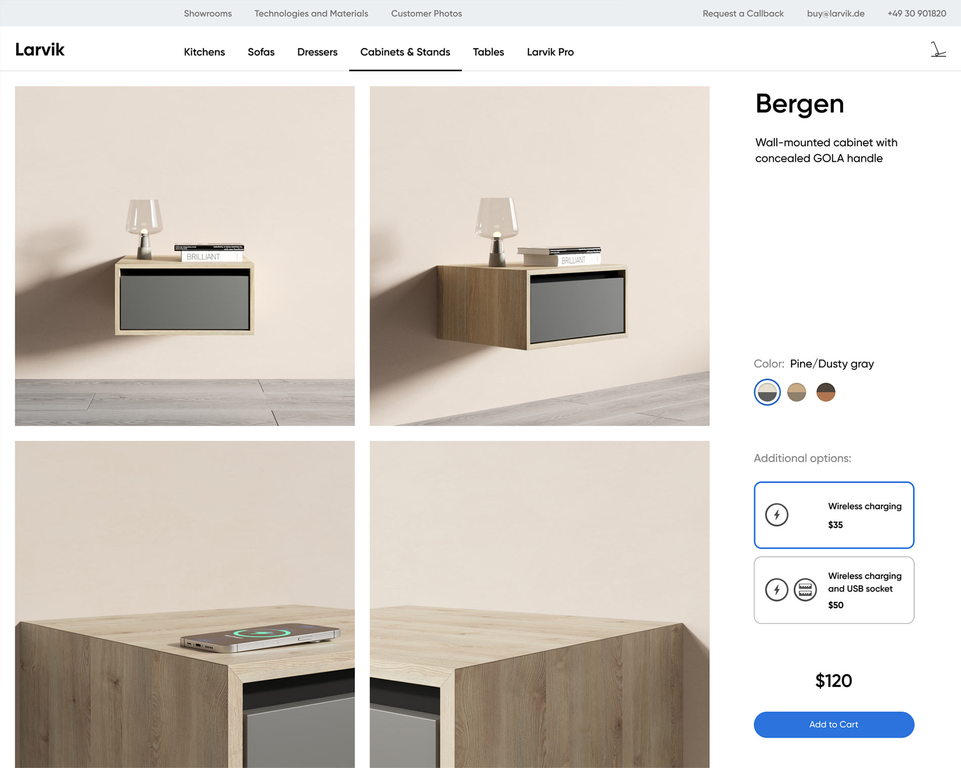
Product Page
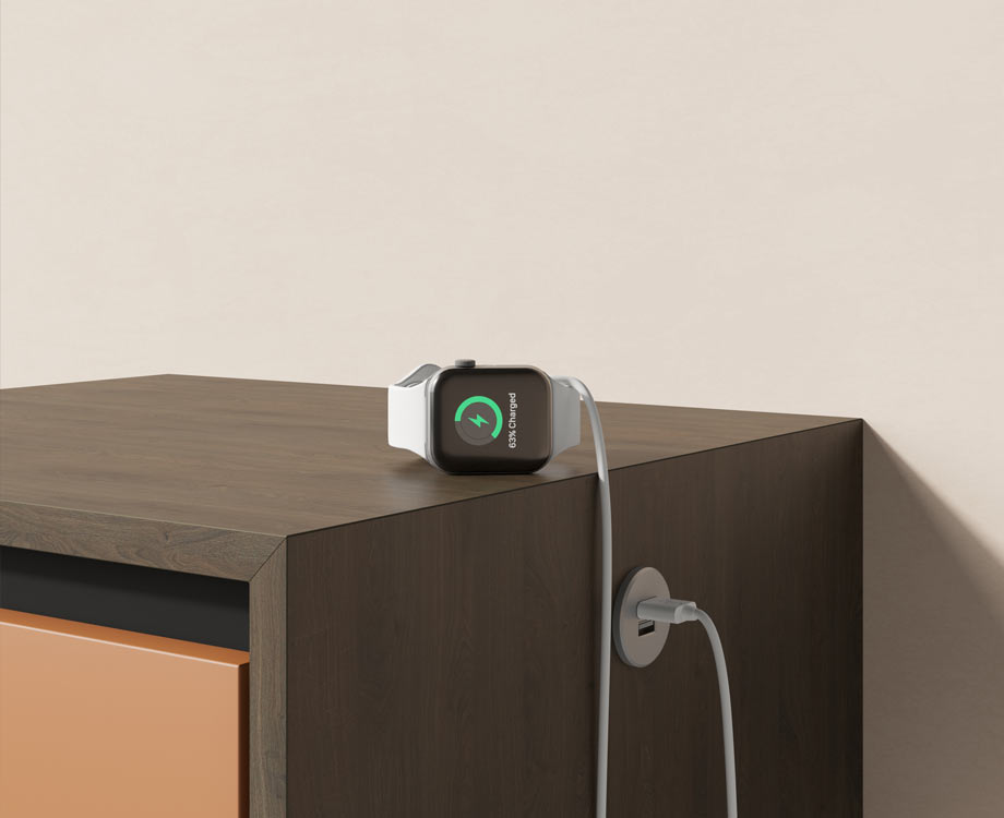
Larvik furniture can be optionally equipped with technical features such as wireless phone charging or a USB port. When an option is selected, all furniture images are updated to highlight this feature. This way, the buyer can clearly see how their option selection will affect their furniture.
Kitchen Configurator
The main concept behind the kitchen configurator is to emulate the offline showroom experience as closely as possible during online shopping at Larvik. Therefore, all kitchen modules are displayed at the same scale in the kitchen builder. Additionally, during a virtual walk through the modules, you can «peek inside» them by hovering your mouse over them. To view how a module looks with a different finish, you can select it from the module list without having to go inside.
Result and Successes
The website was launched in June 2023 and received high praise from both buyers and brand owners. The site’s design was so well-crafted, and the illustrations were of such high quality, that visitors initially couldn’t believe the listed prices were real. It was only after placing an order that they were convinced there was no deception. Larvik simply knows how to make beautiful and durable furniture at a reasonable price.